Jorge Arango: My name is Jorge, and I’m an information architect. I’m based in Oakland, California. And I’m one of the coauthors of the fourth edition of the polar bear book on information architecture, along with Peter Morville and Lou Rosenfeld, who you may have met here at the conference as well. And my background is in architecture, so the design of buildings informs my perspective on our discipline. And my presentations usually start with buildings, because that’s kind of what inspires me.
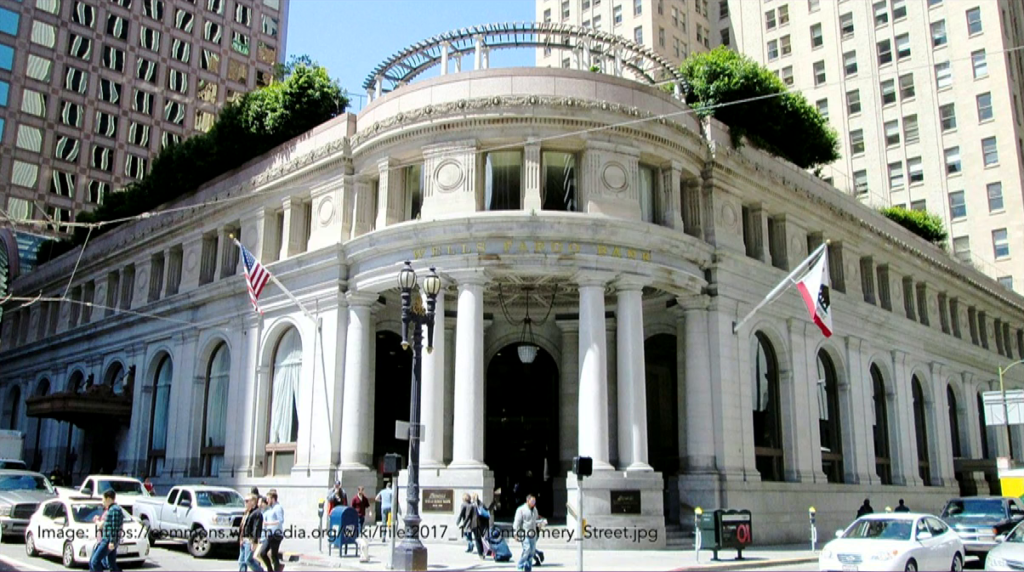
And this is a building in San Francisco. Those of you who live in the bay area may recognize it. This is 1 Montgomery Street in San Francisco, and this is a branch of the Wells Fargo Bank. And this is an unusual building for California because this building was designed to be a bank 110 years ago, and it’s still serving the purpose for which it was designed.
I visited this place with an architectural historian who pointed out all the details that made a bank a bank, all the kind of semiotics of banking in the early part of the 20th century, and it was fascinating, right. You walk through these doors and it’s like you walk through a time portal. This place has these ornate ceilings, marble cladding everywhere, a high station for the bank manager to oversee what’s going on.
And one of the details in this place is they have these tall, carved stone tables that were used by bank patrons to sign checks and deposit slips. And these tables have, carved into them, inkwells. Because of course at that time people didn’t use ball-point pens. So they needed access to ink. And the inkwells have been dry for a long time. Because people for the most part don’t use fountain pens anymore. And increasingly they don’t use places like this to do their banking, either.
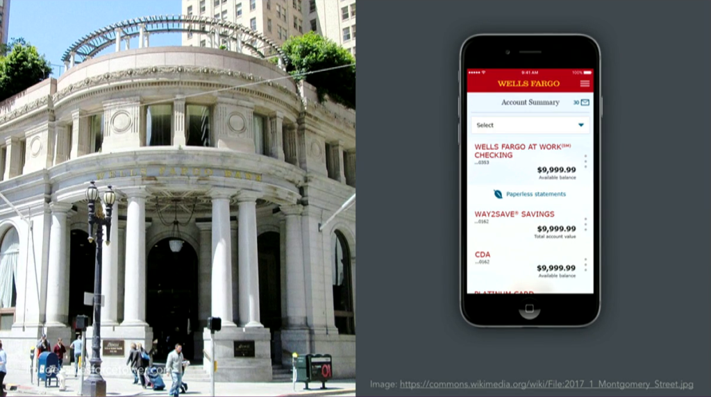
So, many of us are doing our banking in information environments instead of physical environments. Things like web sites and apps that are serving the roles that places such as 1 Montgomery used to serve in the past. And it’s not just banking. We’re doing this to other important aspects of our society.
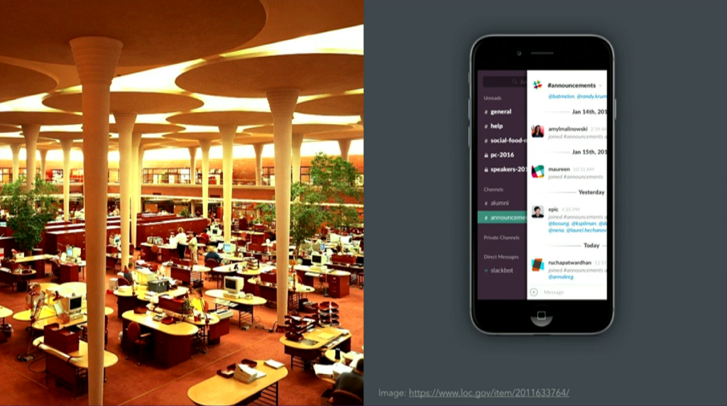
We are consuming and accessing our arts and entertainment in information environments. We’re shopping in information environments—you may have heard of something called The Great Retail Apocalypse of 2017, right? We are learning in information environments. Some people are finding their mates in information environments. We are holding our civic discourse in information environments. And of course many of us are working in information environments. This building on the left here, this is the Great Workroom in the Johnson Wax headquarters which was designed by Frank Lloyd Wright. This is one of the first open-plan office spaces. And in the words of architecture critic Paul Goldberger, this was a place designed “to give the company’s clerical workers a sense of community and nobility.”
These days, if we want to give our workers a sense of community we very carefully structure our Slack channels, right? And we kind of have given up on the nobility thing.
The main point is that these things create contexts in which we understand the world and inform our actions. And the framing of what we design is very important to how we go about it. We have not been framing these things as contexts. We’ve been framing them as products, services, and a whole other series of terms that are— Tools, for example. And these are things that are mostly transactional. They’re not things that are meant to be inhabited.
And when I speak with folks who are new to the field I find this concern with the user interface of these things and the the ways that you interact with them, as opposed to the framing that they’re doing to our lives, right, and how they’re acting as framing artifacts.

And I think that the result of this is that they’re not serving us very well as places. We’ve seen a marked erosion in our civic discourse over the past few years. And I think it’s in no small part due to the fact that we are having these important social transactions in places that have not been designed as places.
So in the keynote this morning Anab Jain said the tools we create to shape the world are shaping us. And I think that’s spot-on. But I think the problem is that we’re thinking of them as tools when in fact in some ways they are places.
We are called to be architects of the future, not its victims.
R. Buckminster Fuller [slide]
I also see a great deal of angst among designers about this situation. And in the spirit of Buckminster Fuller I want to call on all of you to think of yourselves kind of as architects that are designing environments where people are conducting important parts of their lives. I’ve adopted this mindset myself, and I have this question that I pose to myself which is, “How can I design information environments that serve our needs as a society in the long term?” And that’s my main provocation to you with this presentation. And because of my background in architecture I have three principles or three perspectives that I bring from architecture to help answer this question.
The first principle is to be mindful of the fact that in these things that we are designing, we are imposing upon the world a conceptual structure that influences how people understand where they are and what they can do there.
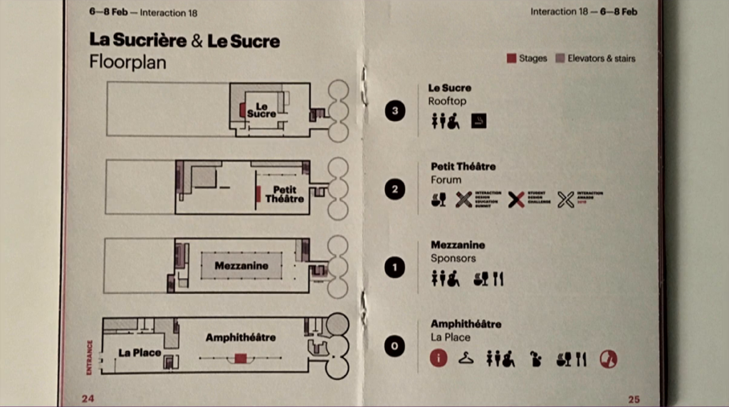
We’ve been doing this with physical places for a long time, right? So I think that by day three you all are familiar with how this place that we’re in now is structured to serve the needs of this conference, right? This very room that we’re in is structured in a particular way that enforces a structural distinction between me the presenter and you the audience. And that is by design. There is a context here that allows this presentation to take place.
On Tuesday, Nina Lysbakken said we have different rooms for different purposes. And our digital things are serving these roles—well, she didn’t say that part, that’s what I’m saying. But she’s right on this idea that different rooms serve different purposes.
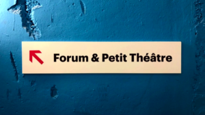
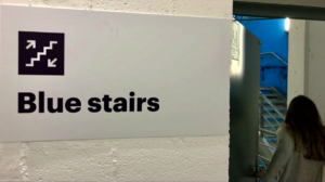
We label these rooms, so that we know where we are and how to get to them. We provide ways of moving around the environment, and do things like paint the stairwells with primary colors so that we don’t get confused about where we are. So these are things that we’ve been doing for a long time in architecture. And it’s important to notice that these things don’t just serve as navigational elements. They also create the context.

So one exercise that I like to do, and I invite you to try as well, is to visit web sites and cover up the branding so that you can’t tell what it is. And just look at the navigation bars and try to ask yourself how much context is just the navigation giving me? And if you do that you’ll discover that these things— This reads like a bank. In very much the same way that 1 Montgomery served like a bank, right? In her keynote yesterday Haiyan Zhang said that the screens for apps are a way of structuring the world, and this is partly that what I think she was referring to.
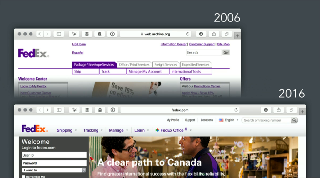
Now, an important point to keep in mind here as we think about the longevity of these things is that these structural aspects of the things we design are more long-lived than user interfaces. So when I was working on the polar bear book one of my tasks was updating the examples. And this is a book that was originally written in 1997. So there were some old things in there, right. And one of the things I noticed is yes, the UIs had changed a lot, because now we had bigger screens, and greater color gamuts, and fonts, and all sorts of neat things. But the structures, the navigation bars, were pretty similar, you know. So these things evolve more slowly than others. If you’ve seen Stewart Brand’s pace layer diagram, right? That’s at play here and the structures are more long-lived.
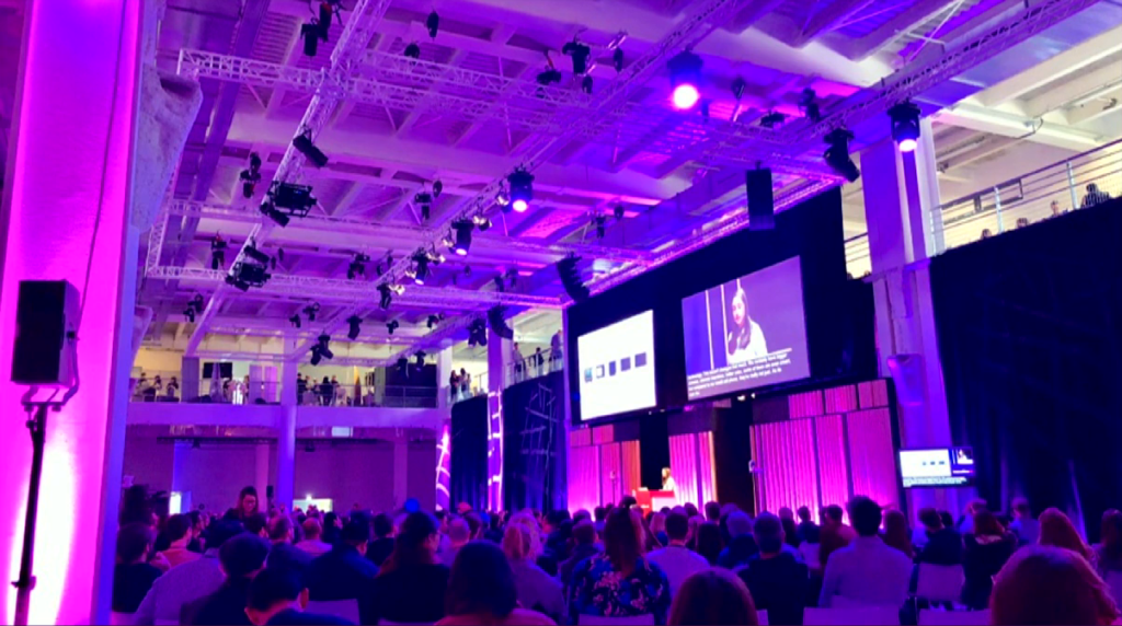
So the second perspective is that these structures don’t exist on their own. They are part of and participate in systems that are greater than them. So again, if you look at architecture and a place like the building we’re in, for this place to function as such there are many different subsystems that coexist, right. So there’s the physical structure that’s keeping this place up and standing. There is the electrical grid. There is a heating and air conditioning system. And all these things must be designed as a whole so that this place functions for us as human beings.
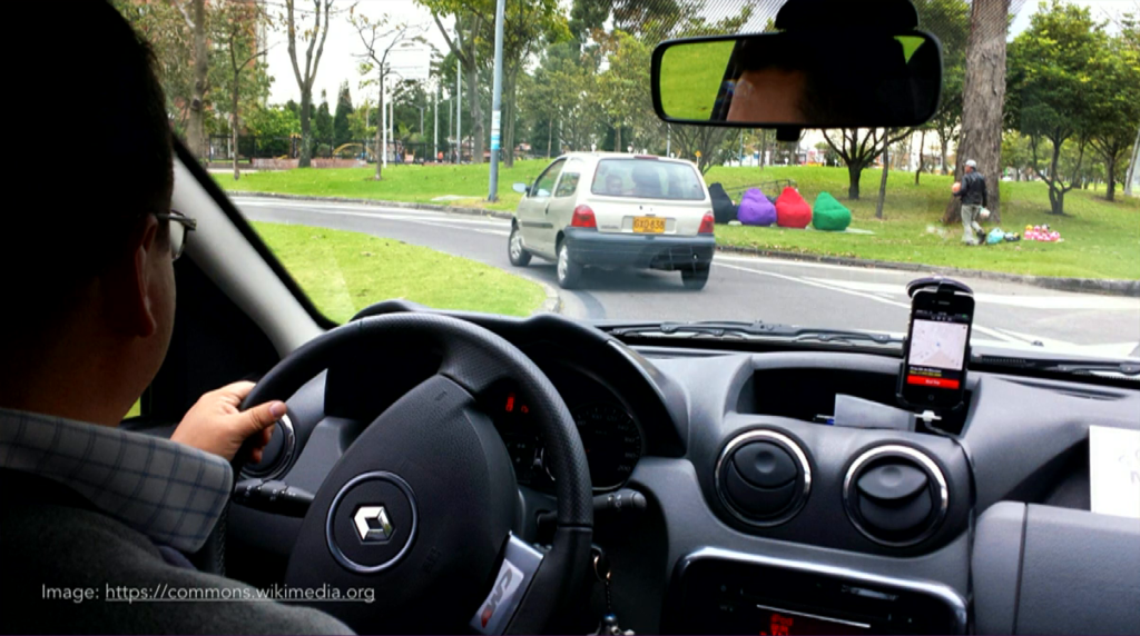
Now imagine that you’re working on the design for a ride-sharing app, something like Lyft or Uber. If you’re tasked with designing say the passenger app for this thing, you cannot consider that app in isolation to the broader system in which it functions. To do a good job you must understand that there is a driver app that is the counterpart to your passenger app. There is an intermediary set of services that match supply and demand, so there’s a marketplace. And there are things also, systems that are outside the boundaries of your organization. So this app can’t work without GPS, right. And maps. Two things that your organization probably would not be able to afford to build on its own.

So this question of the system and where its boundaries lie is very important for us as designers. Because the boundaries of the app you’re designing do not stop at the boundaries of your company. The societies where these things exist are also systems, and your app is a part of that society as well. So we need to be very conscious of systems and the impact that our things have upon the broader system that supports them.
The third perspective is that these systems are always evolving. They’re dynamic, right, and we need to design them in such a way that they evolve to remain in existence, both in and of themselves and in the societies that that support them.
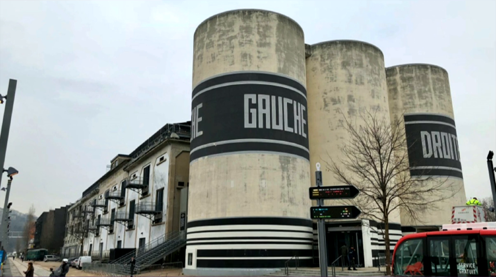
Again, architecture has been doing this for a while. So when architects work on a building they must consider the context that they are working within. And especially in recent times, there’s been a movement to do things like repurpose sugar warehouses into conference spaces, right? Like this isn’t a building that was designed for its current purpose, but there is this consciousness to the cost associated with tearing down these structures that kind of invites us to a more responsible relationship with the artifact.
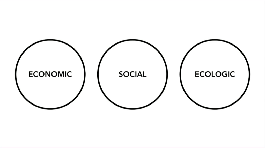
So when I talk about sustainability I’m talking about sustainability in three spheres. One is the economic sphere; the social sphere; and the ecological sphere. And I’m going talk really briefly about all three.
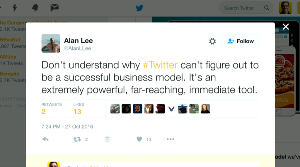
Alan Lee, Twitter
So the economic sphere I’m not going to spend too much time on because I think it’s obvious. The thing you’re working on needs to produce enough value to make it worth everyone’s while. I think this is kind of self-evident, but it’s not necessarily so for some important information environments.
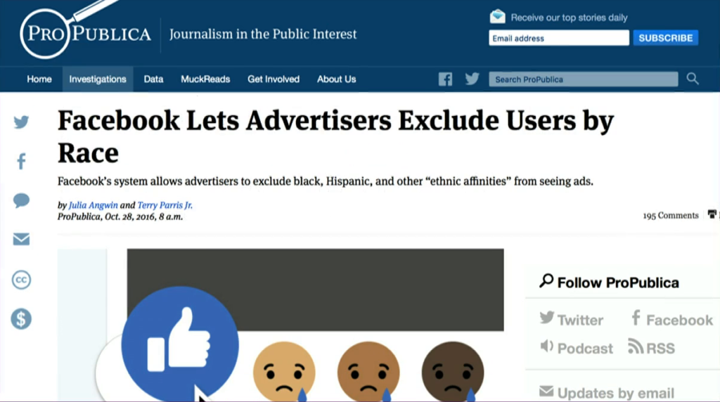
Facebook Lets Advertisers Exclude Users by Race, ProPublica
The next sphere, the social sphere, is related to this, and Alan Cooper touched on it on Tuesday, you know. This idea that we have to be careful with externalities. Like there is a cost to society to doing some of these things, and we need to be mindful that the systems that we put into the world are contributing to the long-livedness of our societies.
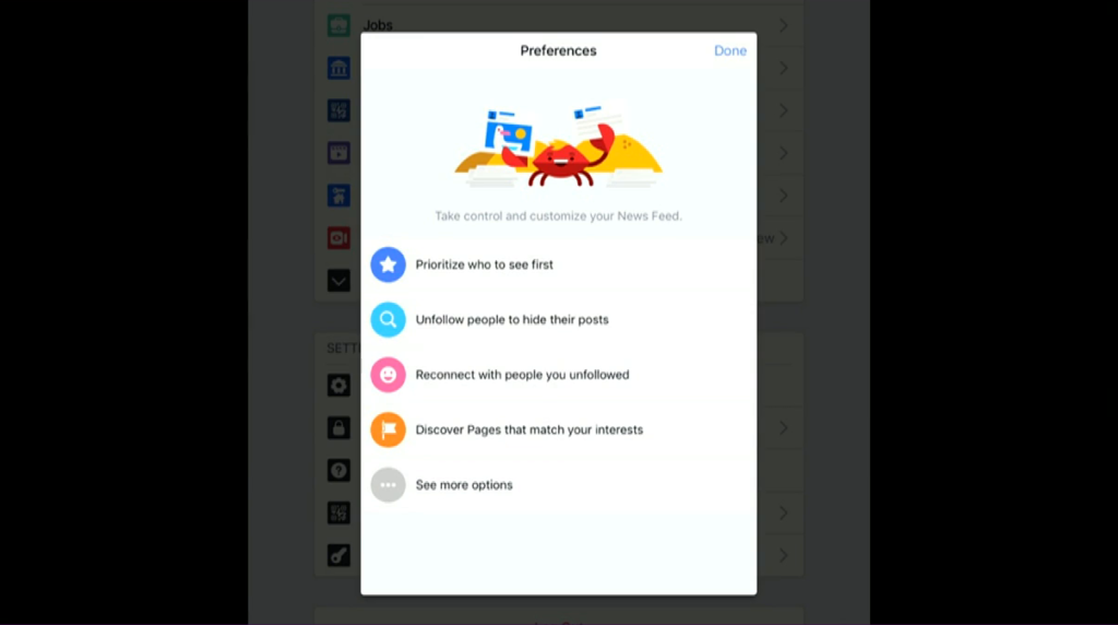
The third sphere is perhaps a little trickier, which is why I want to spend a little bit more time on it. So this is the idea that there is an ecology to information. And we’re familiar with ecology in the physical environment, right, like this idea that you don’t go out and pollute the river, for example. Because we all depend on the river. So what’s the analogy here with information?
Well, the media theorist Neil Postman had this term he used, he called it “semantic environments,” this idea that for language to function well, we have to have a set of conditions that make our shared meaning conducive to creating understanding between us. And semantic environments can become polluted when we start shifting the meanings of words. And I think we are doing this unwittingly all the time. So think of what’s happened to the word “news” over the past two years, right. This is a term whose meaning is shifting, and is shifting in a way that makes it impossible for us to use it for its intended purpose. And I think that that is at least in part due to the fact that we as designers, as technologists, have shifted the meaning of news from something that was a reverse-chronological list of the latest, to something that is algorithmically designed to somehow keep you engaged. We need to be very careful with this stuff because languages are… It’s one of the things that distinguishes our species, I would say, and we’re messing around with this stuff, right.
So to recap, I want to echo Alan Cooper’s call on Tuesday for us to be better ancestors. I think that aiming for the long-term viability of the contexts where we live our lives is a good way of going about it. So as you go back to work on Monday, I want to ask for you to ask yourself these questions. Are the things that I’m designing creating conceptual structures, distinctions in the world, that are viable? Are the systems that I’m working with respectful of the broader context that they’re in? And are they sustainable, economically, socially, and ecologically?
Making wholeness heals the maker
Christopher Alexander [slide]
As we move more and more of our activities to information environments, interaction designers have greater agency than ever to make a difference. Through our work we can bring wholeness and healing to societies that desperately need them. We can and must choose to do so. So, I thank you. I have a book coming out on this subject in the summer, so if you are interested in this topic please check it out. And I’m happy to talk with you later. Thank you.
Further Reference
Architect Everywhere, by Jorge Arango, exploring related topics.
