Holger Kuehnle: As a designer working with technology, I’ve always been really passionate about technology. I always saw technology as something that empowers people, that helps people communicate better, that helps people understand information, and with that build knowledge and remove bias and bring us all together as a society.
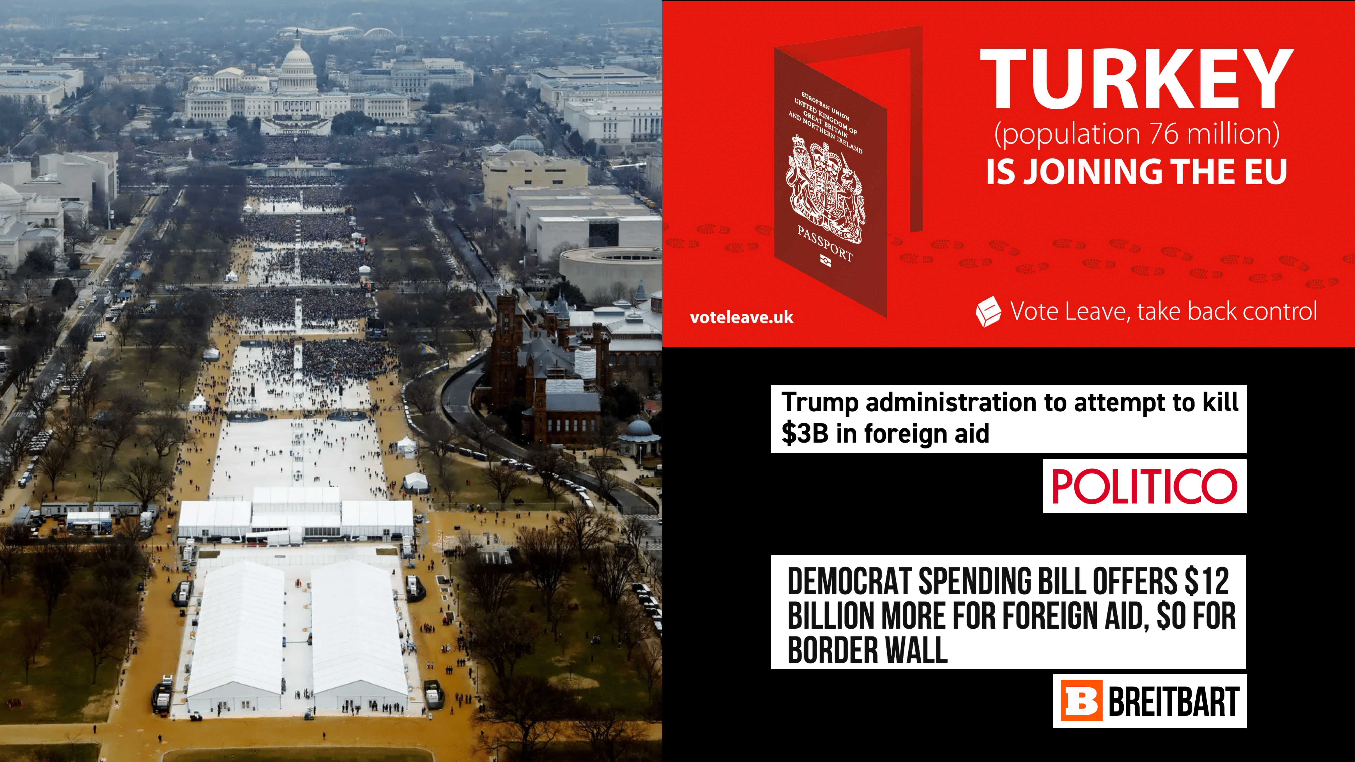
And then this happened. Someone who seemingly no one wants to see become President became president. People in the UK—the United Kingdom—became very very afraid about the sheer number of people living in Turkey and what would happen if Turkey would join the EU, [what] that would mean to their social security system. 76 million people in Turkey. And it prompted them to vote to leave the EU. People started getting very very very angry and agitated about issues such as how much the United States spends on foreign aid. And so, I’m looking at this and I’m not even quite sure what this means. Three billion less, twelve billion more. To me as and individual, and I’m assuming this goes for a lot of other people on the stage here—for most of us—any billion amount of amount of dollars sure sounds like a lot of dollars to me.
So what’s going on here? In the first example, we’re looking at how many people attended an event during a certain specific moment in time, and we’re using that—we’re spending a lot of media time—talking about how many people were there, how many people weren’t there, to make an assumption about whether this person is a legitimate president or not. If you think that this person should not be president, your moment to do that as an active citizen was likely during the election. At this point this person’s already standing there up on stage getting inaugurated.
And in the second example, we’re using a very large number, 76 million people, creating assumption that Turkey joining the EU would mean that all these people could suddenly come to the United Kingdom and have a negative impact on the social system there.
And in this third example, we’re talking about increases or decreases to a number. A number that’s actually not mentioned here. I don’t actually know from looking at these headlines how much money is being spent on foreign aid overall. And how has that been the past couple of years—and probably most importantly so, for me to have a really good opinion about whether that’s good or bad, what are we using this money for? What is actually foreign aid used for?
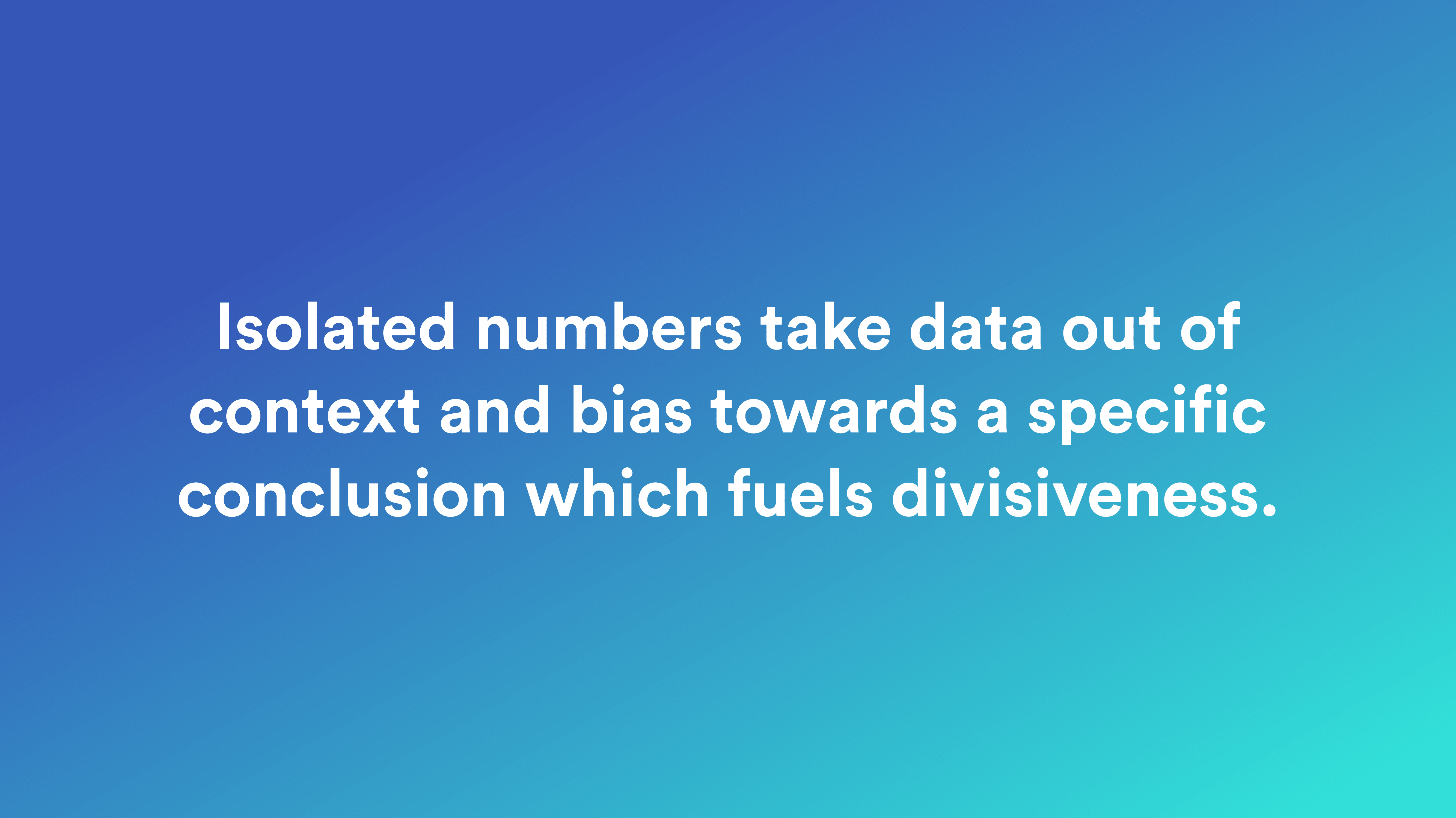
So what do these examples have in common? They take a single number out of context and bias toward a specific conclusion that actually fuels divisiveness. The key here is context. You need context. And I’ll talk a little bit about how context is necessary to really understand data, necessary to understand numbers. And I want to do that with an example.

So let’s imagine somebody shouts, “Ball!” What does that mean, ball? Should I duck, should I be scared? Like am I going to be hit by a ball? Am I on a sports field, should I hold our my hands and catch a ball and that’s a good thing? I don’t know. I have no idea of knowing what ball means if you just say “ball.”


Is it a ball that I’m supposed to kick? Is it a ball that I’m supposed to uh… Either way, it’s supposed to be a football as well.


Is it a small ball? Is it a large ball, a big heavy ball? I need a way to quantify what this ball is. What does this ball mean to me from a quantitative perspective?
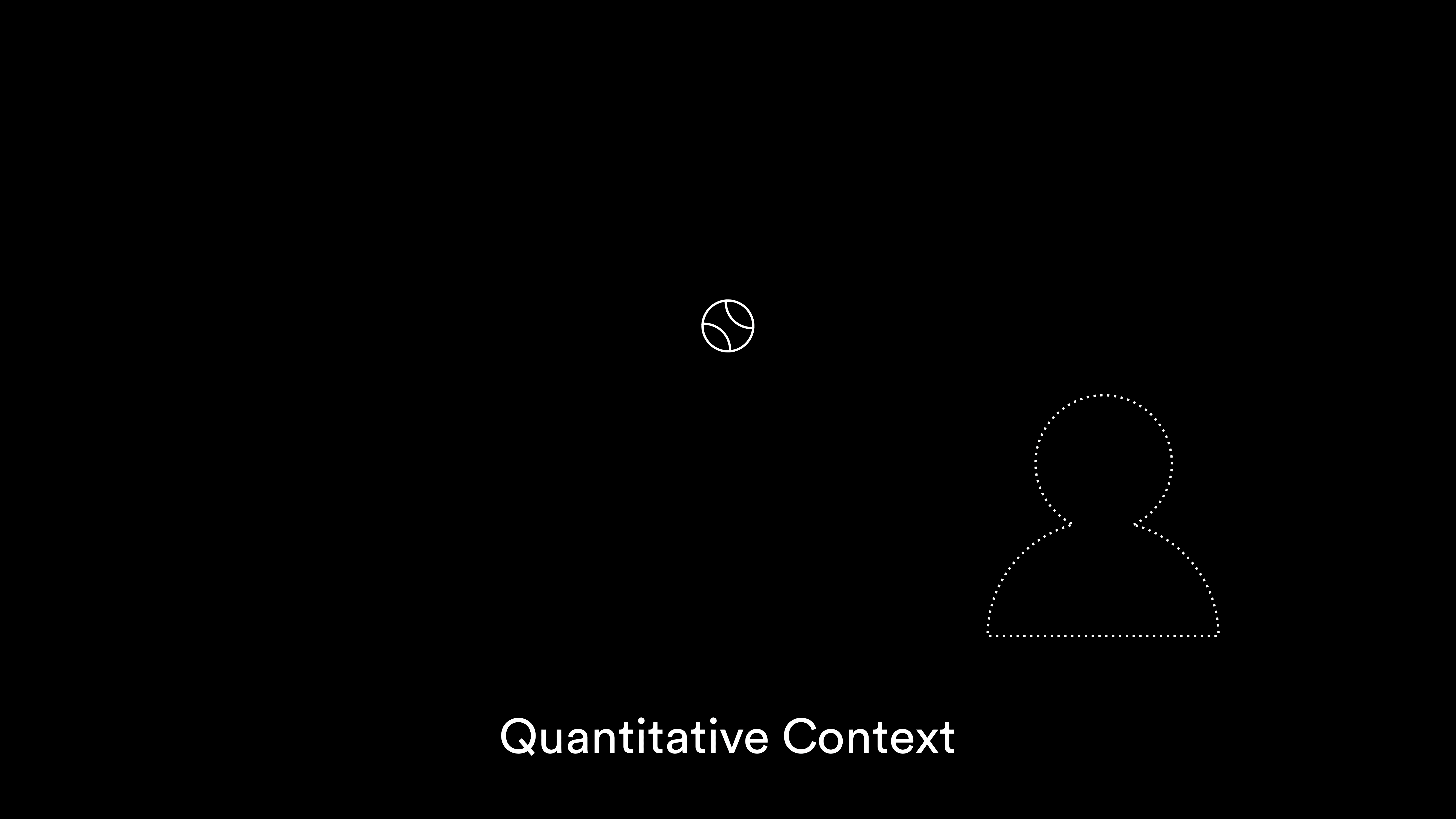
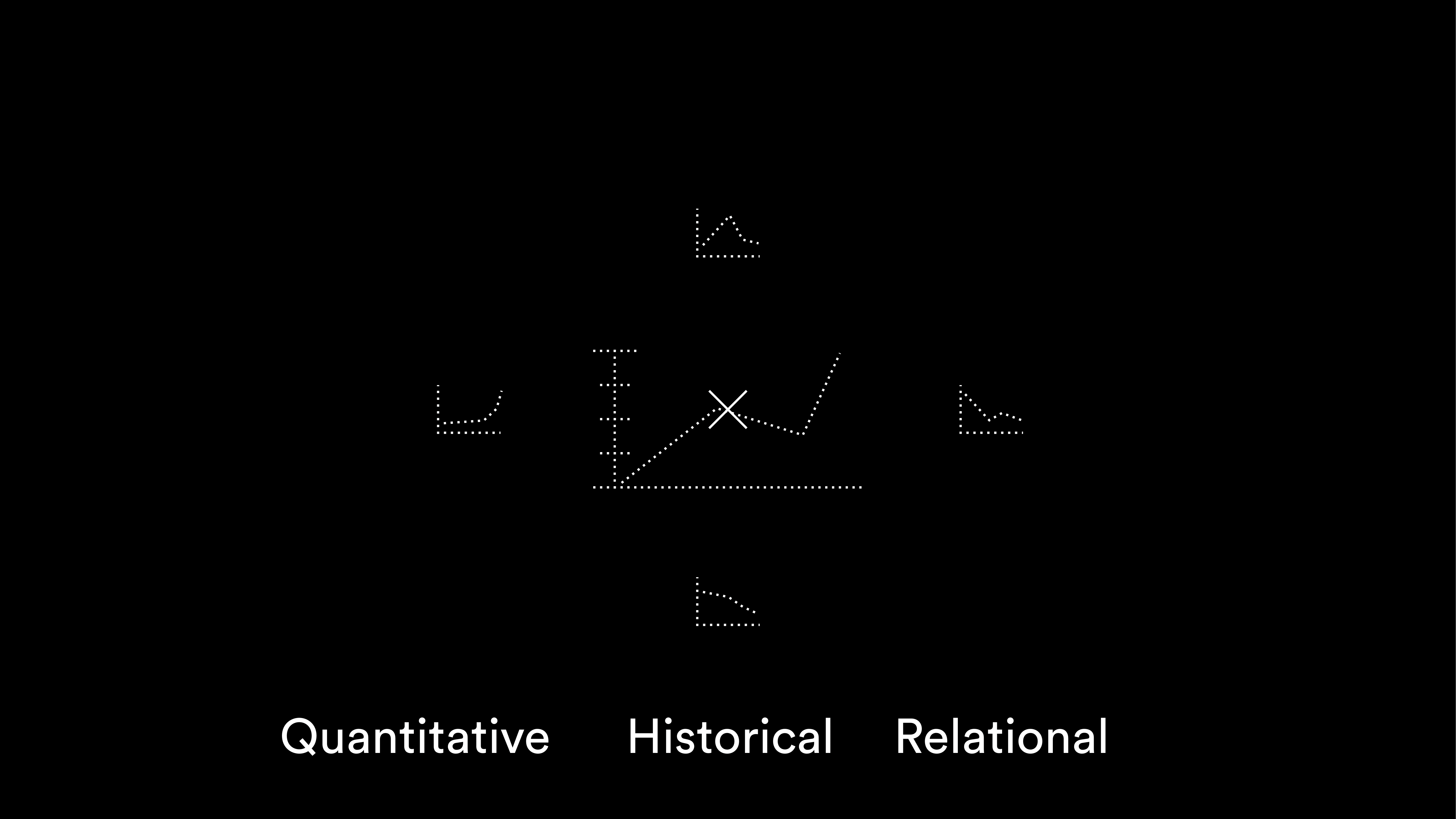
Well, how large is it compared to you how large I am? If it’s sort of you know, slightly smaller than my head, okay. I understand that. That gives me quantitative context. That’s one of the key elements of context I need to be able to quantify what it means.
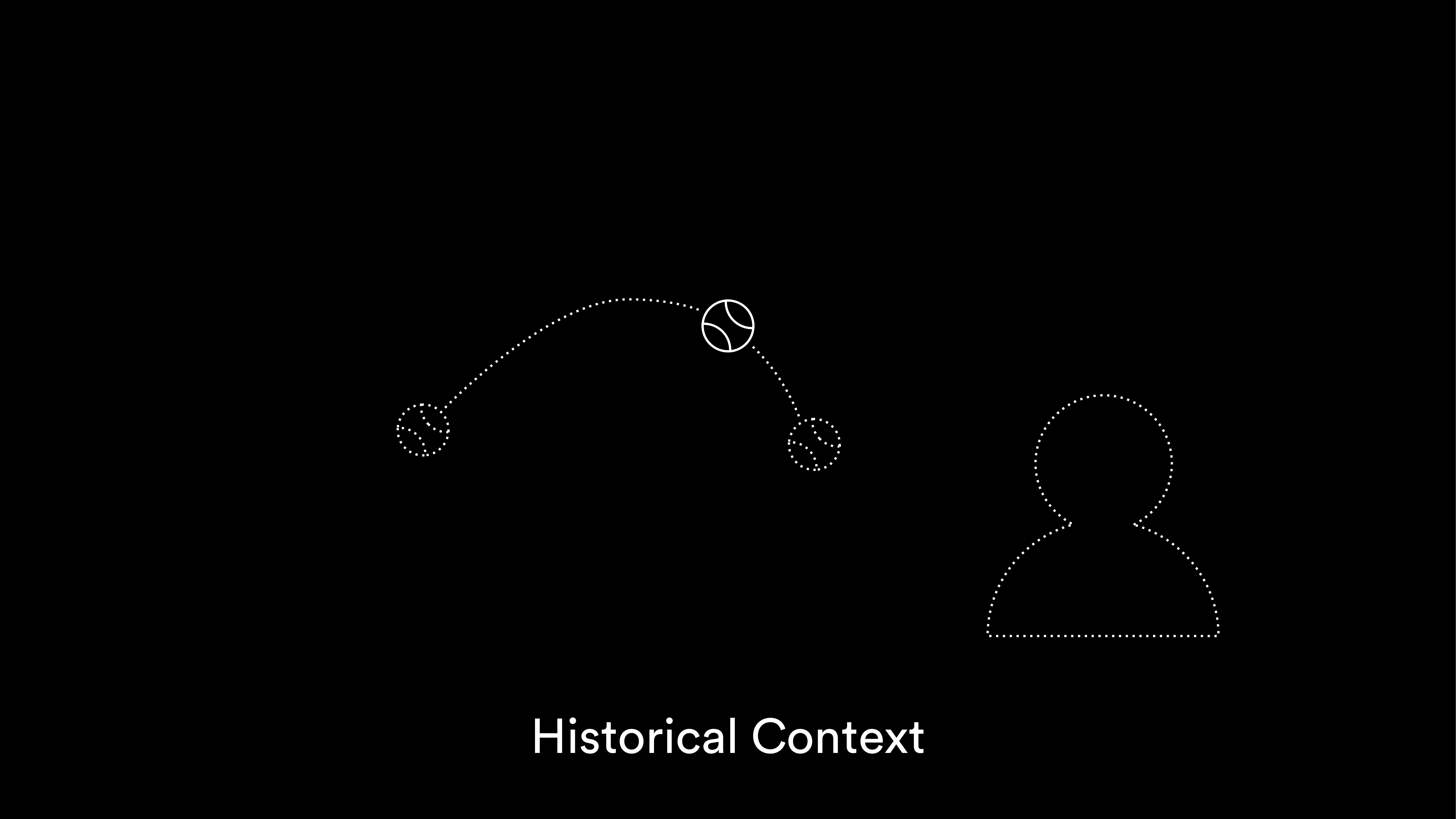
And then next what’s essential is understanding the historical context. Where has this ball been before, where is it right now, and with those two components I might infer with some amount of confidence, or less, where it’s going to be in the future. Is it flying towards me? I need to understand the historical context.
And then next it matters a great deal about where all this is happening. This ball’s flying towards me. Alright, I understand. It’s sort of a small ball, slightly smaller than my head. I understand a little bit more what “ball” now suddenly means.

Well, if I’m holding a tennis racket, and I’m on a tennis court, that’s a great thing. Ball’s flying towards, flying towards my tennis racket, everything’s great.
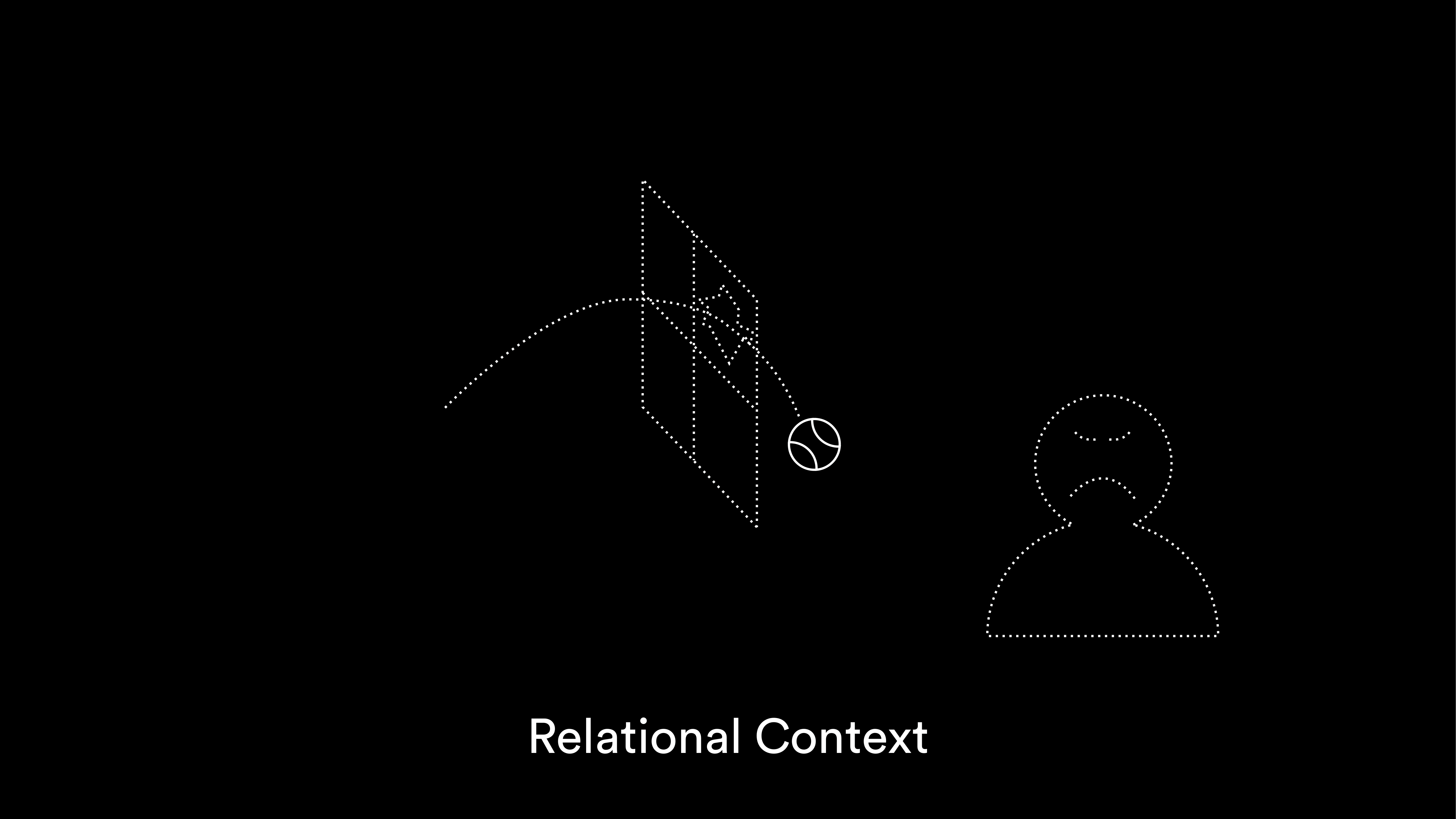
But if the environment that the ball exists in changes. If let’s say I’m standing on the opposite side of a window and that ball’s flying towards me, that’s kind of a bad thing. Like I’m not going to be very very happy about that.
So, the relationships that this ball exists in matters. It’s the relational context that the ball exists in. So in order to understand context we need to quantify, we need to understand the historic context, and we need to understand all the relationships that what we’re talking about exist in.
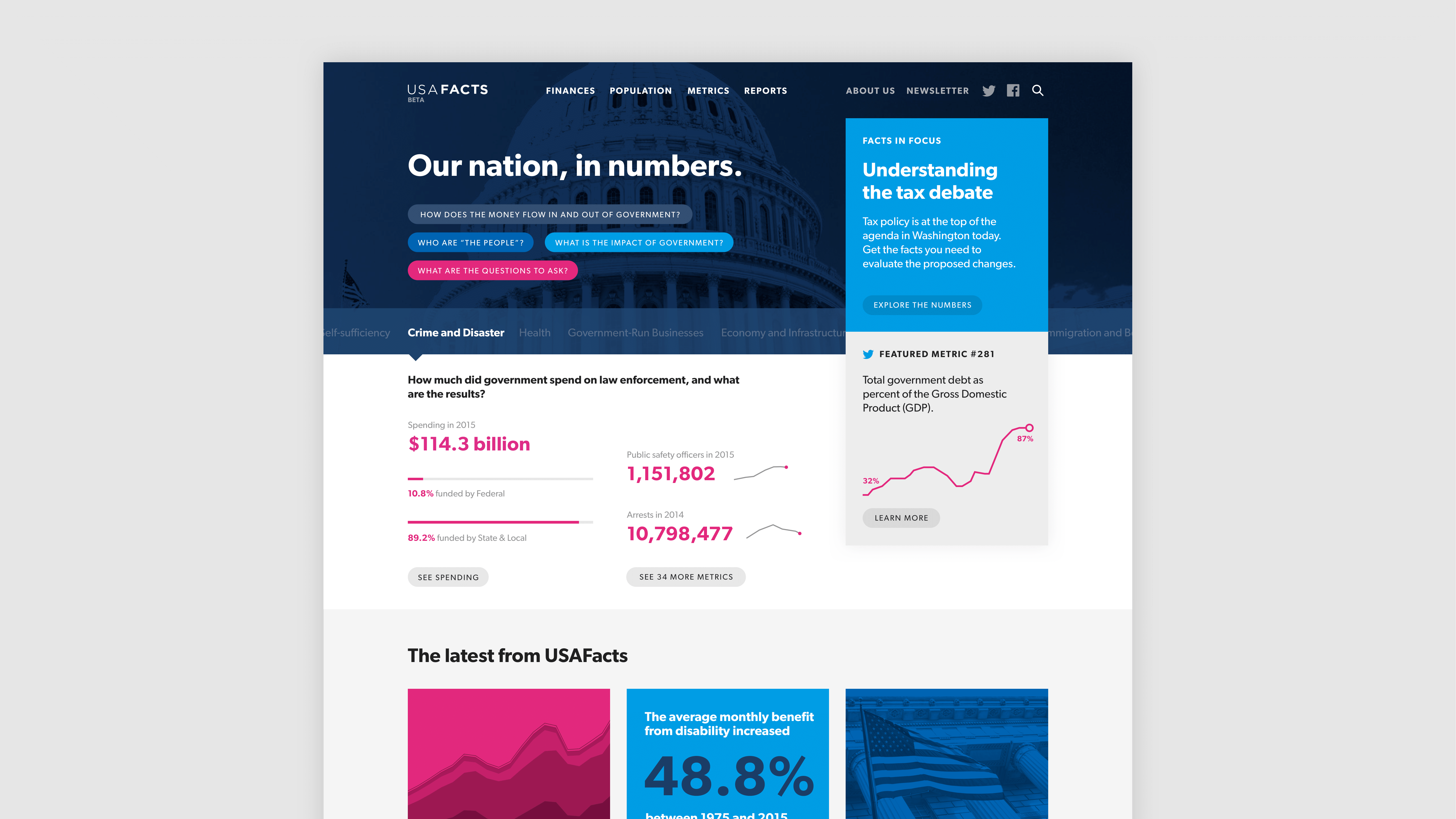
So how does all that apply to numbers, right? I’m standing up here, supposed to talk about data. Well, I’m gonna give you a couple of examples of a project that I’ve been working on as a design lead at Artefact with one of our clients. And that project is called USA Facts. USA Facts is an unpartisan platform for aggregating government data, with the goal of making that data easier to understand, more accessible, with the overarching mission to drive and foster more civilized public discourse that is based in facts. And what USA Facts does is it takes all this government data, puts it into a format that is universal to some extent and can be analyzed and then publishes it on their web platform.
It does that without any form of interpretation. So USA Facts does not take sides. And that’s actually quite challenging. And if you have to imagine like, this data’s actually—you can today go and access all sorts of government data. It’s available. However it’s all caught up in different reports. It’s being published by different agencies that have different schedules of when they publish these reports. It might be in a spreadsheet somewhere. And so USA Facts does all this work of digging this data up and making it comprehensible.
We’ve working with them for a while and we’ve built visualisations in which we’re trying as much as possible to put data in context. I’m gonna show you a couple of examples of how we’re doing this.
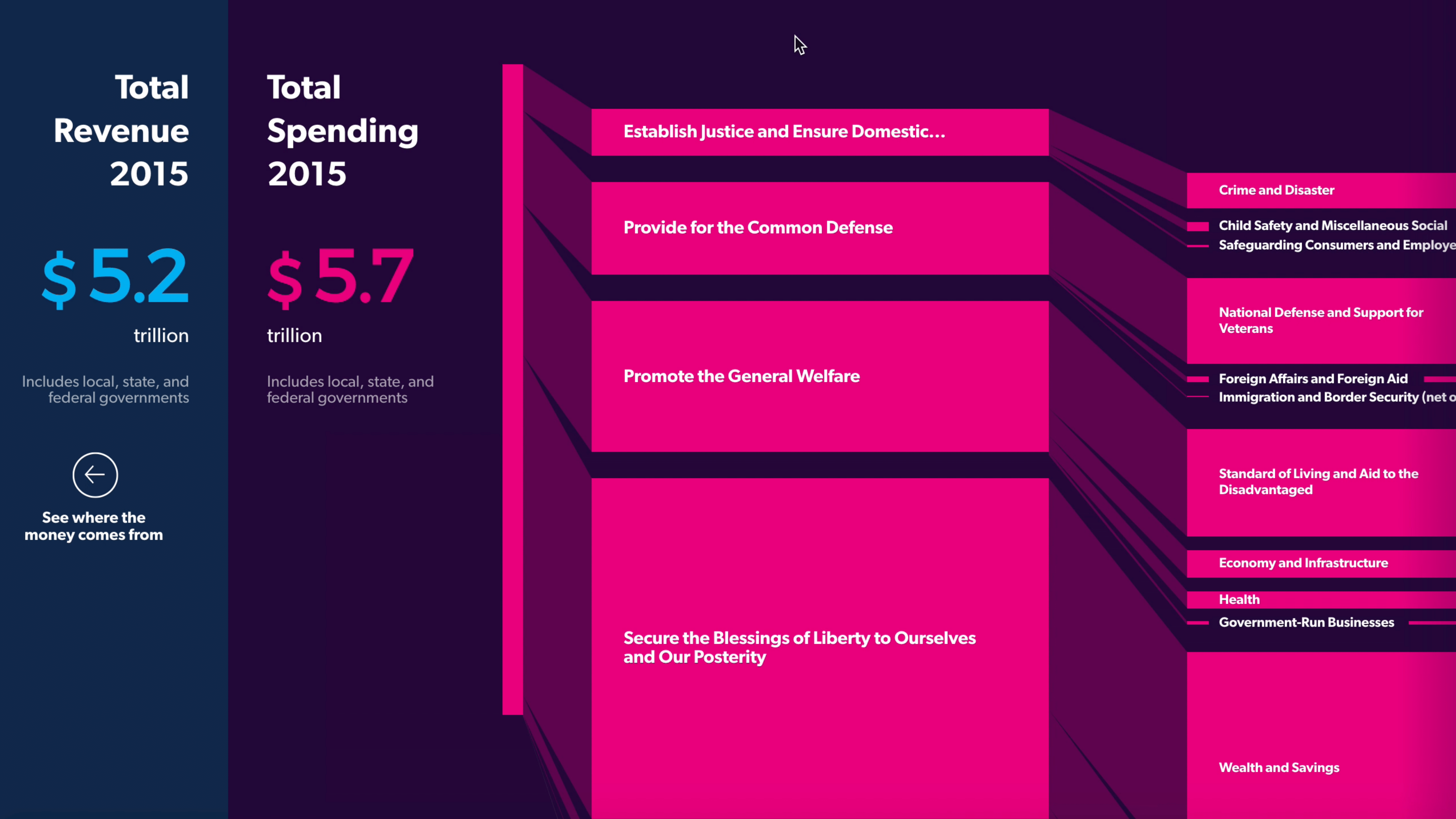
Government Revenue & Expenditures; USA Facts
So, maybe we’ll go back to the previous example when we talked about foreign aid. Remember we talked about three billion less, twelve billion more—well, we don’t know how much we’re spending in total in foreign aid. These are 2015 numbers right now. This is a visualization which breaks down the spending, the total spending of the United states across different areas such as defense, welfare, and sub-units of those, of those spending areas. So here we can see that in 2015 the United States spend $5.7 trillion. That is actually really a lot of dollars now, right?
And so when we go over here and we scroll over a little bit to the right, we can see how that spending is being broken down. I can see it in relative context to child safety, defense…and, down here, foreign aid. And we can see that in 2015, the United States spent $48.5 billion. That is really a lot of money as well. But if you look at it in relation to the total spending of the United States, it is only .86—making sure I have my numbers right here—.86%. And that allows me to much better quantify whether I think that the three billion of twelve billion more is bad, in context. Because I’m able to quantify it, to have context that I can now see.
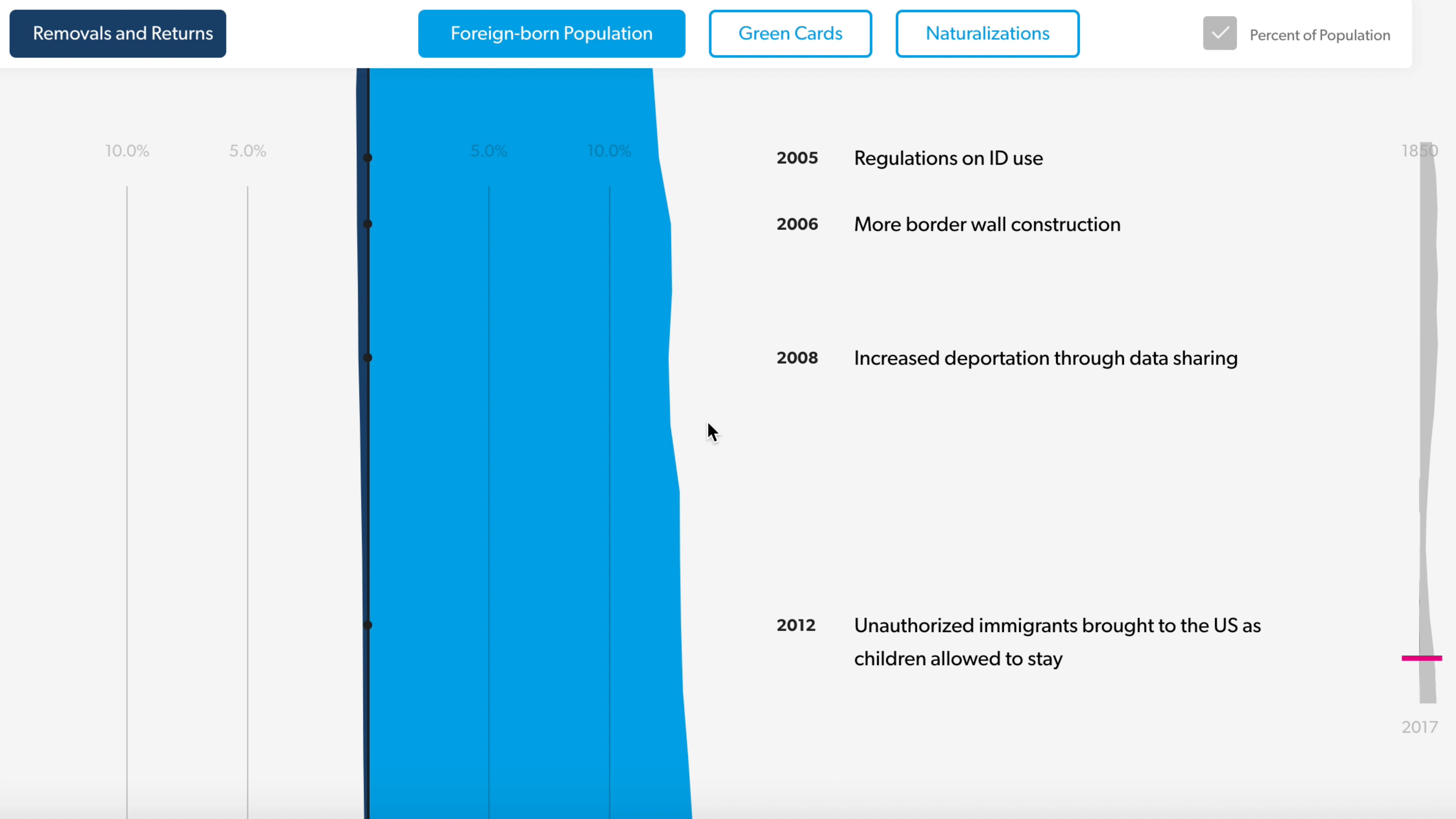
US Immigration Throughout History; USA Facts
Let’s take a look at another example of establishing context in a visualization. This one I’ll have to explain a little bit because it’s built for actually being looked at in a browser so we’ll adapt it for stage a little bit. It’s actually turned to the side because it’s meant for scrolling through. This visualization shows the number of people living in the United States that were not born in the United States—the foreign-born population. And it’s actually turned to its side because it’s much more immersive to scroll that way. And it allows you to see that number over time, in juxtaposition to historical events that might’ve happened that are important to consider.
Another important piece here is that we’re showing this as a percentage, not as an absolute number. That’s another way of quantitative context, is that you want to make sure that you look at it, as the number goes up and down that you’re also considering that population might’ve been going up and down total, which will actually like to assess the impact much better.
So we’re seeing here that in 2012 we had about 12% of people living in the United States that were not born here. And if you look at sort of the political climate, there are definitely people that say, “Oh yeah, there’s been an influx. There’s been a flood of immigrants. They’re all coming here. And it’s been a ton. And the previous administration—” etc., etc., etc.
So let’s take a look at what that looks like. Are we suddenly in a flood of immigration? Well, if we go back in time here a little bit, we can see that yeah, it’s been going up; it’s been up quite a bit. And now it goes to the 50s and the 60s, you can kind of see well, wait a minute there’s sort of a dip and now it’s going back up as we go back in time. And in 1910, we can see oh wait, it’s almost been 15% people in the United States that were not born here.
And the context here is also that I see that that was actually when a lot of people from Italy or Norway or Sweden came the United States. So we had a flood of immigrants back then as well. And that helps me to actually look at immigration in much more context where I understand that if you talk about a flood, let’s take a look at actually what flood looks like over time, so I can understand it better and see is it going up? Is that an unusual thing? Is that maybe something that happens in waves? And what are the potential factors that cause these waves? So that gives me a historical context of the number of when we say there are so many foreigners living in the United States. Like myself.

Let’s take a look at another example for context. This is a microsite that we designed for USA Facts last year for the midterm elections. We call this a Voter Center. What it does is you can see in the bottom right here, it shows you stances of candidates. These are things that candidates have said on specific issues. And the Voter Center breaks down these issues into things that are relevant to active citizens making a decision—in this case voting—such as the economy, healthcare, immigration, defense. Things that really are really talked about a lot in the political agenda.
And you can see the candidates’ stances. And what USA Facts is doing is it’s juxtaposing these stances with data—it’s not necessarily a fact-checking, because it’s not interpreting and it’s not biased, and not really trying to take a stance. But it says “if you listen to this politician, here’s the types of data that you should look at to establish contexts and understanding of when somebody says, in this case, that say the economy is doing bad. Or the economy is doing well. And it’s because of the administration, or not the administration. You need to look at a multitude of factors. You need to look at…for example a popular one for economy is GDP—it’s the strength of the economy.
But that’s really only one factor, so if we keep going, you can kind of see here, you can go down and see that there are other factors that you might want to consider. There’s like, how much private investment is there? What might be the gold price? How many businesses are opening? How many business are closing? What’s the employment looking like? What’s the median annual wave. Those are things that you would need to look at to consider if you want to have a clear image of how well the economy might be doing.
Now you may look at this and say, “Whoa. That’s kind of a little bit of a…you know, eye chart. It’s a little bit of a rough sort of slide here. There’s a lot of numbers here. You’re throwing up a wall of numbers.” At a design conference; it’s a pretty bold move.
I agree. There are a lot of numbers here. And I do think that there’s a lot of complexity here. You’re absolutely right. And you sort of might be rubbing your eyes a little bit.

And I’m actually gonna jump into something that Bill brought up a little bit early this morning, is we’ve done a great job I think as a discipline, as interaction designers, in taking technology and making it easy to use. We went from having these machines—and Bill had a picture of it as well—of these computers that would fill entire rooms or multiple rooms, and you needed a physics degree or a mathematics degree, and maybe even later a computer science degree, in order to operate them and actually derive value out of them.
And I want to give credit to interaction design to say we went from these these room-fill[ing] machines to something that fits in the palm of your hand and for example allows you to manage your mental health. We created We created these from these machines that worked for a very few and they could be used by very few people, to making them so easy to use that almost everyone was able to use them. And that’s a terrific accomplishment. So can sort of give ourselves a hand a little bit. This is great.
However. There are certain complexities that can’t be simplified as easy as just reducing them. We’ve done a great job at creating platforms and technologies that allow us to communicate with everybody, nearly everyone, on the planet in a matter of seconds very very easily.
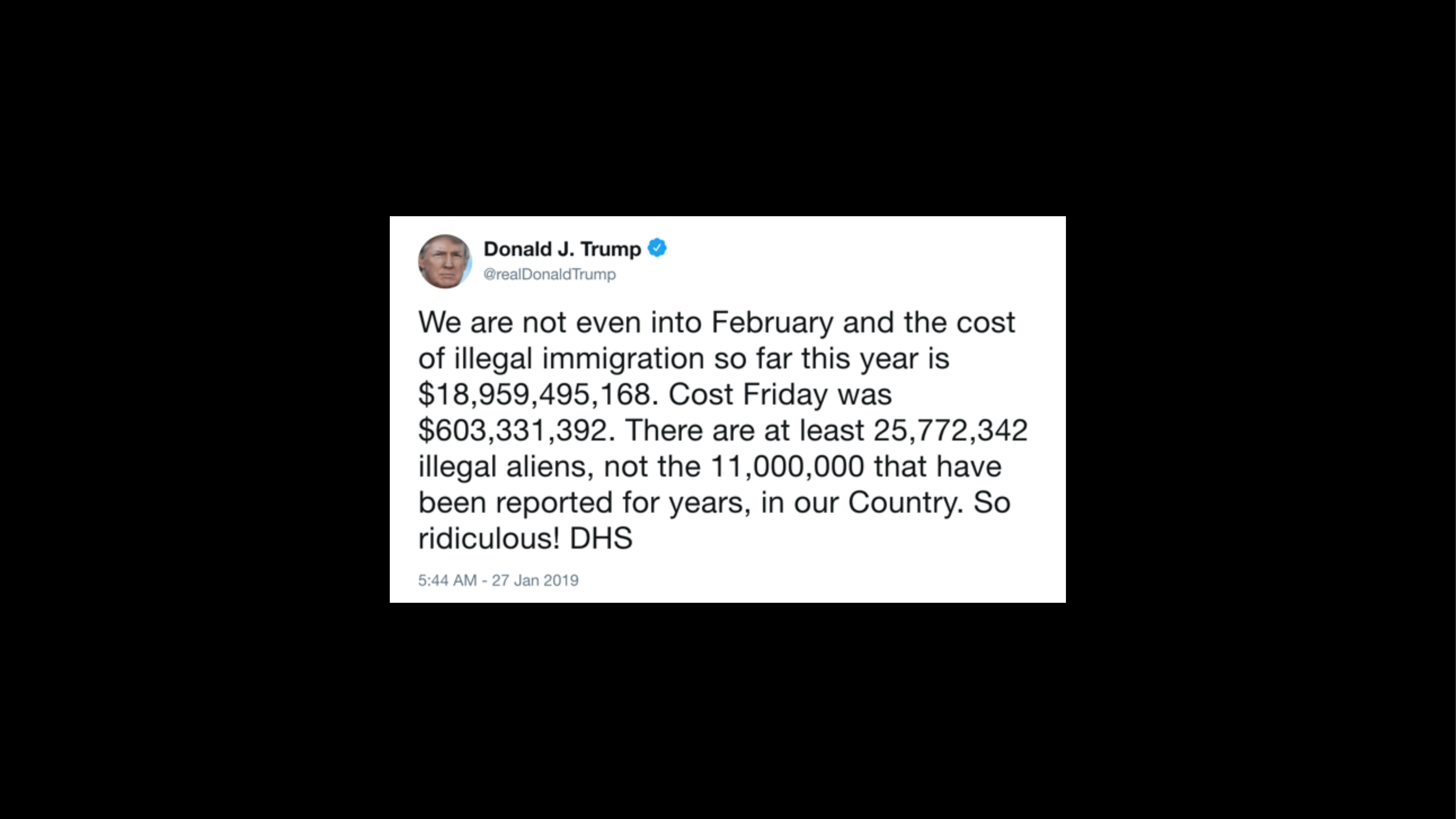
[Donald Trump, via Twitter]
But maybe some topics can not really be discussed with a sufficient amount of context that is necessary to fully understand them in 140 characters or slightly more. You need more context to understand them. They don’t fit. They are complicated topics. They are not easily simplified.

We’ve made technology so easy to use that in certain cases I can sit on my couch and get hours and hours of content that’s specifically tailored—that smart algorithms that are really great will feed me endless hours of content that will fit my taste and help me enjoy my life. And in this case I don’t even have to do anything to get more of it. Some of the greatest interaction design of all is sort of the interaction design that doesn’t require the user to do anything, right? That’s great. Doing nothing is great.
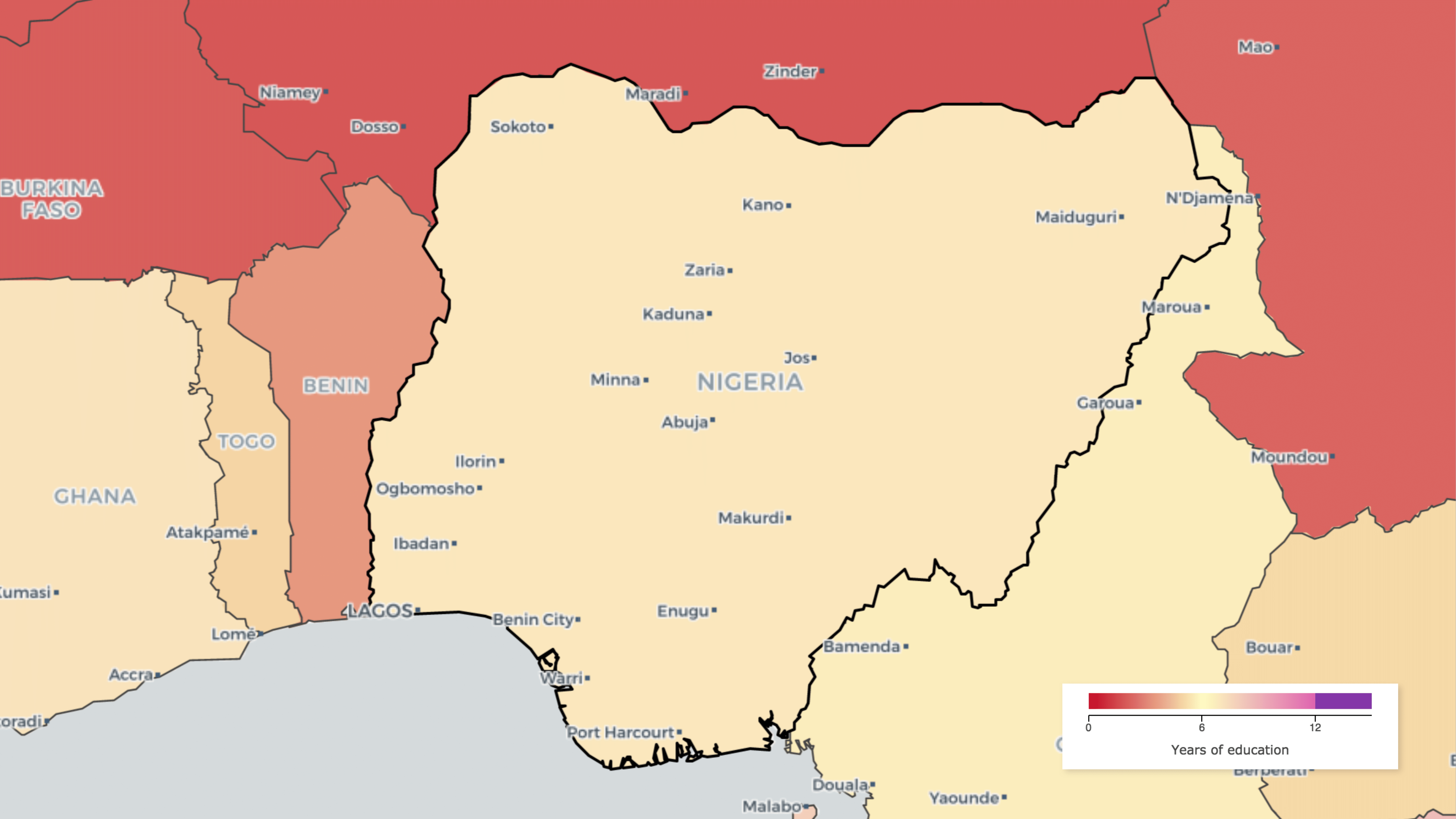
But in certain cases, doing something is actually really important. There are topics where we want people to take actions. We want people to take very very informed action. This map shows the educational attainment of women age 25 and older in some countries in Africa, in this case specifically Nigeria. So I look at this map and I can see alright, the educational attainment—this is the a number of years of education that women get on average is about seven. I may know that in other countries such as the United States, Germany, the UK, that number is about thirteen on average. So
I can see now like well you know, Nigeria…it’s not doing so great in that regard. Okay. But I don’t actually know what to do about the situation. If I’m somebody who’s invested in improving the situation I don’t really know where to start and say, “Well, I guess we’ve got to make education better.”
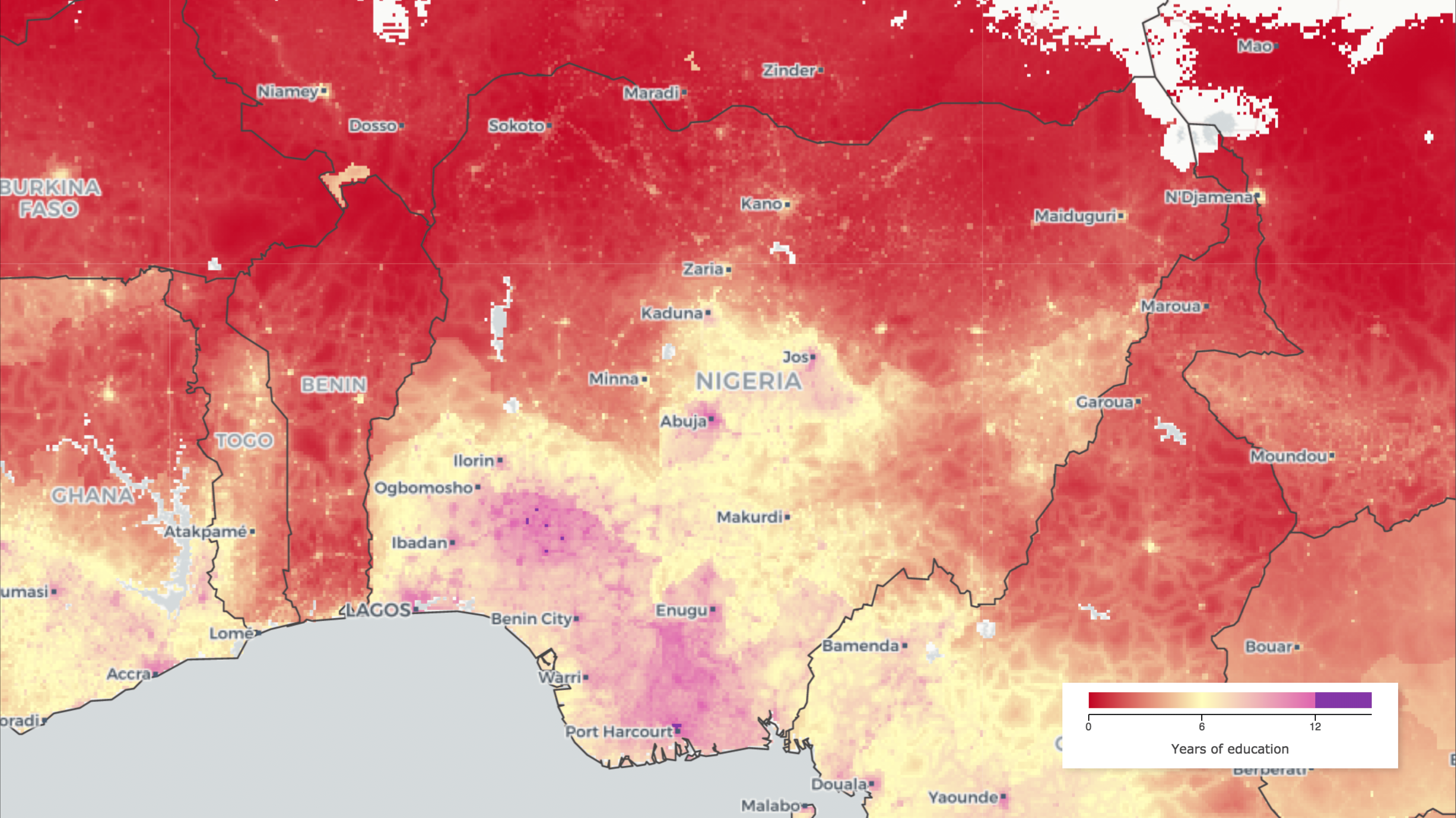
But if I add complexity to this realization, I can now see that the problem is actually a little bit more nuanced. This is a map created by the Institute for Health Metrics and Evaluation. It’s part of the University of Washington. And what they do is they map health data specifically but also other factors that factor into health, such as education, on a five by five-kilometer basis; these estimates do that.
And it adds a lot of complexity. If you look at this now I see wow, there’s a lot going on here now. But what I also see is hm, the education is actually much worse in the north and it’s in the south, and in the south there are actually pockets where it’s doing quite well. That’s interesting.
So if I look at this I can now say if I am involved in this and I want to invest in education in Nigeria, I might focus my efforts, my investments, to the north. And I may actually look at the south and see what’s going well there. And what are the other factors that actually impact the situation being the way it is in the north versus the south. So the complexity here actually inspires action. Whereas before, the simplification sort of blankets the problem where I don’t really know where to start to address it.
And so for us as interaction designers, as we’re looking at problems, as we’re being tasked with communicating information, we should look at when somebody’s telling you, “Well, we need to say that the quantity of Blah ix ‘X,’ we should strive to say we should help users, help our audience understand the quantitative of nature of X. How much is a lot of X, how much is a little X? We should also look at Understanding of well historically has X been a lot and has X been a little? We need the historical context. And we also should look at all the factors that matter around X. What’s the relational context that X exists in? And for those people in the audience that’re sort of really big on data, likely more than me because I’m just a designer, I’m not meaning that these mean correlated factors. That doesn’t mean that there’s a statistical significance of saying “well, if you look at the X then Y is always going up or down…” These are just factors that matter to what might drive X, what X may drive in regard… Those are the things to look at. Help users quantify the numbers, help uses see the numbers in historical context, and also show them all the factors that exist that I should understand in order to form my opinion about what we should do.

And I think as interaction designers, we’ve focused so much on making things easy. I think we should use the tools… Surya talked about our toolboxes this morning. We should use our toolbox to make complexity understandable. We need to use the tools at our disposal to build data literacy by showing the context that data exists in. Because with that data, and with context around the data, we’ll be able to build understanding—we’ll be able to understand complex issues, and I think we should all work together, strive, to building understanding for everyone around us. No matter what side of the issue they stand on, we need to talk about the same data. We need to talk about the same understanding that we have of the data. We need to all have the same context about the data.
As interaction designers we’re really empowered to make it easy. We’ve managed to harness the complexity of technology and make it available to anyone. Let’s all harness the power of numbers for us to drive better decisionmaking, and making those numbers easier to understand so that we can inspire the right action that helps us live in a better world that is less biased, more knowledgeable, and yields outcomes for all. Thank you.