Marie Jasmin: Hi. So yes, my name is Marie. I’m a UI designer in video games. And today I’d like to address the issue of time well spent, in games and beyond, with a very small yet powerful idea.
So, imagine a person emerging from a long play session in her living room. She turns off the screen and maybe the room has gone dark, and she’s wondering how three hours have gone by? Often these days we hear people describe their screen time as a vortex. My friend told me the other day, “I fell in a YouTube hole,” as an excuse.
But, games aren’t meant to be productive. How are we to measure time well spent in a product with an entertainment component? That’s a very subjective question. So, here’s a very personal answer.
If our players emerge from an experience inspired to create their own story—to draw, to write, to dress up maybe. Or just to talk about it with friends. To share. If our players feel enriched, transformed by an experience. If they form memories, fond memories, then yes I think the time invested has worth.
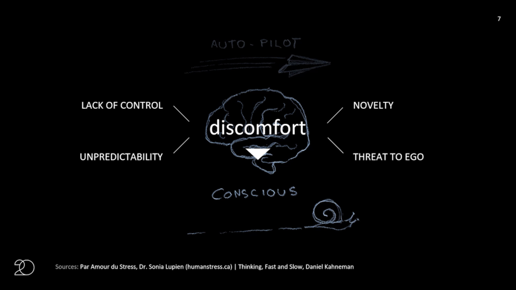
Now, for an experience to be memorable let alone transformative, the brain—the human brain—has to be pushed out of default auto-pilot mode into conscious thought. And that push necessarily involves some level of discomfort. Now for the sake of presentation, here’s my definition of it. Discomfort has four major forms: lack of control, novelty, unpredictability, or threat to the ego. But what it all boils down to is that the brain needs to leave its comfort zone for an experience to be memorable. Small moments of discomfort. Not trauma, but small moments of discomfort sprinkled like spice throughout an experience are the birthplace of good stories and fond memories.
Your everyday designer knows a lot about discomfort because it is our job to prevent it from ever happening. And this includes interface designers. We are here to make the world a little more fluid, a little more usable, a little more accessible. The craft of design is about removing friction.
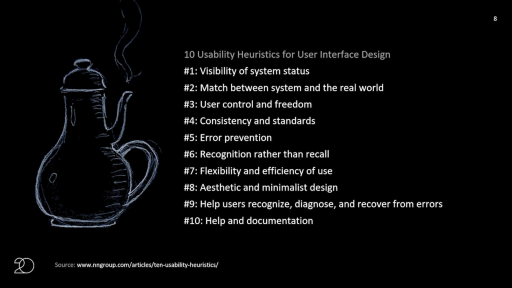
But think about it: it follows that if we know the heuristics of usability, we know how to violate our own rules. We’re discomfort experts. And I have for you today three examples from interface design and video games where discomfort was added on purpose for memorable impact.
So my first example is also the first game project I ever worked on. It’s pretty old. Assassin’s Creed 2. So for this game, the interface design team was tasked with making the player feel like they are interacting with a machine that is cutting-edge future technology that lets you relive the memories of your ancestors. So basically we were told that for narrative reasons our players needed to feel like grandpa using a remote, a mix of curiosity and insecurity.
So we violated the rule to match the system and the real world by purposefully not using familiar terms in our labeling system. So the the main menu was called the animus, and the replay menu was called the DNA menu. There is no match in the real world whatsoever for a DNA menu. We knew that our players would just need to click all the buttons to find out what they did.
The animus became undoubtedly memorable if not quite usable. To my bewilderment actually, it still comes up in best game UI lists over ten years after the game’s release, which in game industry time is an eternity.
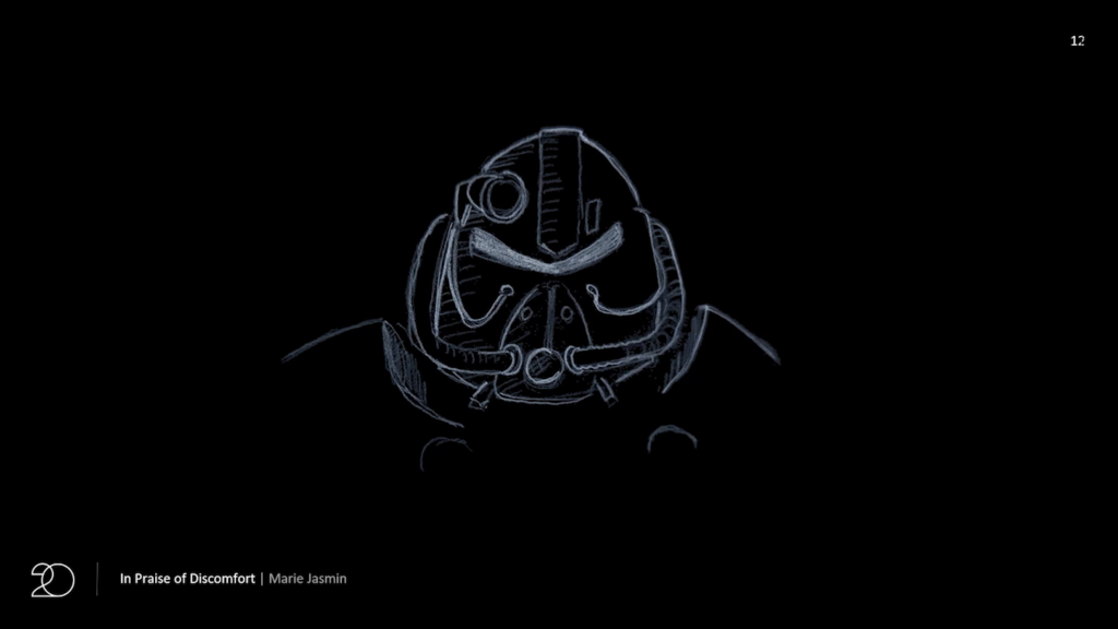
Here’s another example, a pretty bold one actually. This is the power armor that players will encounter at some points in the Fallout franchise. And as its name indicates, it provides our players with great protection. Obviously, there are caveats. And here interestingly, one of the major costs of using the armor for the players is a cost in usability.
So upon entering the armor, the interface elements that the player is familiar with, which are in green in this screen, are completely reshuffled and the same information is suddenly presented in a different way, forcing the player to expend conscious mental effort to relearn a new interface in exchange for a gameplay advantage.
This element of discomfort makes the choice to use the power armor, or not, an interesting choice. In fact games often become iconic for their ability to offer memorable choices that become the basis for people to create their own stories.
My last example is pulled from the recent cultural phenomenon Untitled Goose Game. Here, our player is a goose. They walk a bit clumsily. They honk. And they can also bend their necks. The neck-bending control is mapped to the left trigger. Meaning that the fingers of each hand need to move independently to control different parts of the goose. This control scheme is usually reserved for a bit more advanced players as it can cause struggle in casual players or children.
However, in Untitled Goose Game the struggle itself is fun; it’s part of feeling like a goose. So here efficiency of use is being sacrificed on the altar of game feel. It’s very well done. It does feel like a goose.
I want to take also this opportunity to state that any intentional, purposeful sacrifice in usability can and should be tested in the lab. Like, it’s UX as usual. It’s just an extra set of constraints for which success criteria can be established, measured, and weighed against other goals.
I can’t help but wonder how all this could apply to interaction design beyond video games. Should we all be keeping a closer watch on the “memorable” metric? Can we measure stories created and shared about an experience? Can we redefine engagement to include emotional involvement? Creative inspiration? What should engagement become?
Design is a garden of storytelling. If we fertilize our users with just enough discomfort, their stories will take root and grow.
Further Reference
Interaction 20 web site
