Actually, the honor was all mine to be introduced by Massimo who’s a god, a legend already, and to be here with you. There’s nothing better than being at a conference where I don’t know hardly anybody. It’s really a big pleasure. And I’m here today to talk to you about food and design. About what’s cooking in design, and what’s designing in food. But most of all I’m here to recommend to you never to let designers decide what you will eat, because this is what you’re going to get:
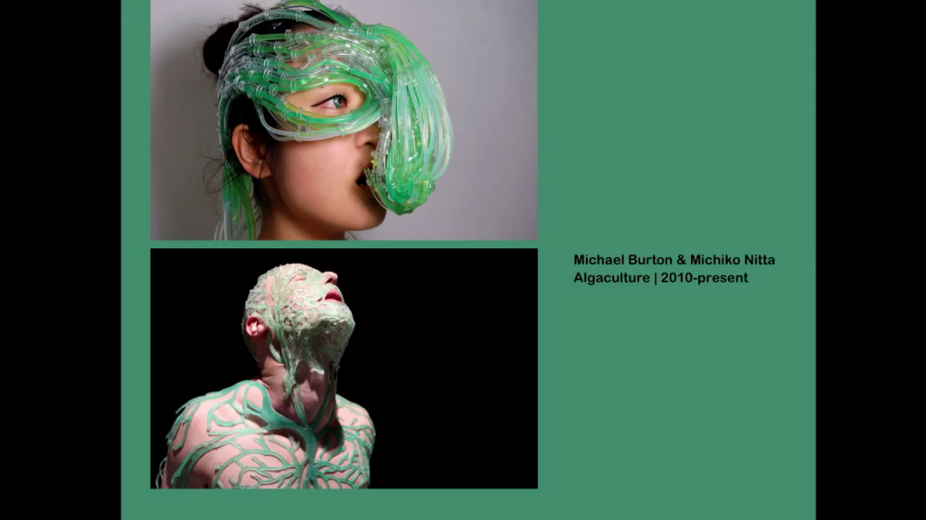
Michael Burton & Michiko Nitta, Algaculture
Designers lately are obsessed with how we will eat in the future. They’re so concerned about the shortage of food in the world that they’re envisioning so much of what will happen, and so much of it is catastrophic in their minds. You all think, or maybe not all of you, but many many think that design is cute chairs and graphics and maybe fonts. But so many designers, instead are thinking of scenarios for the future, thinking of the consequences of the choices that we make today. And in this case Michael Burton and Michiko Nitta have decided in the future we will have to rely on algae. And of course we already are, but seaweed will be the way to go. And they’re thinking of these kind of science fiction scenarios that will help us understand and survive the future.
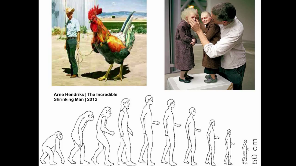
Arne Hendriks, The Incredible Shrinking Man
Or even worse. Arne Hendriks, a Dutch designer, is suggesting we shrink to 2⁄3 of our current size in order to really cope with how much we’re consuming of the world’s resources. So, it really is a set of party poopers is that we’re dealing with, in terms of design. And so much so that they’re thinking of how we can change our physiology, and even start just gestating endangered species.
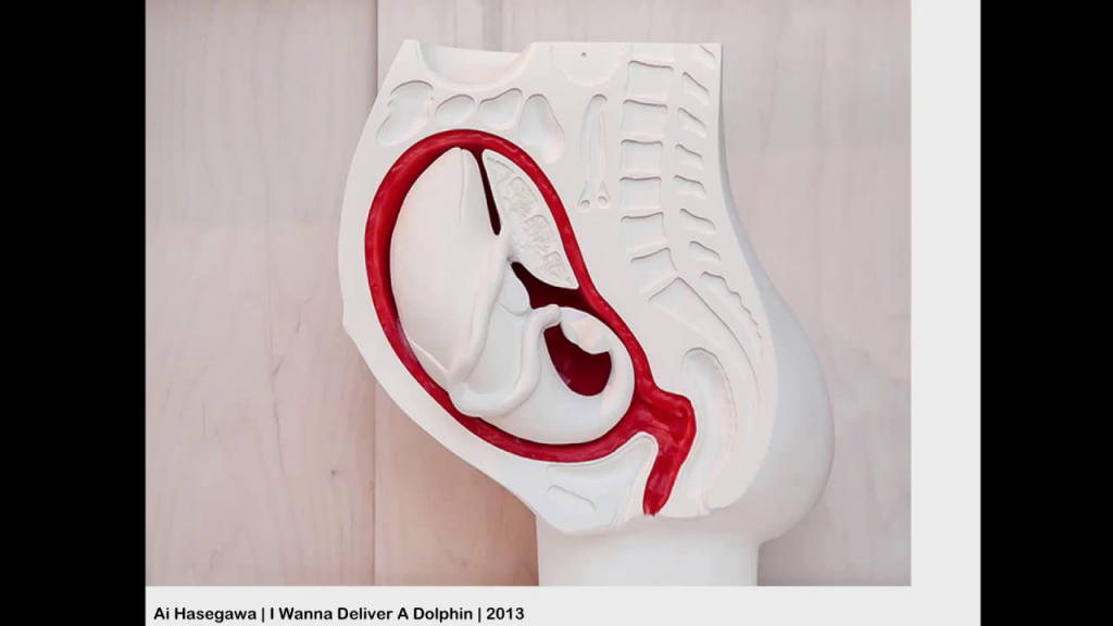
Ai Hasegawa, I Wanna Deliver a Dolphin…
This is Ai Hasegawa, who thinks of how we could actually gestate a dolphin as opposed to babies. As opposed to human babies, we should start thinking of species that are endangered right now.
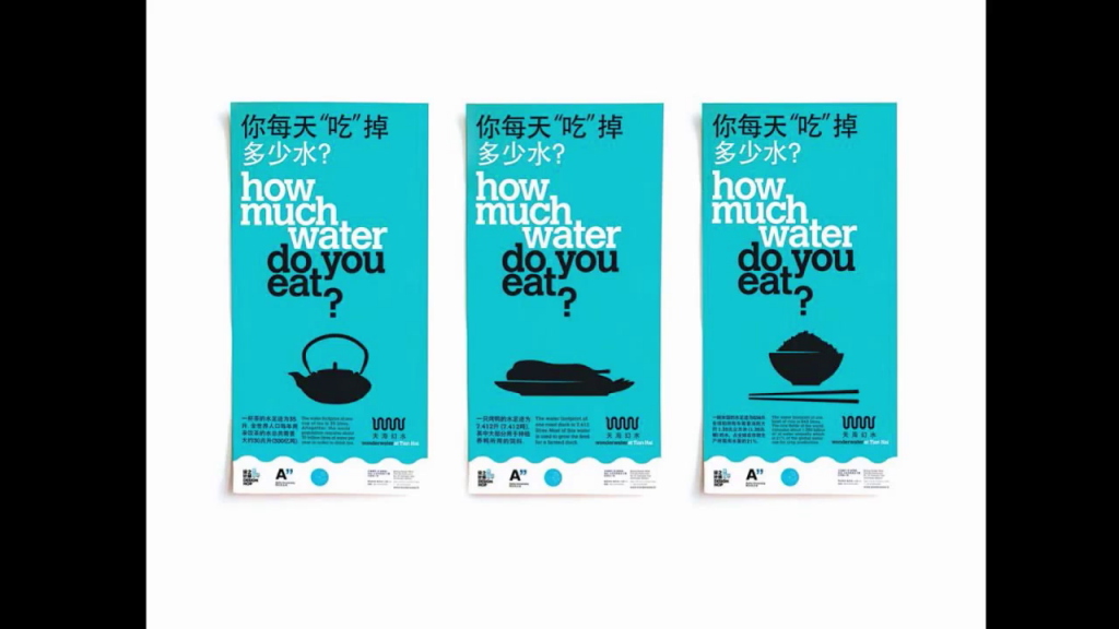
Wonderwater Café menu designs
Even worse, sometimes designers get so far as to reminding us before we even start eating of how much we have consumed already by choosing those pieces of the menu.
So, I think designers really need you, because if, as Julian [Baggini] reminded us before, there are so many different scholars and chefs in the past that have talked about the difference between feeding and actually enjoying, and about eating and instead just getting nourishment, designers need to have a little bit of levity and delight injected in what they do, and to stop thinking of scenarios like this.
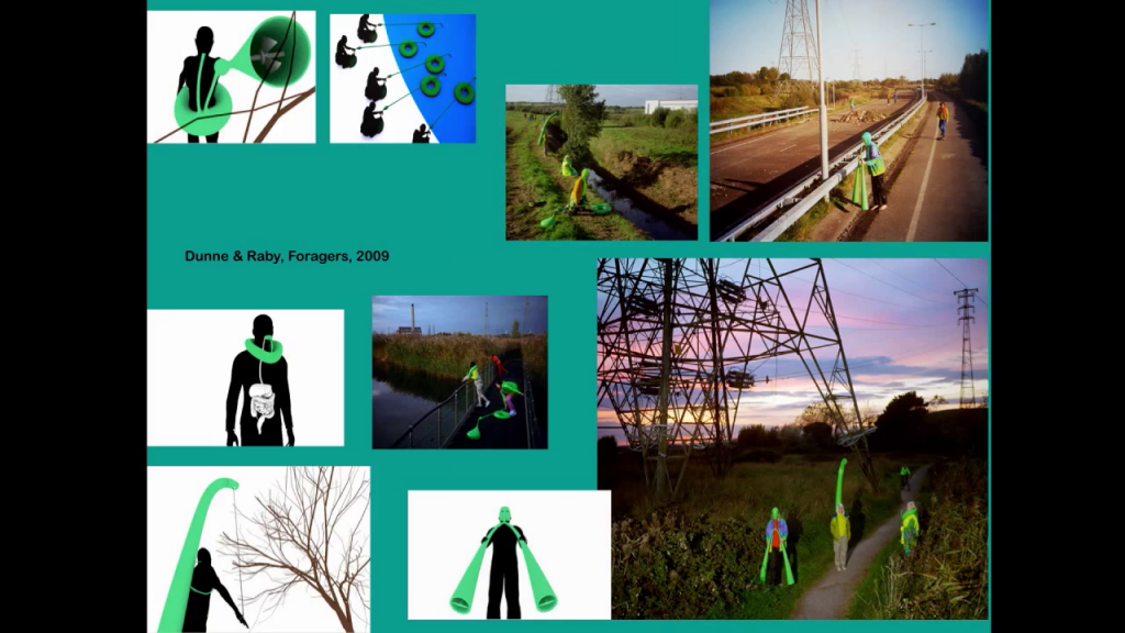
Dunne & Raby, Foragers
These are Dunne & Raby, the great designers from London that are the father and mother of critical design. They’re actually thinking of outsourced gastrointestinal systems that in the future will enable us to go back to digesting things we stopped digesting millennia ago, such as, once again, algae, or roots, or leaves from trees. A pretty sad scenario for the future were thinking of. But I don’t know how many of you are involved in the understanding of new theories such as the theory of the sixth extinction, as Elizabeth Kolbert calls it in her recent book [The Sixth Extinction: An Unnatural History], or the theory of the Anthropocene, that thinks of the fact that humans are really consuming too many resources and therefore are on the way to extinction.
But before we get to the [?] of extinction, we’re going to enjoy it as much as we can. And we’re going to try to replenish as many of the resources as we can. But when designers think of food, even though they are so sad, they also try to get a lot of understanding and lessons from the way food is cooked. And more and more, designers are trying to cook their objects. They’re trying to do alchemy and chemical reactions in what they do. You see it in the way so many objects are designed today. I’m sure that all of you have heard of 3D printing, which means changing a slurry of plastics, and hardening it through heat or light, which is not that different from what we do when we cook, for instance pasta or many other ingredients.
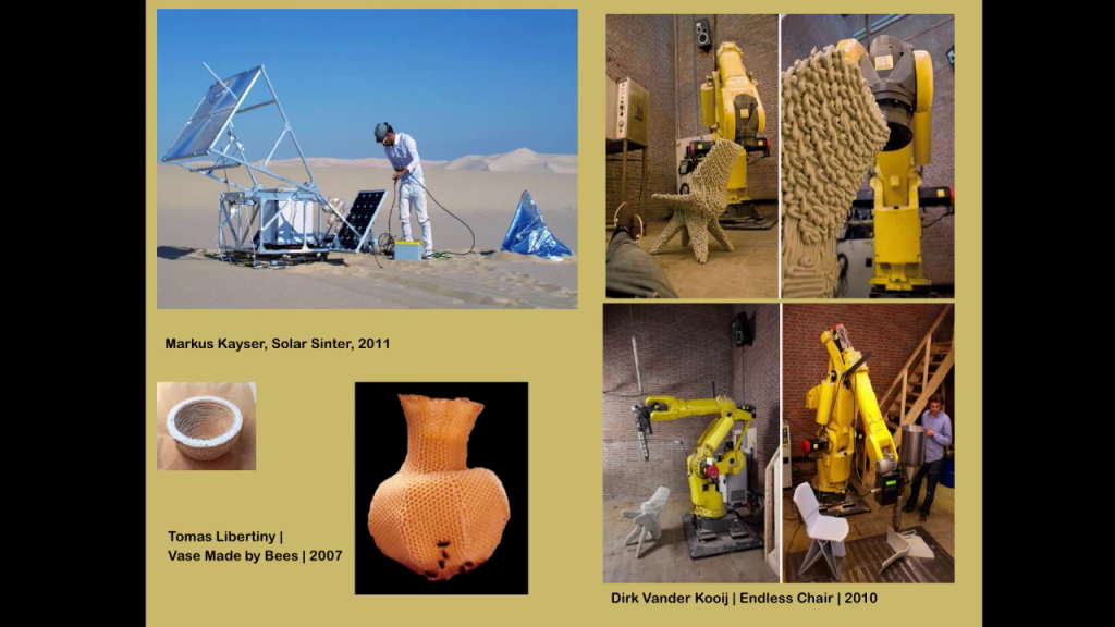
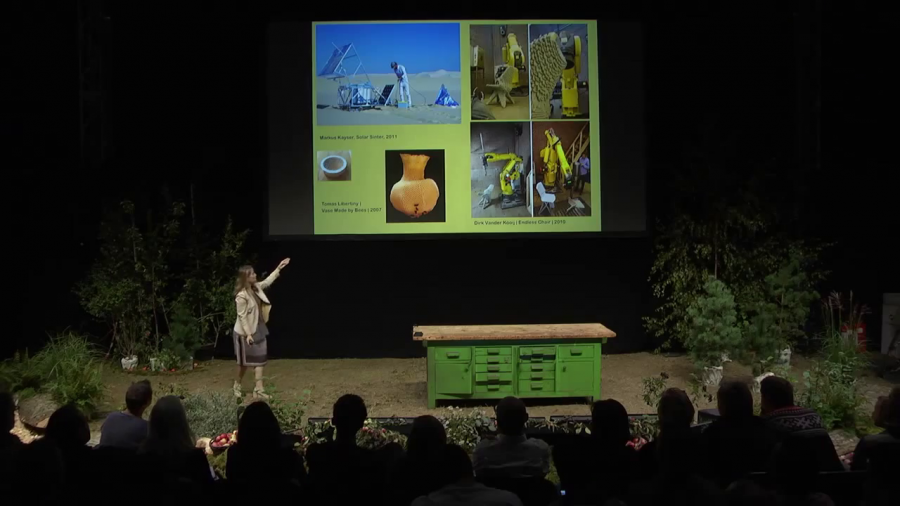
Markus Kayser, SolarSinter; Tomáš Libertíny, The Honeycomb Vase, 2007;
Dirk Vander Kooij, Endless Chair, 2010
And you can tell how it’s usually done with resins, but some other designers like Markus Kayser tried to do it instead of using resin using sand, and the silica that is in sand that can become glass. So he uses sand in the Sahara Desert and he concentrates sunbeams using the—you know, we used it as children, the Fresnel lens to burn the leaves. And by doing so he makes beautiful vessels that look at the same time centuries old and done yesterday, because they report the scanning of 3D printing, but they are made of sand and glass.
Or Tomáš Libertíny, that takes forty-five thousand bees and sets them on a scaffold made of cardboard so that they can make beautiful vases such as this.
This idea of growing, this idea of making using nature, of trying to understand new ways in which things can be generated by the rules that are intrinsic to them (which is what we do when we take natural ingredients and we cook) is happening more and more also because designers and scientists are coming together.
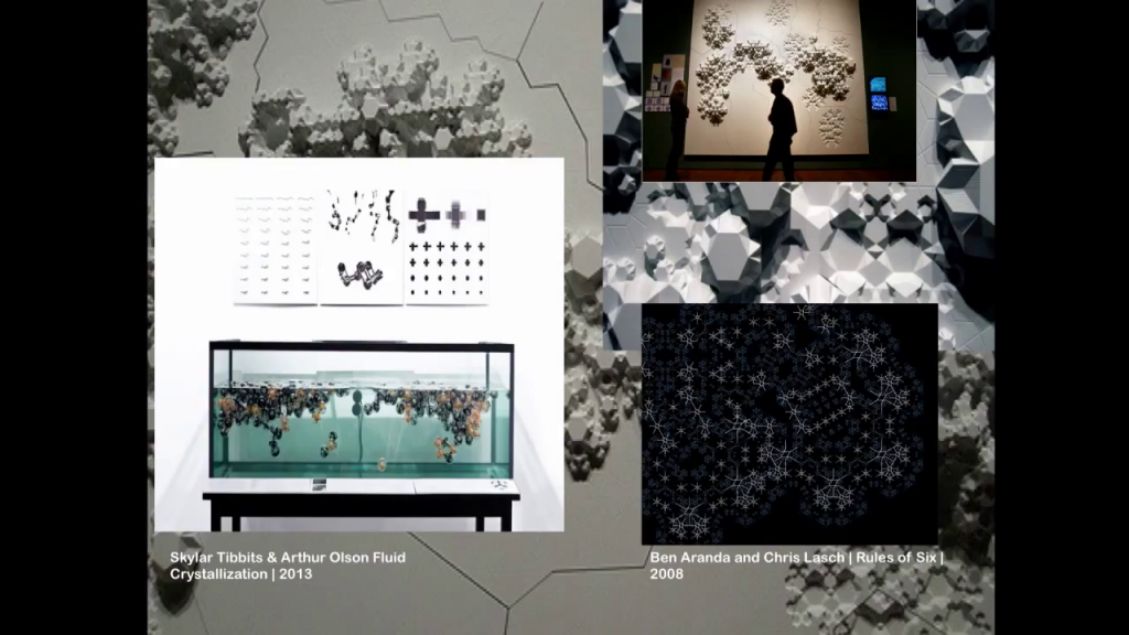
Skylar Tibbits & Arthur Olson, Fluid Crystallization, 2013;
Aranda\Lasch, Rules of Six, 2008
You see here a set of experiments that are from nanophysicists working with architects. Or chemists and biologists working with designers. More and more it’s about crystallizing new forms. More and more it’s about learning from natural structures, crystalline structures, how buildings, objects, our environment, even infrastructure, can generate itself in a way that is at the same time natural and also new.
Nature does it best. We all know it. You know, when we look for the ingredients to make our best dishes, we look for something that already is the best in nature. And then we try to understand how to optimize those processes so they can generate something that is even more delightful.
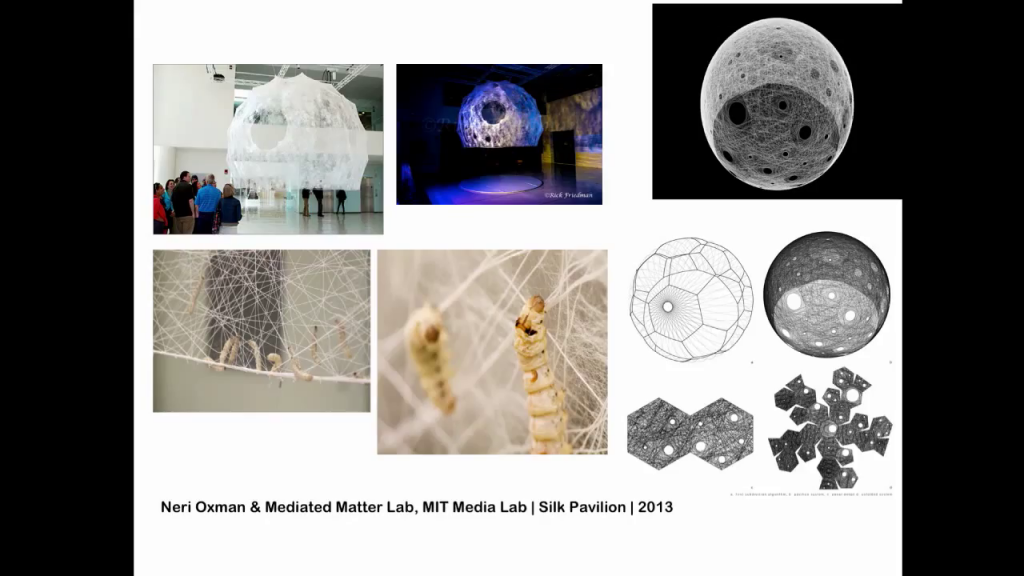
Neri Oxman & Mediated Matter Lab, MIT Media Lab, Silk Pavilion, 2013
And nature has done it best for millennia. The work of Neri Oxman, who is a great engineer and architect from MIT, is particularly important because she’s trying to incorporate the way nature makes things into architecture. In this case, you see this pavilion that she built at the MIT Media Lab in Cambridge Massachusetts. The construction workers are actually silkworms. Silkworms that are applied to a structure that is set to light and temperature conditions that are optimal for the silkworms to build exactly that pavilion. It’s woven, it’s made by nature, it’s biodegradable, it’s a perfect structure that is also perfect for human beings.
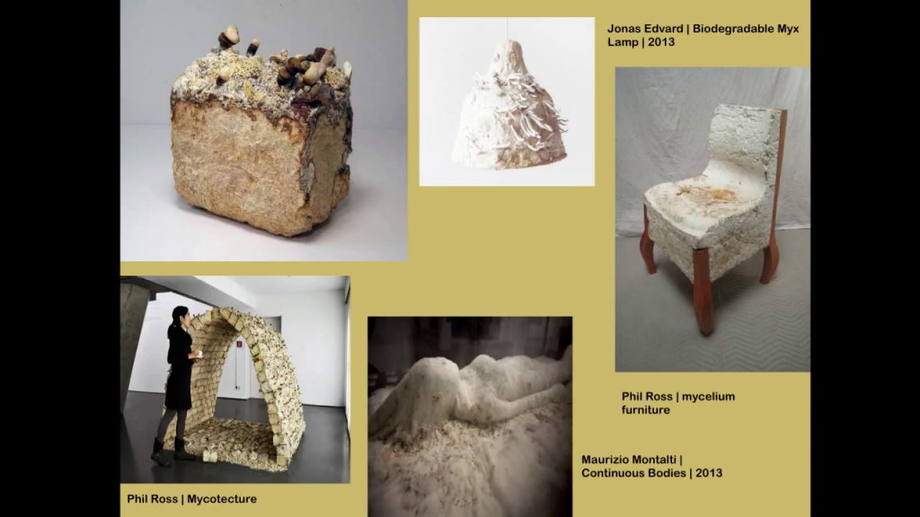
Jonas Edvard, Biodegradable MYX; Philip Ross, Mycelium Furniture, Mycotecture;
Maurizio Montalti, Continuous Bodies — Bodies of Change, 2013
And so on and so forth, designers try to really really cook. Mushrooms seem to be one of the biggest obsessions together with silkworms for so many designers. And in particular mushroom mycelium, which is what mushrooms secrete that helps them attach themselves to trunks of trees.
The mycelium of mushrooms is used by so many architects and designers to look for a new way to bind biobricks to make structures, to actually make it so that a biodegradable binding element can be added to buildings. And to chairs, and to lamps, and in this case this designer is actually thinking of a shroud in which dead corpses can be inserted so that they decompose more naturally. Fun, huh? I’m talking about really cheerful stuff today.
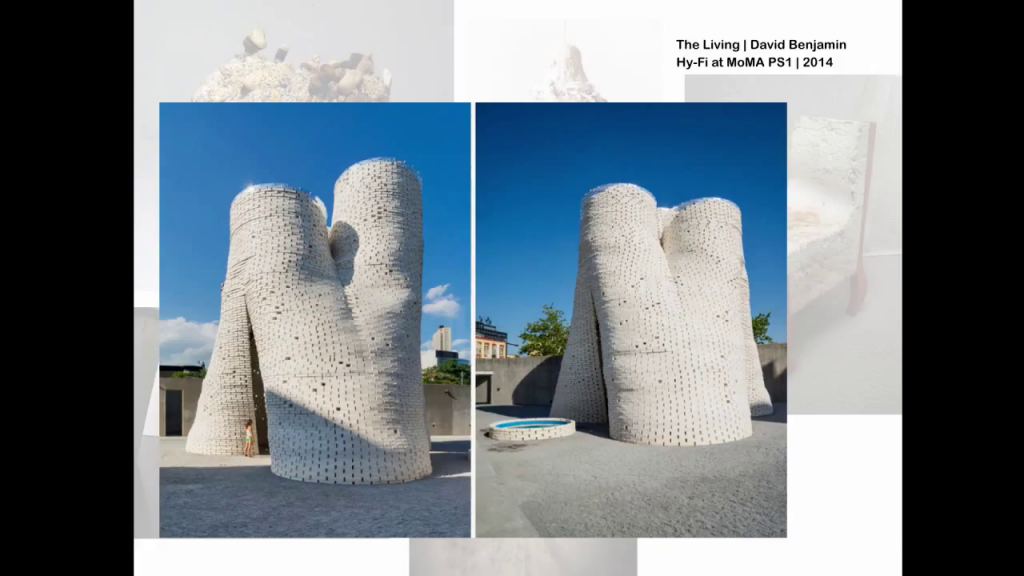
The Living/David Benjamin, Hy-Fi, 2014
But there is cheerful stuff to be done. Because you see here one of the first examples of a structure that is built with bricks made of corn stalks that are kept together with mushroom mycelium. And actually we have somebody in the audience, Audrey, that has worked on this. She has worked on this beautiful project that is currently at MoMA PS1 in Long Island City.
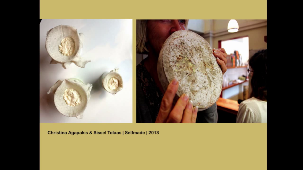
Christina Agapakis and Sissel Tolaas, Selfmade
So, really it’s happening. Designers are cooking. They’re also cooking their own body elements. You see here the work of Christina Agapakis and Sissel Tolaas. Sissel in particular is a wonderful scent artist and designer, and I am sure that so many of you would love to work with her. She’s based in Berlin. She uses science and she uses design to distill new types of scent. And in this case, Christina and Sissel worked together to make—sorry to tell you—human cheese. Which is cheese that is harvested using in part human milk, and bacteria from armpits. So you know, it’s about self-sufficiency for the future. In fact it’s called “Selfmade.” So this kind of alchemy, it’s happening a lot, and designers are actually talking about it.
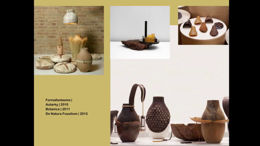
Formafantasma: Autarky, 2010; Botanica, 2011, De Natura Fossilium, 2013
This is the work of two fabulous Italian designers that work in the Netherlands. One is from Sicily, one is from Venetto. They’re called Formafantasma together. And they have been doing so much of what you have also been doing. Looking to the roots of our culture, looking to the way argilla and clay come together. Or looking for these natural resins that make up straws and honey and beeswax, and trying to teach other designers how to cook them, literally. There’s a department store in Milan called la Rinascente where they did this performance in which they had big pots, and they were cooking pretty much like here we saw noodles be made. They were making resin there and stirring it, something that could never happen in United States. There were fumes all over the place and people throwing boiling hot resin [at each other]. It was was pretty fun.
So, designers are cooking, too. But what I would like to really talk about is what Massimo was actually hinting at. Every day, everyday foods, basic foods the come from material culture, from different parts of the world, foods that no designer and no new architect could ever improvise. And I would like to link them to an idea of design.

You see here the “at” sign. This is something that we acquired in the collection of MoMA two years ago, as an example of design. Why? Because it really answers all the questions that you ask of a great design. It is old. It is ancient. The first time it was encountered was actually in medieval manuscripts. The monks used it to abbreviate the Latin preposition “ad,” which is in relationship with in direction. And it’s remained throughout the centuries, used by merchants, to think of “at the rate of,” quantity versus price, used by accountants. It was even in the typewriters in the United States at the end of the 19th century.
And it remained throughout history. Until in 1971, an electronic engineer, Ray Tomlinson, was working for a contractor for the government of the United States. They were designing the Internet. And in particular he was in charge of the email program. And he needed something to shrink the line of programming code that connected the name of the person to the name of the computer. It was the name, and then always the same command.
He looked at the keyboard of this teletype that he was using. He saw this beautiful little thing, did some research, understood that it meant exactly what he needed—connection—adopted it, and the first email that he sent was about this sign.
So, tradition and modernity, old and new, simplicity, economy, and also beauty. Because if you think about it, beauty is in this piece, is in this object. And beauty is not something that costs more than ugliness. Beauty is a human right that is available to everybody, and that’s what we seek in design objects.
Objects like this need to be isolated from their context for people to notice their beauty. And since my job is to explain to as many people as possible the power of design, and I try to do it with everything. With the at sign, with the Post-it note, with any simple things, the paper clip. Why not food?
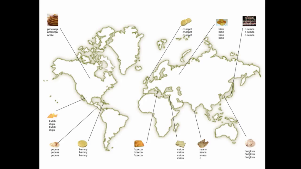
So I started thinking years ago of a book called Design Bites that would not be a recipe book but a design book that would talk about food from all over the world. And the food would be divided in chapters that were designed chapters. So you would have a chapter with structural breads from all over the world. Chapters about focaccia and matzo and naan and bammy and tortilla. Everything that is flat and made from a mixture of a cereal of sorts with some water, maybe some leavening, and then flat-cooked, or no leavening at all.
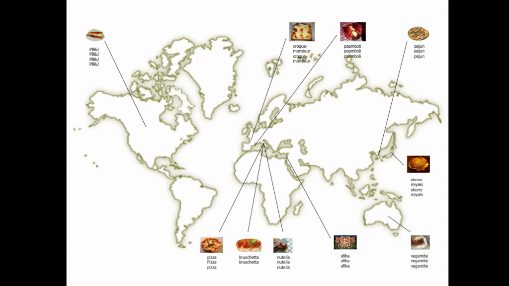
And that would then become structural and support for something else. So you see pizza and Nutella, Vegemite; whatever goes on the structural bread.
So this idea of really thinking of the world as a set of designed material cultures that generate foods that nobody else could generate, that really are picked up generation after generation and transformed and metabolized into something new.
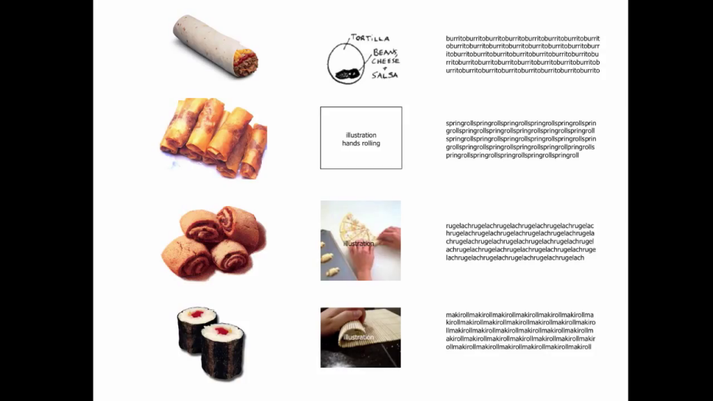
A chapter would be on rolls. So you would have of course tortilla rolls, and all of these different maki rolls, and rugelach. And even though the ingredients matter so much and the quality matters much, it’s more the way things are made that would actually be meaningful to these chapters.
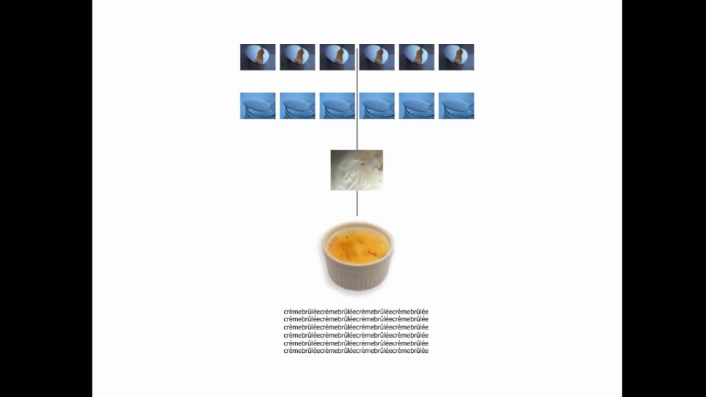
We would get to this kind of concoction. New materials such as a crème brûlée or such as pudding. Putting together certain very simple ingredients that create a new consistency that creates a new way of eating the ingredients that by themselves would be so much less than the sum of their parts.
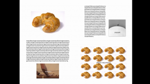
Of course that would be a chapter on sushi, and on all these layered ingredients. And a chapter on iconic shapes. From the croissant to the bagel, and all their background.
If you think about it, it’s really about how things are made. It’s about…not really you. You would be giving wisdom to a wider audience for them to understand what design is about.
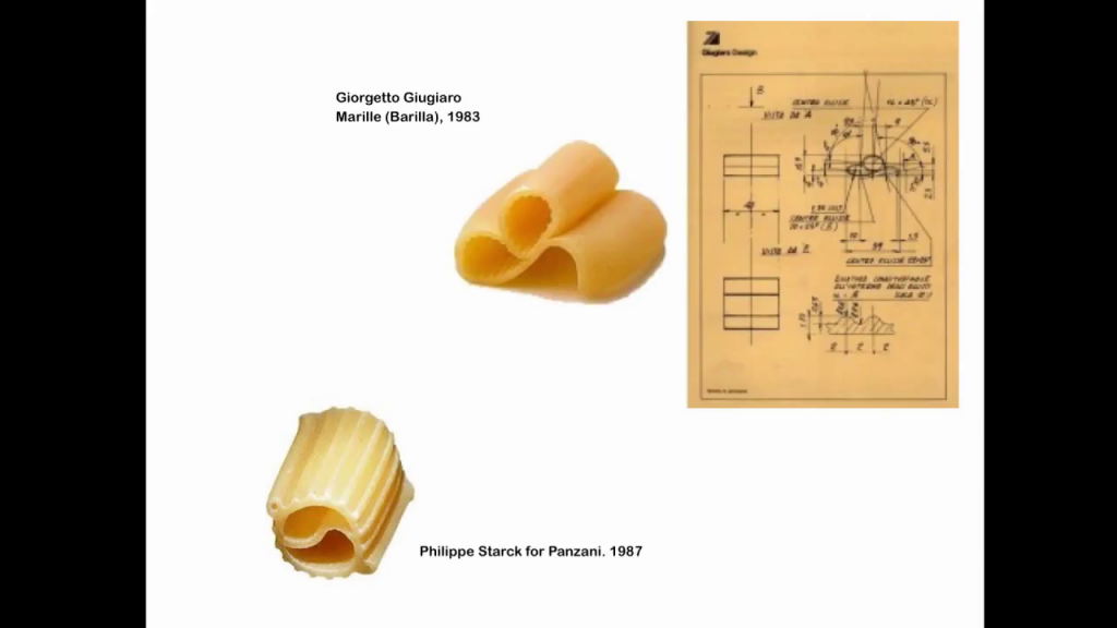
Giorgetto Giugiario, Marille; Philippe Starck for Panzani
Pasta, indeed, would deserve its own chapter. And it would deserve its own chapter also because of the different relationships between different parts of the world. Also, it’s important to note that pasta cannot really be touched by designers. I’m showing to you here two examples of colossal failures from the 1980s. And understand that the 1980s were extremely problematic for design. I’m sure they were also for food, if I remember correctly, as an amateur eater.
But for design it was a real weird moment of celebrity designers that thought they could design anything, like Giorgetto Giugiaro, who always designed cars. All of a sudden he starts designing pasta for Barilla, Marille. It was actually put in production. It was in the stores. And nobody bought it. Why? Hello. Ask any Italian woman (or man) and she would have told you that some parts would overcook and some others would undercook. The overcooked part would be floppy like that [flaps hand at the wrist] while the doubled-up part would be completely undercooked.
The same with [Philippe Starck]. This is even more absurd, this kind of strange peace sign, yin and yang sign with two side canules. That also did not work at all. It was a complete flop. So in some cases, these basic units of food cannot be touched by anybody but generations after generations.
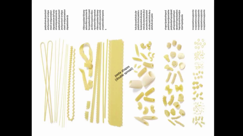
And then pasta in itself, because of how diverse it is to accept different kinds of sauces and to accept different kinds of preparation, would be for a wide audience a wonderful example of how design is universal.
We’re used to dividing design, art, food, movies, and keeping everything separate. But if you think about it, the act of taking materials that are available and elaborating them together in order to achieve something that—as we said before—is more than the sum of its parts, is something that we all do. So, what is the difference between art and design? We were discussing it before with Massimo. Art is completely free from any bounds. Artists can choose whether to be responsible towards other human beings or not.
Design, much like the preparation of food to a certain extent, has to respond to certain expectations. You expect to not be poisoned, first of all. Maybe you expect to be delighted and surprised. You expect to have a relationship with the food that is prepared for you of affinity, if anything else. It’s part of your system.
The same for design. Function used to be something really pragmatic. Today, function sometimes is emotion, delight, and surprise. But it’s still something that people expect from design. So there are different degrees of design, just like there are different degrees of food preparation, but quality is something that we expect all the time. And so is the presence of some sort of material culture or local culture.
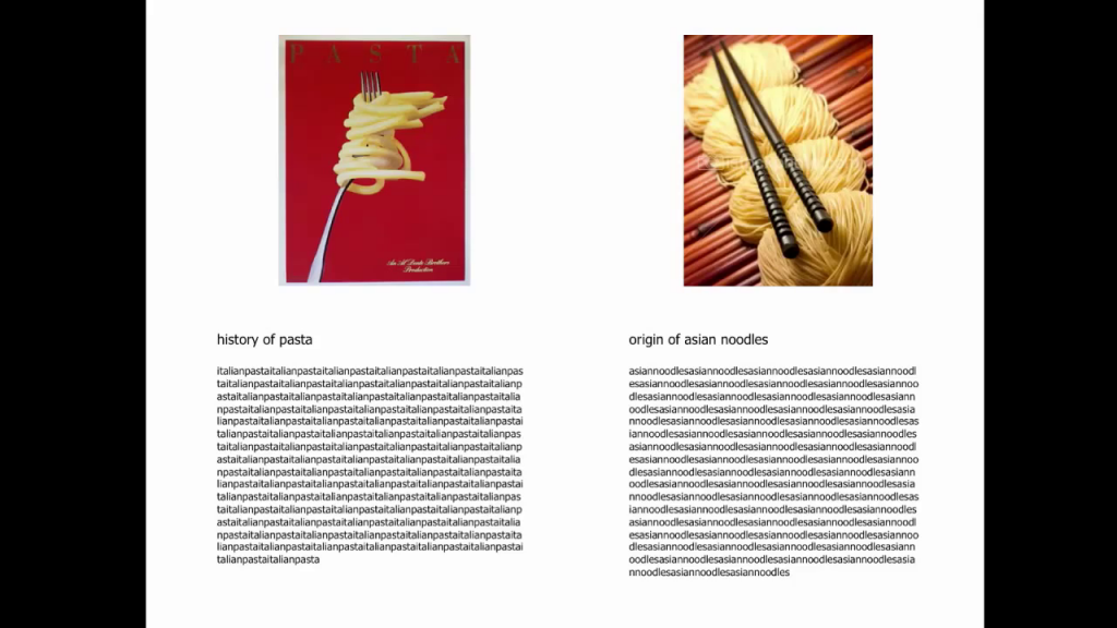
You know, the eternal argument about the birth of spaghetti and noodles is an example of such. I would rather leave it to historians to really dissipate any kind of doubt, but as far as we’re concerned, they exist together and they contribute to each other.
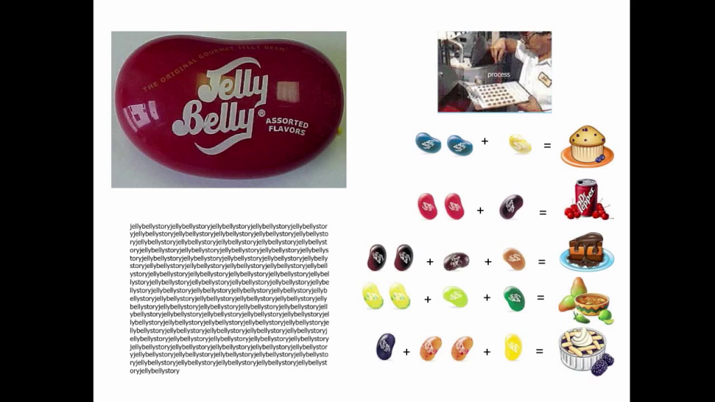
Of course, in the book you would get to more and more technical and synthetic kinds of foods. And sometimes the category of snacks and cereals, which I’m sure is it some of you a guilty pleasure and to others of you a blasphemy altogether, is extremely interesting. Some of these technical foods we have in the collection of MoMA. The jelly beans, we have the M&M’s, and we have the Chupa Chups, and what else do we have in terms of foods?
And people ask me how do they get stored. And it’s like no, we store it there, and if they go bad we get the M&M’s again. We make sure they are the original colors, because there’s been a lot of variations in the colors. But one of the beauties about design objects is that something done today, if it’s the same manufacturing, it’s the same process, is an original, right? So we can keep on buying M&M’s and jelly beans so long as they’re the right flavors.
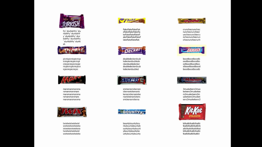
So they are in the collection of MoMA because they are great examples of design, as are—well, actually we don’t have bars yet in the collection of MoMA. But when we did the story about humble masterpieces, we had the Mars Bar because Mr. Forrest Mars was actually also the one that introduced the M&M’s into the United States, having learned how to make that kind of coated chocolate in Spain during the Civil War. So, really interesting stories about them all.
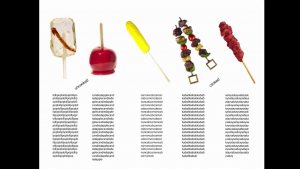
Then foods on a stick, kind of compositions of foods that are still quite connected to design, all the way to just a few designed foods.
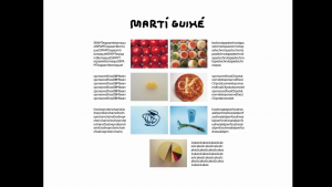
Food and designers is a little bit of a difficult topic, because very often designers don’t know how to prepare food. Sometimes they’re good at collaborating with chefs. And in this case Martí Guixé is a good example. He’s from Barcelona. And actually he stopped designing food quite sometime ago. But he became well-known in the 90s for his techno-tapas. They were not very techno, they were just ways to distribute tapas so that they could be handled without having a whole dish and a whole preparation.
But I think I would stop there with the degree of design, because I believe that truly in order to explain design to a wide audience it’s better to stick to what everybody knows, so that they can understand design because they can also eat it. And ultimately, what we’re all looking for is what we said before: tradition and innovation. Something that comes from an antiquity that is in affinity with us as human beings, but is completely lively today. Something that is functional and at the same time sublime. Something that gives us at the same time nourishment, function, but also delight and surprise. Thank you very much.
Further Reference
Shortly after the acquisition of the @ symbol, Paola also published “@ in Context: Criteria for an Acquisition” as a follow-up to reactions.
Overview page for the MAD 4 / What is Cooking? event.
