Golan Levin: Our second presenter is Nathalie Lawhead, who is a net artist and award-winning game designer that has been creating experimental digital art since the late 1990s. Their work includes titles such as the IGF-winning Tetrageddon games, Everything is Going to be OK, and the Electric Zine Maker. Folks, please welcome Nathalie Lawhead.
Nathalie Lawhead: Hey everyone! My name is Nathalie Lawhead, and I go by alienmelon online and in my work. I make weird software, tools, net art, and experimental games. You can find more of my work in this slide. I’ve been making stuff like this since the late 90s and very much love everything about weird art on computers.
I’m here to talk a bit about my tool the Electric Zine Maker and how I think the intersection between games and tools is really exciting. There are so many tools out there built by small developers, many of them free. It’s an amazing space that just keeps growing. I’m constantly watching devs post tools to itch.io, and it always surprises me. “Tool” is a pretty flexible concept here. Each one is different. Many of them explore their own restrictions or simplicity in interesting ways. Many of them treat the concept of “tool” more as a game.
I think if you do anything generative on computers and don’t know what to do with whatever you just made, turning that into a little tool that people can use to do stuff like tweak values, play around with some visuals, and just export whatever they make goes a long way. Coming from more of a game design angle, it’s easy to overthink interactivity and want to build on the systems in ways that get really complicated. If you look at tool design, often the opposite mindset is the most rewarding. Just letting people play, without a set goal or agenda, allows for a really meaningful relationship to develop between the computer and person using it. Small indie tools are ways to explore art fantasies. It’s kind of how I started viewing all of this after building the Electric Zine Maker.
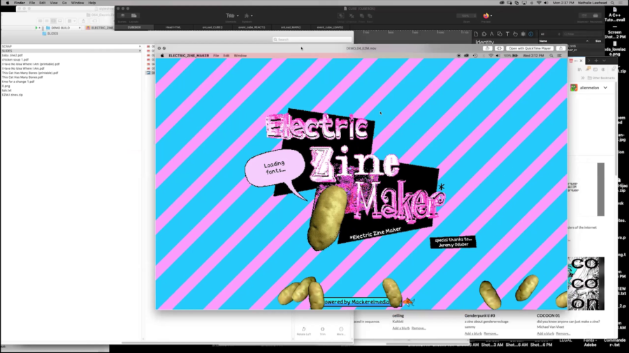
So for a little context I’ll show you some of the Electric Zine Maker.
https://www.youtube.com/watch?v=GvNS7Fdlk8s
[this demo video plays, unsynchronized, from ~2:26–6:28 of the presentation recording]
The Electric Zine Maker is something of a digital print shop and art toy. It’s built so you can easily make print-ready zines. I made it because I needed a way of easily making zines without messing around with templates in complicated art tools. I asked on Twitter if people would be interested in a tiny zine art program that lets you draw in black and white and throw stuff in the eight-page fold template. People were excited about it. I asked mainly because I wanted to make sure that nobody else made something like this and that I wasn’t encroaching on someone else’s turf.
The Electric Zine Maker grew really fast because of all the interest. I originally thought that only my close circle of friends would care about it because it’s so weird and different, but people all over the world got into it. There was an artist that made a peace zine to protest war and American imperialism in the Middle East, with facts and information, as legitimate literature to give to people for awareness. Other artists made some really beautiful Black Lives Matter literature in it. Many others shared autobiographical work that they created with it. There’s a lot of art that was really touching. I had no idea people would use it to make such a variety of stuff.
The Electric Zine Maker is really experimental. You have your basic tools like drawing, importing images, and text. Then you have all these other weird and silly tools.
Like there’s a brush called the “bacon brush” which lets you paint streaks of lines, or an “egg brush” that leaves uncontrollable splatters as you draw. Tools like the egg brush let you tweak their values so you can even glitch them and draw with those glitches.
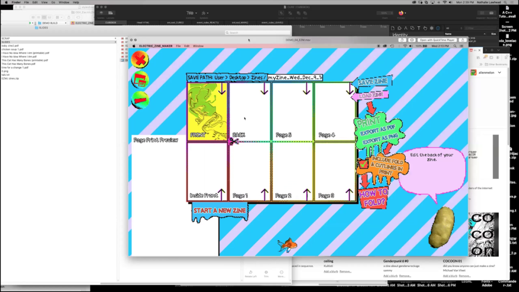
You select a zine template that you want to make. There are a number of these like booklets, or the classic eight-page fold. And then there’s a menu with a bunch of panels. These are the zine’s pages. You fill out each page with your art. Once you’re done, you just print it. The art is automatically put into a template for you so you don’t have to mess with placement and proportions and all that. It makes otherwise complicated zine formats easy for people to get into. I view it as a good starting point into zine-making because it helps people wrap their head around placement and folding.
Each template comes with fold instructions and a video. It’s built to be as print-ready as possible. The Electric Zine Maker is a very glitch art-centric tool, too. There’s lots of glitch capabilities in it that allow you to kind of break your art in a more or less controlled way. Attaining glitch art itself, and just the concept of glitching things, is pretty uncontrollable. I wanted to make something that makes glitching stuff as accessible as possible, and even let you incorporate that as if it was a medium that you could paint with.
Many of the tools here I made because I was inspired by projects like BECOME A GREAT ARTIST IN JUST 10 SECONDS. If you haven’t already you definitely should check that one out. I used to talk a lot about how I think it’s ironic that so many commercial art tools on computers try to mimic physical media like watercolors, pencils, and so on when computers have their own unique visual language that just doesn’t seem to get made accessible enough, or get tapped into enough. You kind of have to jump through hoops to get stuff like good glitch art to work. Making glitch art usually requires some kind of computer literacy. I really appreciate it when tools try to find ways of making glitching more attainable to people without that know-how.
So when you see these smaller, experimental tools that focus on computer styles like pixel art or glitch art, I think that’s really beautiful. These tools kind of open up potential for exploring other art styles. They let you create your own unique visual language that’s native to computers. These are styles and aesthetics that wouldn’t exist if it wasn’t for our computer culture. So the Electric Zine Maker explores a lot of that. You have ASCII art, image glitching, intentionally breaking things, painting with Perlin noise or gradient rainbows. The stuff people make in it ends up always surprising me. Just how people come up with interesting ways to combine all these tools is beautiful to see.
You would think that if a tool is too different, then people wouldn’t know how to apply it. You would assume that it’s useless for how unusual it is. I’ve learned that this is absolutely not the case. If you give people really weird tools and allow some practical application like making it print-ready in a template for a zine, people really get into discovering ways to apply those tools. They become important to people.
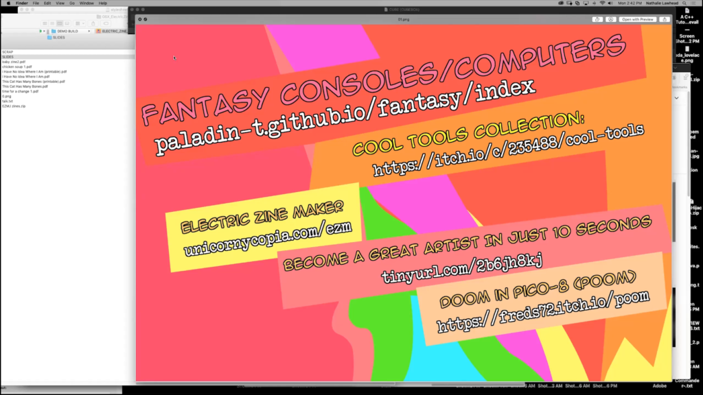
Fantasy consoles/computers; Cool Tools Collection; Electric Zine Maker; BECOME A GREAT ARTIST IN JUST 10 SECONDS; Doom in PICO‑8 (POOM)
All of that creative philosophy is why I think movements like the fantasy console movement are so exciting. Each one of these tools, these tiny weird or arbitrary platforms, opens up these really unique art styles that are specific to that space. Bitsy games look uniquely Bitsy. People explore what it means to express themselves in these restrictions that end up not really being restrictions at all. They are the reason why creating for that particular platform is so unique. I would almost say that there is a certain therapeutic aspect to building for tools like Bitsy, PICO‑8, Twine, and so on because the restrictions kind of control the scope. You’re discouraged from going overboard. When that happens, you’re placed in this headspace of just playing around. There’s so much need for that, especially with the creative burnout people often experience when using larger tools.
I think an interesting point could be made about Bitsy because the art style in it is so restricted and therefore unmistakably Bitsy, that it really doesn’t matter how professional of a game designer or artist you are. Or how amateur you are. Games made in Bitsy will pretty much all be of the same caliber. By nature, Bitsy is unavoidably egalitarian.
The restrictions of these tools are what makes work made in them so recognizable, too. PICO‑8 games are unmistakably PICO‑8. Then people try so hard to push the boundaries of creating for it and get stuff like Doom ported to PICO‑8, and you have this wonderfully weird visual echo of Doom on something that probably never was intended for a game like that. The art we enjoy from these spaces is almost like a fingerprint, it’s so unique. Each of these tools lets us explore a new type of creative expression, and that’s why I think tools from smaller devs are so valuable.
In a similar vein to exploring visual styles that is distinct to certain platforms or eras of computer history, the Electric Zine Maker is presently built as an AIR project because it was my undertaking to preserve a lot of these old effects that people made in Flash. Each of these platforms has a visual style that’s unique to them. In Flash’s case it represents a creative era on the Web. It’s kind of in a prototype stage where I’m trying to save as much of that historic footprint as I can so that it can live on in the zines people make. So people use the Electric Zine Maker and get to enjoy what I saved, or re-created, from that era. To me, the Electric Zine Maker is as much of a weird, arbitrary code preservation project as it is an art tool. I wanted to save a snapshot from that era and pay homage to it by letting people still experience it. It’s also interesting to hear how much people pick up on that. They often describe it as very Web 1.0.
Every tool or platform lets you speak a creative language unique to it. It sometimes becomes unmistakable and almost something impossible to re-create anywhere else because it’s such a unique type of footprint of that platform. The aesthetic is kind of an expression of a tool’s history. Flash grew from a lot of different needs, demands, directions, use cases. So the type of visual style that came out of that is unmistakable to that certain era of Internet history. This is a big reason that I think all technology (languages, IDEs, creative environments) is beautiful. All of it offers something special. So to me, it was important to preserve this specific mode of expression in a tool like the Electric Zine Maker.
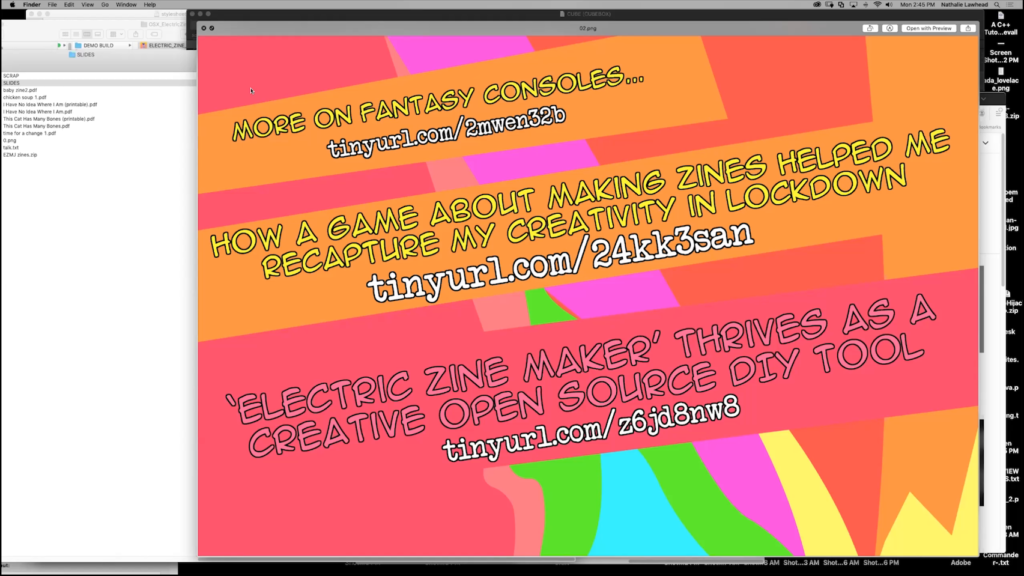
More on fantasy consoles…; How a game about making zines helped me recapture my creativity in lockdown; ‘Electric Zine Maker’ Thrives as a Creative Open Source DIY Tool
To me, the intersection between tool design and game design is a really interesting area. Tools don’t really have to be just tools, they can be a creative type of expression in themselves. For example, the fantasy console is described as software that simulates virtual hardware with limited functionality. The limitations are intentional and pretty much what make them so appealing. They encourage creating and sharing tiny retro-like games or programs built in any of these fantasy languages or tools. In all of this, the arbitrary limitation part is key. It’s so weird to say that, but the fact that any of these tools have such strict limitations is, like I keep saying, what makes them so creatively liberating. It’s not because people need to be challenged. I think they need the disarming aspect that comes from something that just honestly exists for the sake of play. These tools ask you not to take what you are doing in them too seriously. They’re inviting because they themselves speak to amateurism for how they present themselves and are. You can’t even say that something like Bitsy or PICO‑8 are like Unity. They’re not professional commercial software made by a corporation. They are in no way scary for that reason.
For example, I’ve gotten a lot of feedback from people using the Electric Zine Maker telling me how it helped them through a creative rut, or how it helped them get their love of writing back. This slide has a couple of links to these articles. It was so fun to see that, too. Two articles by two different journalists that were published on The Observer and The Guardian, very close together, reflected exactly that experience. Both of them talked about how the tool helped them.
I find that almost humorous because many aspects of the Electric Zine Maker are not that well implemented. Placing an image is harder than it needs to be. You kind of have to fight with it to get it just right. By all accounts, this tool is bad if you’re going to compare how features are implemented to commercial software standards. That is why, though, it is therapeutic to people. It doesn’t let you get too professional. Things like this remind you that creativity is play, and that’s why we all fell in love with that to begin with. I think that’s something that gets lost in professional commercial software sometimes.
Here are a bunch of interesting ones to examine. There’s a playful aspect to many of these tools that make them more like games than just tools. Like the Electric Zine Maker, there are many examples of tools that carry with them some kind of fictional, game-like, or playful element to what they allow you to do.
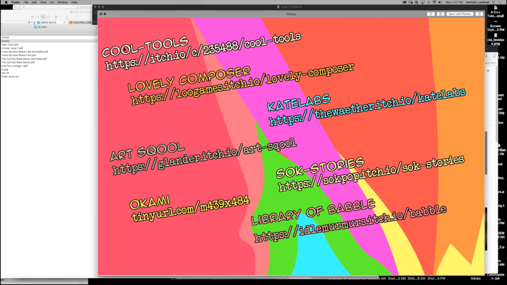
Lovely Composer is a music creation tool that’s reminiscent to things like Mario Paint. The UI is adorable and game-like. The space it places you in for creating music is very playful, in the spirit of a game console music editor.
sok-stories is a silly game and story creation tool that lets you assemble elements, and share what you make. The way it presents itself is in this adorable and silly way that’s ridiculously disarming.
KateLabs is a small game-maker that places you in a 3D space, and you assemble little scenes (stories), and have some interactivity that you can apply to things. I think this one is interesting because the developer basically gave you access to all of the assets for her games, and gave you a creative space to use them in.
There are examples like ART SQOOL which incorporate art creation into the game. You can save what you create in it. The point of it is to create art, and I think it’s really interesting how the the theming surrounding that is basically an art tool with a story applied to it. It encourages you to make really silly things inspired by the context it places you in.
Then, completely on the other side of the spectrum, you have classics like Okami, published for the PlayStation 2, where drawing or painting is incorporated as part of the game. It’s often remembered as being a beautiful and therapeutic experience. I think the drawing aspect of the game helps it be that.
So all these, in varying degrees, are playful, game-like, or use creating art as part of the game. This is a really interesting intersection to look at for how tools actually can be like, and how creating things can be a game in itself. Creating art is very personal. When you place people in a unique space for making that art, it’s kind of like giving them a certain headspace. The framing surrounding your tool encourages people to be creative in certain ways.
The final example in all this, that I feel really drives the point across, is Library of Babble. This one is kind of like a meandering writing exercise. You’re placed in this beautiful abstract landscape that you wander through. You discover writing left behind by people, and you can leave behind writing. The way it allows you to be creative, and the space it creates for you to be creative in, strongly informs the type of writing people make in it. It’s moody, introspective, very meditative.
So, things like this get really interesting because they all show how tools encourage certain types of creativity. The Electric Zine Maker kind of has this fictional universe that you discover if you explore the tool. There’s this ARG you can find, mackerelmediafish.com, which is a fictional technology that the Zine Maker is supposedly built in. When people find this, it kind of reinforces the idea that this tool is something of a fantasy tool. It’s a fictional relic. Using the tool is like being part of that fantasy world.
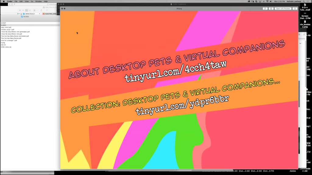
If you look at the push and pull between the personalization of virtual spaces like the desktop, and the corporatization of that, you see how meaningful it keeps being for people to be able to customize, personalize, basically break that corporate tone that always hovers over our digital spaces. Things like desktop pets remain relevant because they kind of humanize that cold, indifferent, professional environment that the desktop is. There’s this desire for people to make this more of a home than it is a system that we are just working on. I think it’s interesting how we came from having this really strong Windows 2000 and Windows XP theming community where people would change things all the way from alert sounds, the startup screen, completely wreck the default look, to our current Windows version that seems so coldly corporate with actual banner ads constantly interrupting your experience.
So professional software, like anything coming from Adobe’s Creative Cloud, really feels the same to people. It’s corporate and intimidating in many ways. This is why nostalgia for things like Kid Pix or Kai’s Power Goo is so strong. There will always be a need for software that runs completely counter to the corporate and capitalist stuff we view as normal. Photoshop is all about maximizing output, streamlining, productivity oriented. It’s perfect at outputting professional stuff. Constantly being placed in a digital environment like that can also wear artists down. Corporate professionalism, when it’s the default, has this aspect to it that can cause creative burnout. This is why I think so many people have said that the Electric Zine Maker helped them rediscover love for creating, or got them out of a creative rut. It reminds people that creating isn’t all about productivity.
So, my closing thoughts.
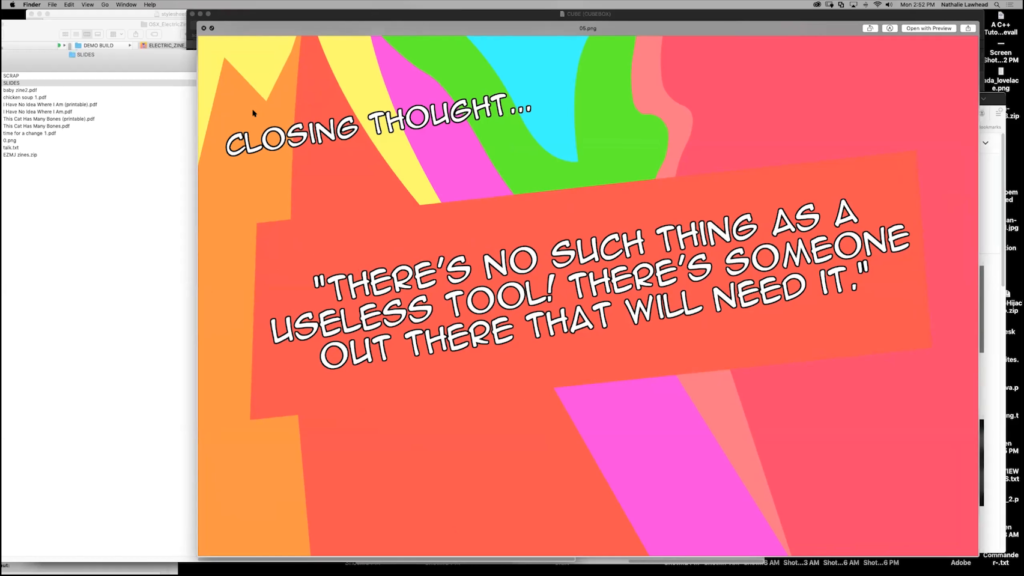
So, all these tools that are just horribly user unfriendly, weird, quirky, different, cute, adorably playful, are a way to encourage people to ground themselves in how creativity is play. Building games and creating art in amateur tools reminds people of that. I think it’s wonderful that you could build a game entirely out of these quirky free tools that are available on itch.io. The value of these tools is not in the professionalism they offer but the way they make some weird, tiny niche thing accessible.
People often talk about how it used to be easier to just get into game-making because of tools like Flash that made these otherwise technically complicated things accessible to any kid. Game-making has gotten a lot more complicated now, and the bar for entry is much higher. All of these tools that you could easily dismiss as amateurish or silly, kind of allow for the same. The simplicity and approachability may be a reason that someone discovers a love for making games or composing music. This is why we make these tools. It might be simple and dumb to us, but it may be a creatively healing experience or breakthrough to someone else suffering from burnout. It might also be a reason that someone starts making games. Your tiny tool may end up being a gateway to bigger things for someone.
So, all that said, there is no such thing as a too-small or too-amateur tool. All tools bring something very meaningful to the table just by existing. It always surprises me how some silly dumb tool I made, that I put out there, becomes so important to someone.
This is why tool-making is special. Thank you.
Golan Levin: Thank you so much Nathalie. That was wonderful. I really appreciate just the emphasis on personal perspective in both making art and making tools for art. I’m just looking in the the various chats to see if there’s questions. And I guess there’s some chatter about the extent to which you think…like how minimal can it be before you no longer have have ideas. I mean it’s a common trope, right, that the constraints are the thing that actually cause the creation, right. But what we’ve seen tonight with your list of tiny tools, your own tiny tools, and the list of tiny tools that Everest was showing as well, is about how we know these tiny tools, through their constraints, give us the inspiration. Now, have you seen the limit of how tiny these things can go and how constrained they can be?
Nathalie Lawhead: I feel like that would probably be a really great game jam idea: try to make something so restrained that it’s not fun anymore. But like, from my experience just playing around with whatever I find on Itch or whatever people share, it seems like it’s almost not possible to make a tool that just sucks because you always catch yourself doodling something in it or doing something goofy in it, just by nature. Because I think people really just like doodling. And it just comes natural and you just lose yourself in it. So yeah, I don’t think there is a limit to restriction.
Levin: I got another question here from the YouTube chat. How do you manage perfectionism while making a tool that is anti-perfectionist?
Lawhead: [laughs] Oh that’s really hard for me ’cause I do catch myself constantly trying to put things in a pixel-perfect position, or…what’s a good idea for an input? Like right now with the Electric Zine Maker a lot of the inputs are number-based and not slider-based. And that was kind of an intentional decision because putting numbers in is a little bit more…I don’t know, serious than a slider but also I don’t think it was a good decision because sliders are easier for people to manage. So yeah, I’m constantly catching myself going back and forth and second-guessing decisions in all this. I think when you’re making the tool, you are super picky. But the end results can discourage that. I don’t know if that answers the question. I’m not good at managing how picky I get.
