Golan Levin: Our next presenter is Luca Damasco, who makes things that help people make things. He develops digital tools for artists, students, and teachers while working as an educator and creative technologist. In his creative technology roles, he’s worked for Riot Games as a technical artist, contributed to the Processing Foundation’s Python mode project, he created Py5.js, a new project which allows p5.js-style programming in Python in the browser, and he runs wickeditor.com, a free open source animation and game creation tool. Luca currently teaches creative coding at New York University’s Integrated Digital Media program, and previously taught interactivity at Carnegie Mellon School of Art. I’m also really really proud to say he’s an alum of our Bachelor of Computer Science and Art program at Carnegie Mellon. Luca Damasco.
Luca Damasco: Thanks so much Golan. Hi everybody. Let me get my screen share going.
Okay. Hi everyone. I’m Luca. I’m a software engineer, educator, digital toolmaker. As Golan mentioned, I love making things that help people make things. And I’m an alum of Carnegie Mellon University. I was in the Computer Science and Art program. I also graduated from the HCI—Human-Computer Interaction—program. And throughout my time at CMU—and I actually threw these slides in after hearing Cassie talk about the contributor’s conference and things. I kind of think of myself as having grown up in the open source creative tools and the OSSTA space.
This is in 2015. This is when I was a sophomore at CMU. We had the p5.js Contributor’s Conference. There’s a much less bearded version of me up there in the corner giving the p5.js hand gang sign, I think? It was a really fun conference and was kind of my first full introduction to the world of open source software tools for the arts.
And this is actually from the 2019 contributor’s conference. Cassie, on the left-hand side there, and I were working on some P5 editor work. So that was kind of a cool thing and great to see Cassie kind of recap a bunch of stuff from the project.
And so right now I help run a project called Wick Editor. It’s a free and open source tool for creating animations, games, and everything in between. And we’ll get to what those kind of things are in a second.
But today, I really want to talk about how we built Wick Editor to grow with the users that were using the tool, and some things that I wish I knew when we started. And I think it’s super useful and super valuable to hear from other creative toolmakers about their processes and about the different kind of problems and struggles and takeaways that they had from creating their tools. So hopefully, to any young creators over at CMU or throughout the world that are making their tools, hopefully this can give you a couple of helpful tips.
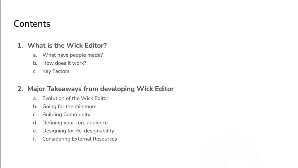
So, I’m gonna be talking about what the Wick Editor actually is. You know, what people have made with it, how does it work, and some key factors that we thought about as we were building. And then some of the major takeaways from developing the editor, from how the editor evolved over time, and different kind of big things that I wish I had known from day one.
And so let’s start with just looking at what some people have made with the Wick Editor, so we get a good idea of what it can actually do.
https://www.youtube.com/watch?v=okMQGBEuroo
This first project is an animation by Kate Chaudoin, another student at CMU, and it’s called Good Eggs. It’s about some good eggs that just wanna have a good time. Sentient eggs that get up, they dance, they have a grand old time. It’s a pretty short animation. You can watch the whole thing over on wickeditor.com
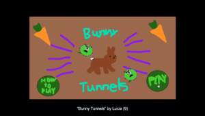
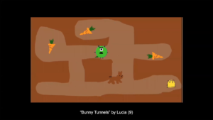
Now, aside from animations, it can also create games. So here’s a game called Bunny Tunnels. This was created by a student in one of our sessions that we ran. It was over a couple of days at the STUDIO for Creative Inquiry. Lucia was 9 when they created this. And it’s an interactive RPG game where you control a bunny that goes around tunnels and collects carrots. You avoid the different tunnel monsters. And prior to having made this game, I don’t believe Lucia actually ever coded before. And so Wick Editor, we did some animation workshops and interactive stuff. There’s even an underwater level for this game. We were really impressed with what they were able to do, and this is kind of an example of the intro/beginner user that might use this tool.
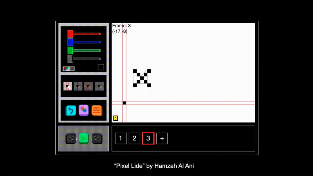
And in terms of the in-between, we got all sorts of different types of in-between projects. This is one of the more kind of incredible ones from recent times. This one’s called Pixel Lide, by a user known as Hamzah Al Ani on our forum. This is a pixel-based animation software that was created inside the animation software Wick Editor, with its own animation engine. They’re doing all sorts of incredible stuff under the hood that I didn’t even think of and that we don’t even have implemented in the engine that they built alongside ours. And it actually recently won a small award over at Mozilla Festival this past March. So, you can make all sorts of different interactive projects in the tool itself.
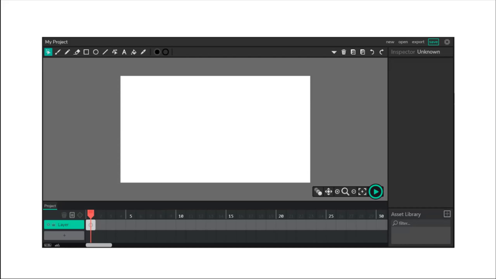
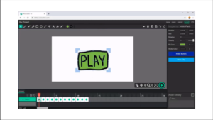
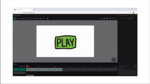
And so how does it actually work? This is the Wick Editor. This is just a screenshot of the interface. It’s got some basic drawing tools up on the top left. You’ve got a drawing canvas. And this is super familiar for anybody that’s used Paint before, or Illustrator, or any of the other tools. But on the bottom there is a timeline. And this is super reminiscent of tools like Flash and other video editing programs and things like that. The timeline on the bottom is just what controls the time-based element of your works, whether that be your games or your animations. And because there’s that timeline there, you get a really really easy transition between this animation and game creation environment.
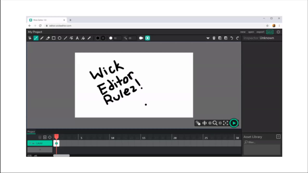
It works in the browser. So you can kind of see this is in a little Google Chrome browser. And people start by just drawing. So you just draw and use your brush tools. Super familiar. You get up and running.
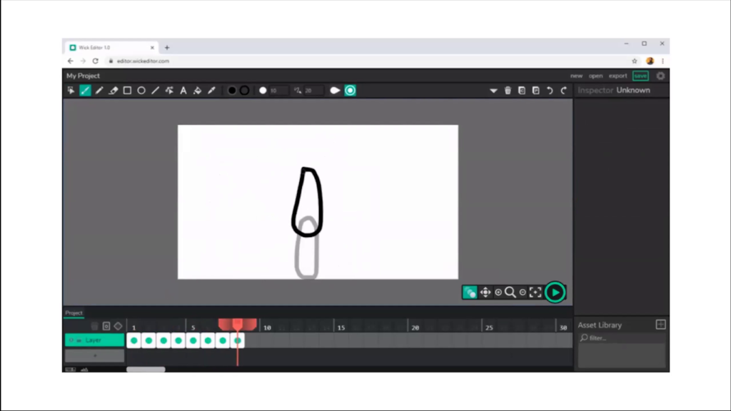
You then can start adding more and more frames to your animations. So here, just drawing out a little bouncing ball. You click the play button, and you can create your little animation.
Now, this is super awesome. If you’re beginner, like Lucia, a 9‑year-old and you maybe haven’t worked with a full-featured animation software before, being able to just kinda get started and up and running is a lot of fun, and it’s exciting. It makes the room kind of really excited to just be there.
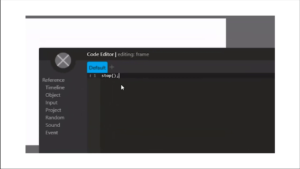
Then, after you’ve made your animations, you can start adding some interactivity. Here I’m just drawing a button. And you can type in a little bit of code in a little custom scripting editor that we have. And you can turn this little drawn “play” button, with a little bit more code, into an interactive button. So with ten characters and a few seconds, we can go from having never made something to having made an animation, to having made an interactive project.
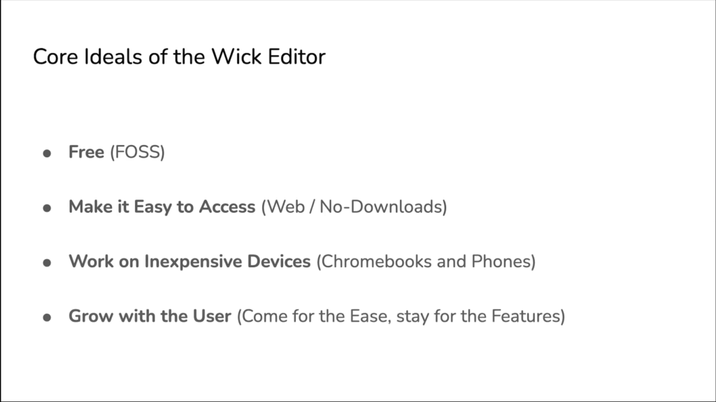
So this hopefully gives a good idea of just kind of the breadth of what you’re able to do in the tool. But while we were developing, we kind of massaged these core ideals of the software over time. And the first one—and this was from day one—that we knew was we wanted the software to be free.
And the reason— I mean, it’s so simple; we’re all talking about open source software tools for the arts, so everything we’re talking about is free to the user. But the concept of an open source animation tool really came from the idea that all these other tools that we loved like Adobe Animate, or Flash, and these other, bigger game creation tools like Unity or Unreal Engine or whatever, these big tools usually have restrictive licenses. When the company deems them not profitable anymore they just die. Or when browser standards change they go away forever. And so trying to build this in a way that if we weren’t able to completely maintain the project, or if we weren’t able to continue it, maybe someone could pick up our interface or work with us to actually maintain it and support the project over time was really important. Because if you’re using a tool and it just kind of dies out of nowhere, that’s terrible for you as a creator, no matter what stage of your career you’re at.
We also wanted to make it as easy as possible to access. And so it’s web-based; that helps a lot. Cassie mentioned earlier if you’re trying to use this in like a school environment, or a place where downloading is prohibitive, having a web-based tool just lets someone go to the web site, click a button, and they’re there. So, that’s super useful, super easy. You don’t have to get IT involved to get something on your computer. It makes it so much more accessible.
It needs to work on expensive devices. So you know, just because something is free or open source doesn’t mean that it’s designed for all sorts of stuff. So, an animation tool or game creation tool can be super super intense on your computer. And so we had to make this work for Chromebooks, like hundred-dollar laptops that are in schools that might not have great funding. So that was a huge core ideal of the project from the beginning.
And then as we kept working, we had this real inclination and desire to make sure that the tool continued to grow with users as they used it. Basically we wanted them to come for the ease of use as beginners, and then stay for the features. And that presents all sorts of kind of difficult challenges when you’re working on such a limited team. Building Wick Editor, I built it with myself and Zach Rispoli, a friend of mine. We started it at CMU as a class project. And so we have very limited resources in terms of what we’re able to actually put into the project. We need to build all these features. We need to get them into the tool. And we need to make them easy enough that a beginner that’s never used them before can use them. And we needed to then hide some more features. It gets kinda complicated. And so how could we make the tool ease someone from a beginner to intermediate stage as a creator.
And so this leads to kind of an overarching theme, which is like, design for beginners without sacrificing functionality. And that concept leads into these next big takeaways from the development process.
And so where did we start? Where is the project…where is it now? And what would I have loved to learn while I was building my software tool, you know, back in 2016 when we started?
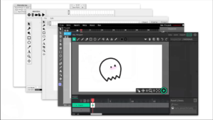
Now, the editor has gone through five major redesigns over time. I’m so grateful to the Frank-Ratchye Fund for Art at the Frontier, which helped support several of the changes we made when we were undergrads at the STUDIO, as well as the Mozilla Open Source Support Program which helped us get our most recent release up and away. But throughout that time we had to keep those core ideals and these other kind of major pieces of functionality in mind and continually redesign.
And so here are some big takeaways that I hope you can use as an open source offer tool developer, or a creative, or an artist. Maybe this goes into your new media practice in some way. Yeah, let’s see.
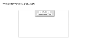
First thing: go for the absolute minimum. Just build the thing. Early on in that first week when we made our first version of this tool, we started it as just like a basic HTML page. This was version 1 of Wick Editor.
And you know, it had the basic features. Things like a basic timeline; you could control the timeline by just clicking these right and left arrow buttons. You could drag in images, so we didn’t even have drawing tools yet. In this first version, we were really focused on the interaction so we had like a prototype of the interactive sequence here. So, this was super important to just kind of have this in front of us. And oftentimes throughout the development process, we didn’t stick to this “build the absolute minimum” mentality, and that led us down so many rabbit holes and made us waste so much time. Whereas if we had just stuck to this kind of fundamental aspect of what was so great about our first version, we would’ve saved so much time and been able to use our resources as effectively as possible. So yeah, go for the minimum in both your features and your tools, and don’t worry if it’s not perfect.
Next thing: build community and get feedback as you go. So, a little under a year into the first version, we put out a forum. This forum started just out of kind of a need to get feedback from our community. It eventually grew into a place where people could volunteer to actually give us support, where people could volunteer new critiques and criticisms and fantastic elements of feedback.
But building the community doesn’t just happen. You don’t just get a community that is positive and engaging. And so we tried to figure out how do we make sure this doesn’t become a negative space from the get-go. And we looked towards other projects that we loved and cherished. And so we got a lot of inspiration from the Processing and p5.js community. We looked at the community statement. We modeled how we would respond to questions based on how people in GitHub issues on the Processing repos would respond. And so really focusing on that idea of like “no code snobs,” right. Making sure that if someone maybe responded in not-so-nice of a way on our forum, we didn’t necessarily berate them or get angry at them, we just kind of explained like hey, that’s not how we do things here. And built that community so that we could get as good feedback as possible.
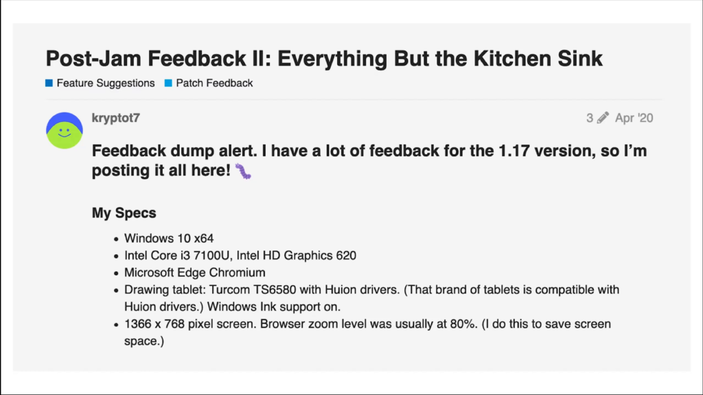
And this came back to us tenfold. We would get responses from power users that would send us really detailed feedback. This user, kryptot7, was fundamental in some of the earlier releases, where they’d come in and spit out twenty pages of feedback after a new release, help fix bugs and things like that, and there are so many folks like this on the forum. I don’t just wanna single them out and kind of miss everybody else. But there’s just so much great feedback you get when you have a place your community can live. It doesn’t have to be on a forum, it could be on a Discord. it could be on an email chain. It could be on a text chain for all you know, depending on who you’re building for. But just make sure that you’ve got somewhere to connect with them.
Now, you getting all this feedback. You’ve got to figure out a way to refine that feedback in some way. And so you’ve got to know who you’re building for. And this is something that evolves with projects, and it evolved with Wick Editor over time as well.
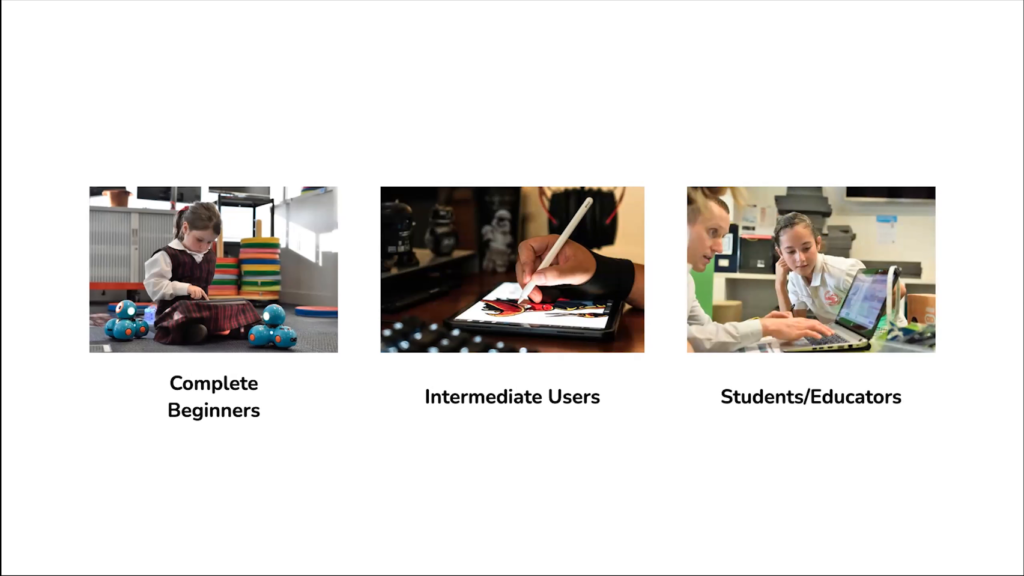
In our case we had this idea that we’d have like the complete beginner. And I’ve got a kid on the screen here, but we were thinking someone that’s never made an animation before, or barely used creative tools before. Like could we build our thing for them, right?
And the intermediate user, right. So we had the intermediate user from a couple of perspectives. The idea that the beginner gets good at some point. They get confident in their own skills and they become an intermediate user. And also someone might come in with previous skills, and we want them to be accepted into our community and be able to engage with our users and help each other grow together. So we want to make sure we have them in mind when we’re looking at this feedback.
And we also had students and educators. So we had a lot of really really good outcomes when we would go to schools and maybe run a session. Or we’d get emails from teachers saying “Hey, I found your tool. This worked perfect in my class.” And you know, with no small thanks in part to the fact that we were building this for a web-based system. You know, these three kind of core groups helped us understand which pieces of feedback to really consider the result that was most important.
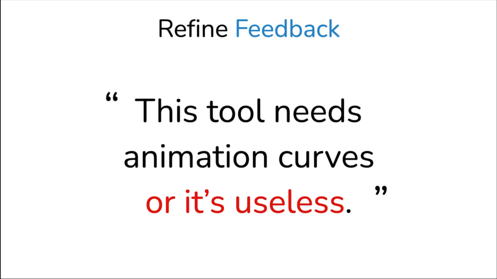
So, by focusing on these target groups, we knew how to gauge our feedback. We could refine feedback that looked like this. And anybody who’s made an open source project before that’s gotten any traction has gotten like, angry things. This is one of the nicer? kind of angry comments in terms of like, “This tool needs animation curves or it’s useless.” And while you might look at this and as a more experienced user you might say yeah, you know, without animation curves and different tweening levels this isn’t really that helpful. But then you think back and say well, that interface might be too complex for a complete beginner and it might actually make them not know how to use the tool.
And so it lets you really refine these ideas that come back to you and put things on the back burner that are valuable, and maybe at some point we’ll be able to get to them for our more advanced folks, but it lets you know what’s most useful right now.
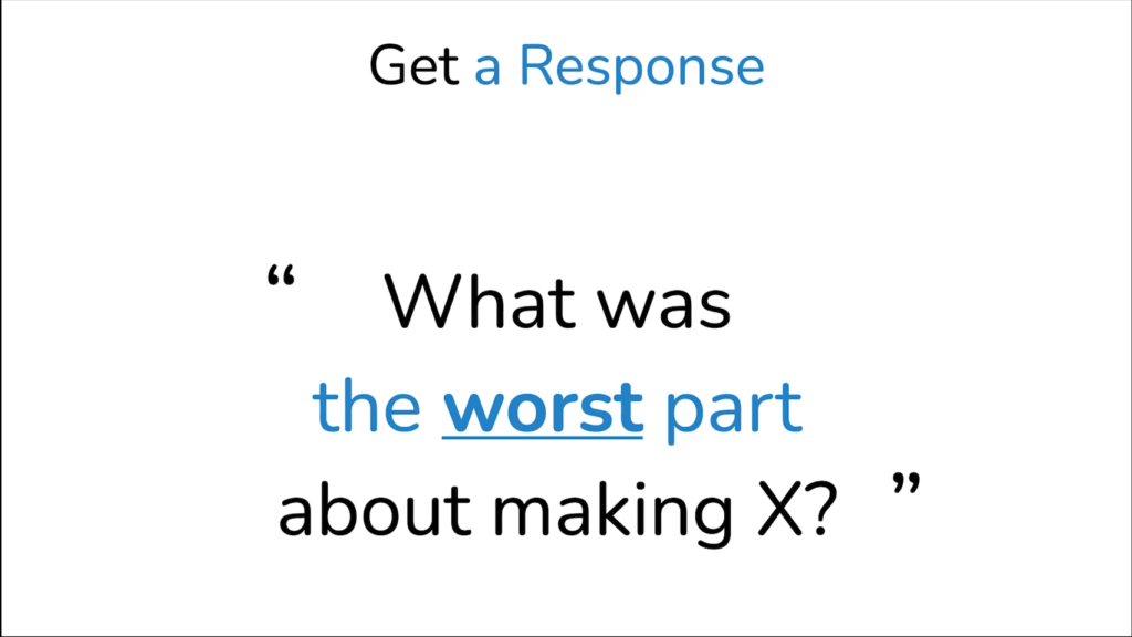
You’ve also got to be able to like, get responses from your community, right, and knowing who those major target groups are lets you do things like ask really targeted questions. Something like what was the worst part about making your animation or making your game? And being able to ask that on your forum and know who’s going to be responding and what kind of feedback you might get. That’s a really really good way to get responses.
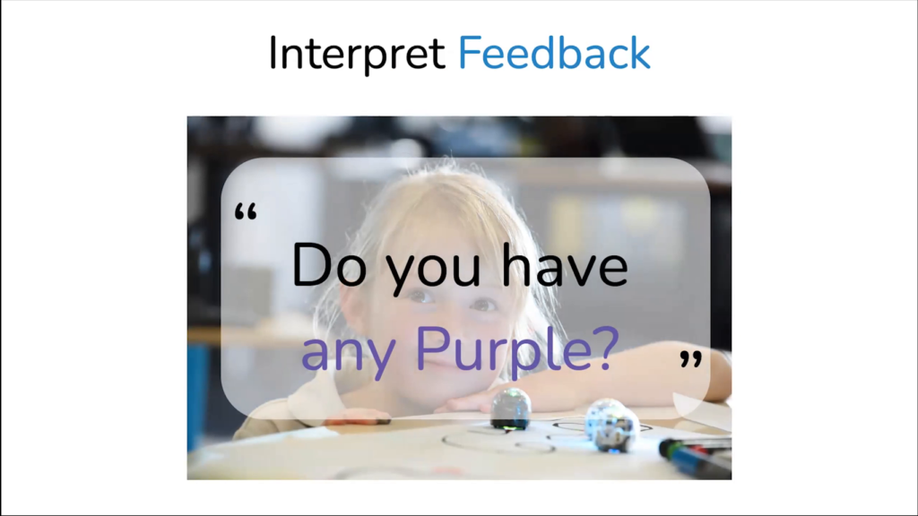
And then you’ve also gotta know how to interpret your feedback. So refining the feedback, getting the feedback, interpreting it. And this isn’t too hard in terms of online discussion. But when you’re in a classroom and you’ve got like a young kid, and they say something like “Do you have any purple?” You’ve got to know okay, this is a 5‑year-old, I’m making an animation with them, and they’re asking me if I have any purple. What’s the metaphor here? Oh, they can’t find the color picker. This means that there’s probably a fundamental issue with the way I’ve put the color picker on the screen, or maybe it’s too complex. Maybe instead of getting like a color wheel, maybe I should make this into something simpler. So figuring out how to interpret your feedback, knowing your target groups, lets you interpret that a little simpler.
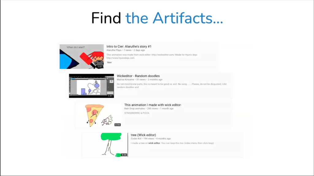
And then lastly having these different community groups and things lets you find artifacts from your community and use those as measures of the community’s success. And so in our case we would do things like search on YouTube for the term “wick editor.” And if people were interested enough in the tool itself to put “wick editor” in their description or in the title of their project, that was like a huge success for us. So we’ve got you know, kids that might be in middle school, high school, using this tool. And they’re like “I made this in Wick Editor” and they’re happy and proud to display that. That’s a great artifact to find, and a great kind of story to tell to let you know hey, are we doing the right thing for our community and for the people that are using this tool.
And this next kinda big takeaway is a little harder in times of COVID, obviously, but get on-site if you can. If you’re building for other people, work with those people directly. And this one might seem like it’s kind of…you know, it goes without saying, but you start to find problems that you never would have experienced when you’re building stuff on your fancy dev machine like a Macbook.
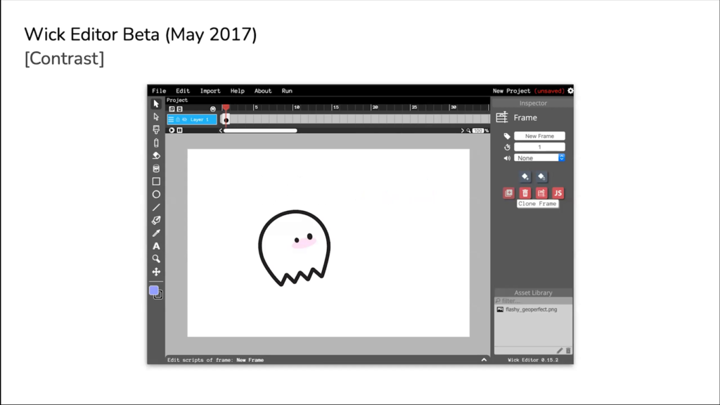
You start to do things like this. So this is our I think fourth release…fourth major release is what’s on the screen here. And this was our first release where we changed the colors of the editor. And you might look at this and be like okay dark mode, it was a trend, right. All of my software that I’m using changed to be dark mode in the last couple years.
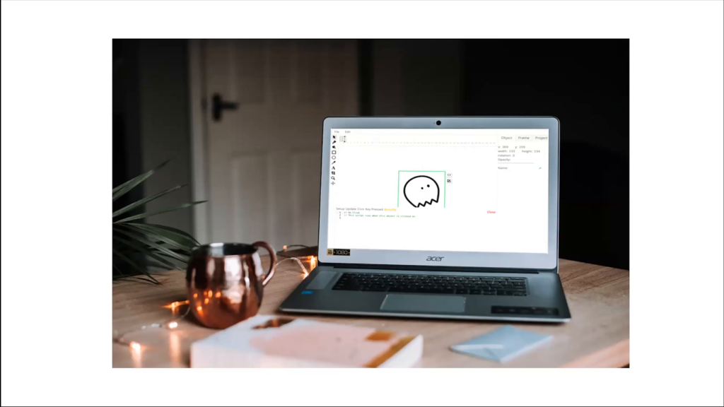
We changed this not because we thought it was a cool thing. We changed because it was an accessibility issue. We would go into classrooms and they would have these really inexpensive computers that would cost a hundred bucks. And because our interface was so light, people couldn’t see. Students that might’ve had an individualized education plan, or some kind of impairment or something like that, it was really hard for them to actually utilize our tool in the current contrast state that it was in. And so that informed how we would improve it. If we hadn’t gone on-site and seen them in their situations and tried to work with them directly, we would never have found many of these problems as fast as we did.
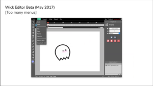
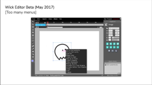
We also wouldn’t have thought of some of our kind of like…expert fog, right? Like because we’re more advanced users, we would add in things like drop-down menus and think these were fine. We would do things like right-click menus that were pretty dense. And if we hadn’t gone into classrooms and just seen that students completely ignored these and beginners completely ignored these, we would never have come to solutions like this one:
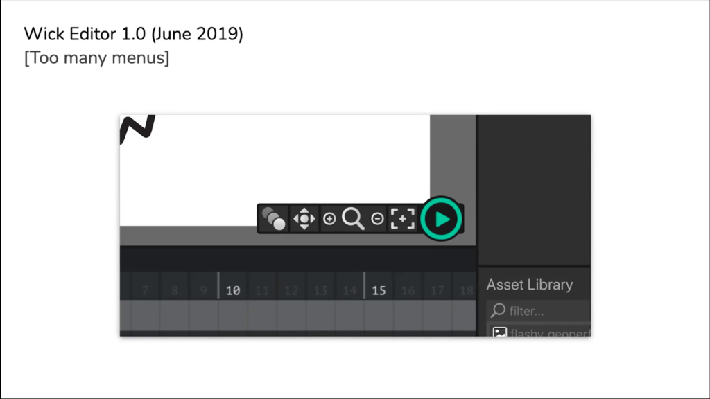
And so in the most recent version of Wick there’s a really really big green play button. Every major function that a beginner or an early intermediate or might need is just a one-click button away. You don’t even have to go into a menu to use it. So in this case you’ve got a play button, and then the button right next to the play button is the recenter button. So if someone drags their canvas too far away or they zoom in too far, they can click “recenter” and come back home and we put their canvas right in the middle of their screen.
These kinds of things, you won’t realize that they’re like features you really need or interface changes you might need unless you’re on-site. And this goes for so many different types of interactive experiences. If you’re not in the situation you don’t really know what kind of problems will come up.
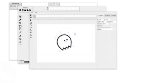
And another big thing that we continued to kind of use as we kept redesigning and redesigning…you know, five major redesigns in five years is quite a few, is we started doing this concept of designing for redesignability. And this is like making sure the product’s approachable without sacrificing this “redesignable” concept. And what that means is we’re just two people that are making this tool, and with maybe a designer here and there that would jump in, our team would never grow beyond five people at any time; the core developers.
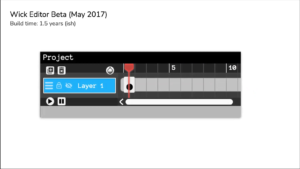
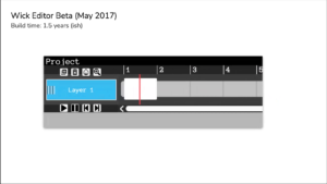
And so we would need to deal with problems like this one, where we’d have our timeline, which was a core element of the animation and interaction of the project, would start to get really cluttered. And so we’d have a few buttons, and then we have to add some more features. And then a few more buttons would show up. And eventually, because this part of the tool wasn’t really redesignable, we didn’t know how to add in new features or what we could remove. We kinda got lost.
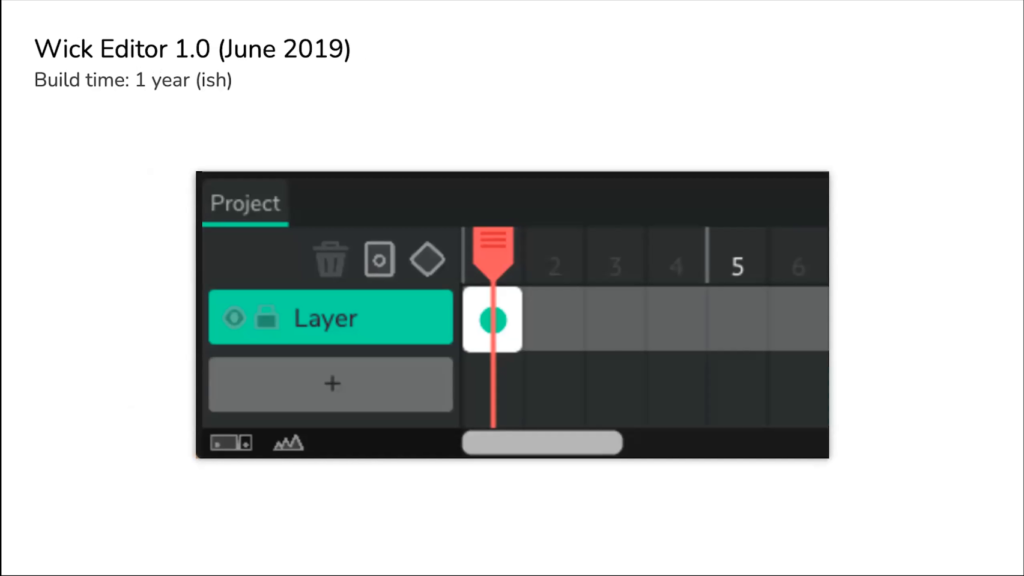
And so this would eventually evolve into interfaces that look like this, where we would have a couple of buttons, a couple of really core features. We’d really narrow down what was super useful. And we’d leave gaps and pieces of empty space in the interface where we said maybe there’s a future we’re going to add here in the future.
We’d also add in some artificial restrictions. So here we could probably only have five buttons if you’re looking from that diamond button next to the red playhead, and then there’s a little frame button next to that, and a trash can next to that. We said we wouldn’t want to have more than five things here. So we only left enough space for about five things. And we were thinking how can we redesign this without kind of going overboard in the future. So yeah, redesignability, really really valuable when you’re on just like a small core open source team.
And then last, biggest takeaway here is the concept of embracing external resources, and learning to ask questions and not do it all yourself if you can help it. You know, before you build a feature, try to ask has someone else done this? There were so many times we were just writing a bunch of code for our tool, and it was a pain. And we then realized three months later that someone had made a library and they had made their library open source. And it was what we were looking for originally. And having an open source tool, utilizing other open source resources just saves you time. It let your projects collaborate in some way. You as a user can then contribute back to them with feedback, or monetary funding if you’re able to do it. These things are super super helpful.
Next thing is before overextending yourself, ask who you can reach out to. If you’ve got that community building up, or if you’ve got folks around you that are developers, or if you’ve got other folks that you can ask questions to, see who you can reach out to at the very least for advice or suggestions. And don’t feel like you have to do it in a bubble. Many times throughout the development of Wick, we would kind of silo ourselves a little bit too much and not ask for help in certain places. And so that was a big problem throughout that process, and I’m sure a big problem for so many other open source tool developers.
And the last kind of main thing here is before you can’t afford your server, ask how can we fund this. And you know, there’s unfortunately like this hardcore mentality for a lot of open source developers where they try to completely separate any type of monetary funding from the work that they’re doing? And if you can afford that, and if you’re in a position where that’s okay for you, that’s fine? But funding in the form of community contributions to something like a Patreon, or an OpenCollective page, or some way you can kind of crowdfund those resources, or funding from a grantor like if you’re at a student at a university that might give you a grant that’s great. If you’re an open source developer and you can maybe find another organization that might be able to give you a grant.
Or on the flip side of this, if you’re an organization that can fund an open source project, you should be doing that. Especially if you’re using it in your own pipelines. That funding question shouldn’t be a taboo thing to ask. Because you know, funding means time, it means the ability to pay your staff and designers and contributors. And that’s super, super valuable. For the project, for the communities that they’re a part of. Ask the question.
And then you know, I added this slide in after hearing Cassie say it, just to emphasize, contribute and support your open source tools that you’re using. If you are from an organization using an open source software tool, or an individual that has the ability to send a donation or support to those organizations, that support gets used a millionfold over, as Golan was saying. So make sure that that you’re contributing to and supporting these tools in any way you can.
And yeah, that’s it for my talk. I’m Luca. If you want to check out Wick Editor, it’s on wickeditor.com. Hopefully these takeaways are helpful for you in your creative tool and new media journeys.
Golan Levin: Luca, thank you so much. We’ve got time for just maybe one quick question, so I wanted to pull it from the YouTube chat. How do you get the first members of your community? You know, what’s a good way to share your project in the very beginning, project in this case meaning your open source tool, to get that sort of vibrant community. I can think of some ways that I observed you doing it. Let’s hear you talk about it.
Luca Damasco: Yeah, that’s a fantastic question. And it’s not an immediately easy one, right? So the first thing I would say is like, ask yourself who you think would find it valuable, and really define for you what kind of a project are you trying to build. Is this a tool for you? Is this a tool for a specific group of people? Like I said, in our case we had students, we had beginners, things like that. Once you identify those groups, try to expand. We were like okay: beginners; we could go to a school. We could go to an afterschool program.
So we worked with a nonprofit afterschool, Assemble in Pittsburgh. And we just said hey, can we come by and run an animation workshop for an hour? And they were totally fine with that and they loved that. So there’s so many organizations where you can start building out these initial kind of like, testers? And from there, your community starts to build.
Levin: In a couple of the previous OSSTA lectures, I think it was on Tuesday night, we saw that people had made a mini-residency within their mini-residency. A.M. had made a residency within their project, and then Valencia made a residency within hers. And I remember that one of the things you’ve done is you had little mini competitions where you sort of elicited people to make demos, for example.
Damasco: Yeah, yeah. We were fortunate enough through the Frank-Ratchye Fund for Art at the Frontier at the STUDIO, we got a micro— I think was a…not a micro grant but it was a couple thousand dollars, which was super valuable for us at the time. We took that money, we broke it up into smaller amounts of money to do things like a small competition where folks could make an animation. That gave us feedback and initial users. We also had fantastic student artists and designers, and we had them—like, Good Eggs, the animation I showed at the beginning of the talk, that was funded by a FRFAF grant. So like, these are fantastic ways of getting people in.

