Hi, everybody. So yes, I’m Senongo. I have lived all over the world, obviously. In three continents now, hopefully four in the future. Throughout my life, the idea of what culture is and who you are in relation to the culture that you’re in has always been a very strong theme.
Over the past few years, I’ve started to expose, both in my work and also in giving talks and writing and so on…this idea of what it means for design to be responsive to the culture that it’s speaking to, that it’s coming from is what I’d like to go over today.
There’s a researcher who’s name is Geert Hofstede. He worked at IBM for many years, and he talked and researched a lot about the ways that internal business cultures were different in different offices. Those cultural variable can also be applied to civilization, to different societies. So as I show you some of these different variables, I’d like to just point out that this isn’t a blanket statement about all people from a particular culture, but more an observation about how they organize themselves as a society.
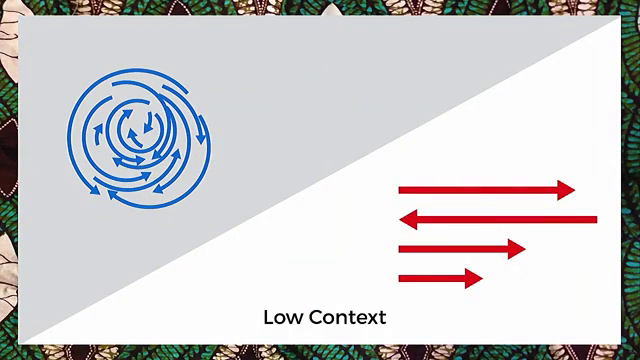
The first should be high-context and low-context cultures. High-context cultures are cultures that are often older. There’s a lot of implicit knowledge, things that people in the society just know. They can read the air. Low-context cultures, on the other hand, are societies where there’s a lot of explicit knowledge. They’re often younger cultures, and information about how the society and the people in the culture should behave is made very very clear.
I lived for quite a few years in Japan. Japan is a comparatively high-context culture. It’s very difficult to walk off the plane and just be Japanese. In contrast, I live in New York now, and New York is in comparison a very low-context culture. You can, literally, walk off the plane and as as soon as you’re on 14th Street, you’re a New Yorker.
So thinking about different cultures in this way is kind of an overarching theme.
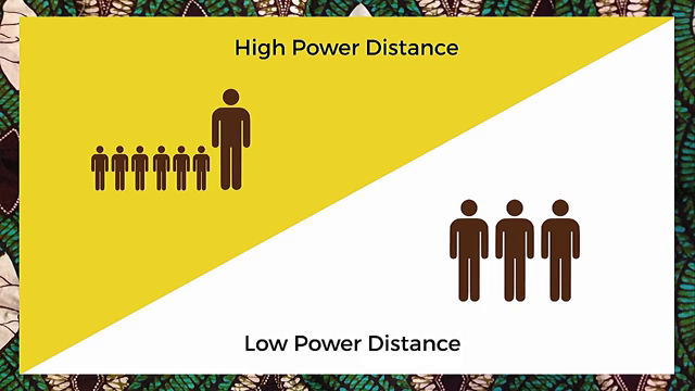
The first real clear variable that we can look at in relation to design is that of high-power and low-power distance. High-power distance societies are ones in which you refer to your boss as sir or ma’am. There’s also quite a lot respect for the aged or respected members of society. Low-power distance cultures, on the other hand, you would refer to your boss as John or Jane, and things are much more equal, or so we believe.
Oscar Ruiz is a photographer. He took this series of pictures with Publicis in Mexico, and it says down at the bottom “this image hasn’t been modified.” This hasn’t been Photoshopped at all, which is really amazing. And you have this huge, huge contrast between luxury villas and slums. As an American, the first thing I think to myself is, “Wow, I’m really glad I don’t live in a society like that.” As a Nigerian, this is all too familiar.
But then, you start to see other ways that this idea can be represented. The New Yorker did an inequality and the subway interactive experience where they mapped the median income at every New York subway station. So you can see Canal Street, which is where I work (I don’t live there; I only work around there.) has a median income of over $150,000 a year for a household. And if you take the A, C, or the E a few stops away into Brooklyn, you get to neighborhoods where the median income is around $50,000 a year. Then you start to see that there isn’t a lot of difference between what we’re seeing in this picture and what we see in New York. So design has a way of illustrating some of these cultural variables in a way that we may not expect.
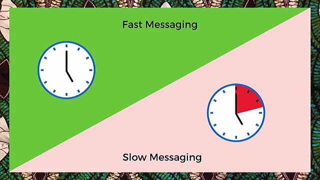
The next variable is that of fast messages versus slow messages. This isn’t necessarily referring to the speed at which the message is transmitted, but it can. Societies that love fast messages are ones in which things need to be crystal clear, there’s not really a whole lot of room to think about them, and they’re spelled out really really clearly. Societies that like slow messages are often ones in which things can be a little bit more ambiguous, and they can take a little bit more time to permeate.
But what does that look like, again, when we start talking about design? Gov.uk is held up as this example of the best responsive design in the world, and rightly so. This is a huge effort by the people of the United Kingdom to digitize their government and to make information clear an accessible. I can think of no faster message than a people saying “we’re going to pay taxes, we’re going to pay money out of our own pockets, to make our information from our government clearer.” This is a really powerful example of a society that values that fast messaging.
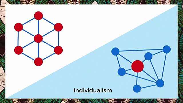
Another variable is that of collectivism versus individualism. Collectivist societies—I lived in Japan again for many years, and it’s very much a collectivist society—you think of the group first and then yourself. Individualist societies, like the US and other places, you think of yourself first. And that’s okay, it’s just a cultural variable. But we can start to see this reflected in the research that we do, and the way that we speak to these people, as designers.
I found this really really amazing story some years ago. A researcher in India, she was a director at a UX firm, was doing some tests on a web site to buy train tickets. So she got some women together and asked them some questions and did some user experience testing, as you do. And she found that the information she was getting from them was pretty sparse. They don’t really want to answer the questions, they didn’t want to tell her what was wrong, and she realized that this society was not the type where you would openly criticize someone else’s work. That’s just kind of the way that it was where she was.
So she took a little bit of a different tack. She said, “Okay. I’d like you to imagine that you are in a Bollywood movie and your daughter is getting married in the next town tomorrow. You’ve just found out that the man she’s going to marry is a horrible person. He has another family in another town, he is a thief, and maybe even a murderer. You need to get to that next town as soon as you can to stop this wedding.” And immediately, when put in this fictional situation, they were released from this need to be collectivists and they could speak on an individual level to what they would do to make this interface better.
The idea is that people want to be comfortable with these cultural references, both in our research, and also in our design.
Ambiguity and directness really speak for themselves, but this cultural variable can again be reflected a lot in the different ways that we design and the ways that we communicate with each other. One of the most powerful examples that I’ve seen recently is at the [Center for Civil and Human Rights]. For those of you who are not aware, in the 1960s the Civil Rights Movement happened in the US, and it was a pretty terrifying time for the country. One of the ways in which black and African-American activists tried to integrate the country was to go into lunch counters. At that time, the cafes and the lunch counters were segregated. Blacks could not order anything. And they would sit down. People would come up behind them, scream obscenities, throw things on them, shit and food, whatever you can think of; threaten to stab them with forks, and they had to sit there, impassive, and wait for their food. And you can imagine how difficult that would be.

What the [Center] did was try to make this real, in a very very direct way. This is an exhibit that they have. You wear headphones, and you can hear people screaming at you in the headphones. You leave your hands on the table, and as long as you don’t flinch, then the timer continues counting down. I think this guy here has gotten to nine seconds so far. This is a really really powerful way to use audio, video, and graphic design to illustrate what the society went through in a very very direct way.
All of these variables, you can imagine societies that they come from, places where some things are more true than others, and the question then arises, is there a place for us to appropriate some of these cultural variables, to take them from the places where they were originally and move them into our work?
The answer is yes, but.

Some years ago, Air France did this visually stunning campaign. You can see the poster there on the right. The reason that it was so successful and appeared everywhere was they were taking images from older Air France posters done probably in the 70s and so on, and here you see an image advertising flights to French West Africa. We have the savage and his savage kid having killed another even more savage beast, wearing nothing, and the only piece of technology that we see is that tiny little silver Air France plane in the top corner.
Now, you can get flights to Dakkar for €675 and the ad that we have now seems very different but, in fact, they’ve appropriated West African culture in a way which doesn’t make sense. We see the woman wearing gele (the head wrap), we see her face painted in an almost tribal manner. But at the same time, she is White European or perhaps a White American, and that cultural clash means that they’ve appropriated something that they probably shouldn’t have. The question arises of why they couldn’t find an African model to take the picture.
Successful appropriation punches up. It doesn’t punch down. It speaks truth to power rather than from it. So we can start to see this reflected in good ways. One of my favorite movies is Blade Runner. I like it not so much because I love science fiction or robots, but more because I want to imagine what that society was actually like. So as I was thinking about this I decided to say to myself, what happens if I try to appropriate a piece of a culture that doesn’t exist yet. How do I “punch up” in that way?
So I started to build these letterforms and created a whole type set, and you can see inside all of these there are pieces of animals, antlers, fish scaled, and other things which are pieces of these creatures that didn’t exist anymore in this dystopian future. One of the key points about Blade Runner is that animals are almost all extinct, and only the rich can own them. So what does that look like, when you start putting this into a graphic design project?

Here you can see the zebra and the macaw, I believe, but really is this appropriating a piece of Blade Runner?
One of the last artists that I really look up to is Yinka Shonibare. He is a Nigerian-British artist, very very very popular, and he uses African wax print fabric in his work. The reason that this is interesting comes back to this idea of appropriation. African wax print fabric is not actually African, or it wasn’t. Wax was this technology that was developed in Southeast Asia during the Dutch East India Company days. This was then “found,” discovered if you will, by the Dutch East India Company and other European corporations, brought back to Europe, mass-produced with cheap cotton (from the colonies) and then sold back into the major ports in Africa and other places, and it really took off.
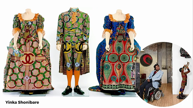
So here you have an artist who is British, whose country participated in this, and also Nigerian, whose country benefited from some of this design, and he is reclothing European and Western icons with this African wax print fabric. So the levels of appropriation get pretty deep here, and it’s really really interesting to see and think about.

Another one of his more famous works reclothes astronauts. I wanted to be an astronaut when I was a kid. Unfortunately my eyes were never that good. But here we see a typical white male occupation. I imagine astronauts as white dudes. But he’s reclothed them in Nigerian wax print fabric, and all of a sudden they’re African, and it’s very very clever.
So to leave this off, you can build this real cultural depth into your projects. It’s possible, if you do it respectfully, and you think about the variables that you’re navigating as you speak to your customers and as you speak to your audience.
Often people will say, “You know, this kind of sounds a little bit difficult,” and it is. And people also say to me, “Well, I just want to live in a world where this isn’t necessary.” Which, I had that comment, and it was an interesting comment because it was somebody who perhaps didn’t understand the power of this for minorities, for Africans, people who traditionally are not seen as the top of society. And in this increasingly global world, we do need design that’s culturally responsive and that speaks to our audience in a way that they’re familiar with.
Thank you.
Further Reference
Description at The Conference’s site of the session this talk was part of.
The original video for this presentation can be found at The Conference’s site.
