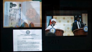
Hi. On July 9, 2011, the Republic of South Sudan was born. After two hard-fought civil wars, it’s people from the more than 60 tribes of this East African land voted overwhelmingly to break from Sudan and become the world’s newest nation.
My name is Anne Quito. Last September I traveled to Juba, South Sudan’s capital to research first-hand the pragmatics of designing for national identity. I wanted to get up close to the process of making emblems, symbols, and structures that comprise the branding kit of a startup nation.
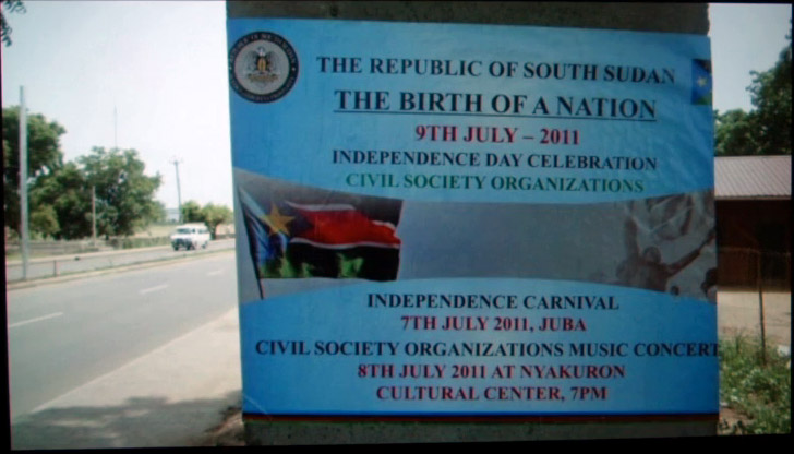
Now, the time between the referendum in February and its Independence Day declaration was short, less than five months to pull it all together. That’s less than five months to gestate a nation.
So how to you design a nation from scratch? Is there a design checklist? I think a list is important, not just as a reminder of action items but as a document that denotes the roles and opportunities for designers to participate in building a nation. In my research, I found no such listing, at least not one that distills a series of design tasks. So here’s my list.
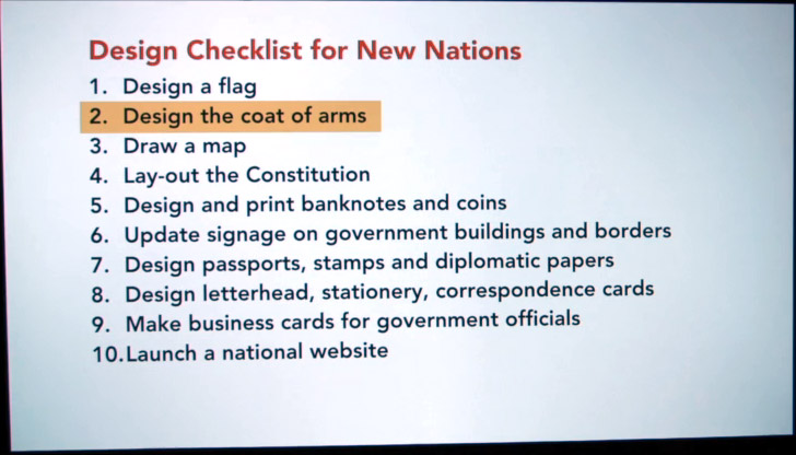
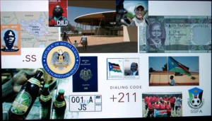
Some things are obvious: make a flag, a map, the seal, the money. But how about finding someone to lay out the Constitution? Or maybe someone to put together the customs landing forms? I’ve ordered the items in this list quite simply, but each one is actually a complex and fascinating design project.
Since the six-color South Sudanese flag is a carry-over from the army, today I’d like to talk about item number 2 on the list. The behind-the-scenes story of their national seal.
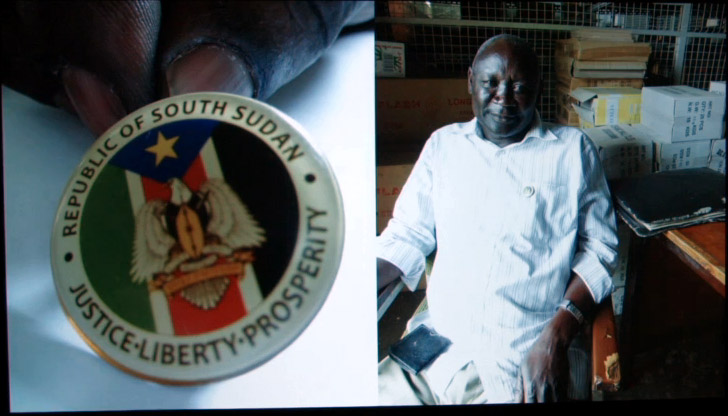
In Juba, I met Hakim, a project manager in the printing press who was part of the coat of arms design committee. When we met, I noticed that he was wearing a shiny pin on his shirt pocket bearing its design. With pride, he slipped it off, handed it to me so I could look at it closer. Let’s look at it together.
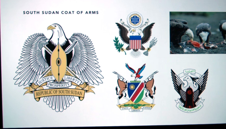
The main design element is an eagle bearing a shield. The bird is a fish-eating eagle common to this region of East Africa. Now, I don’t know about you, but to be honest when I inspected it, I was rather underwhelmed. The design was so generic it could’ve been clip art. It had zero graphic distinction. Hakim was observing me admire his pin, and I could barely hide my disappointment.
I had many critical questions for Hakim. Like, is that Times New Roman on the scroll? Two, were they perhaps inspired by the American Seal—I meant copy. Did they know that the eagle, that particular one, was also on Namibia’s emblem? And why is the design so similar to that of Sudan’s when you just voted to separate from Sudan? Also, were you aware that the fish-eating eagle that you picked was actually a kleptoparasite, a bird that feeds by stealing food from other birds?
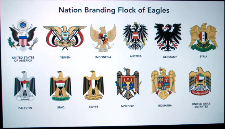
I mean, does the nation branding flock of eagles really need another member? I wanted to tell him, “Hey, I think it’s been done before. It’s kind of so 15th century.” Does the world really need another eagle/shield cartouche combo from this 21st century state? How often do designers get a chance to craft a country’s logo? Surely there must be room for innovation. It seems that “we are stuck in a stalemate of safe choices” laments the cerebral Dutch design firm Metahaven. As a graphic designer, a big part of me agrees with Metahaven, and perhaps if I had not spent any time in Juba, I would join them in disdain.
In hindsight, I think I may have dismissed South Sudan’s coat of arms too quickly. I realized that maybe I had been obsessing over the wrong details. I learned from Hakim that the most-debated element was not the eagle, but the shield. Their challenge was to find a pattern that did not resemble the markings from any of the 60-plus tribes too closely. Hakim’s committee worked through rounds and rounds of revision, presenting to an ethnically diverse cabinet of 28 ministers from these tribes. That is 28 art directors, commenting on every comp.
That very design debate actually echoes the roots of the ongoing ethnic conflicts that besiege South Sudan today. Last December, a rebel faction led by its ousted Vice President, who comes from the Nuer tribe, challenged its Vice President, who comes from the Dinka tribe. South Sudan still finds itself every more debating its national identity, and to this day they’re still tooling with that central shield.
Design for emergence operates on a different set of criteria steeped in the politics and urgency of its time. I believe that in this scenario, having these so-called safe choices is not a bad thing. During this time of emergence it’s good that we have defined a graphic language of nationhood, expedient variations of heraldic traditions of crests, cartouches, and coats of arms. A lingua franca of legitimacy.
Taking a step back, what is the purpose of this emblem, anyway? The coat of arms functions as the country’s seal of authenticity, a validator. I argue that it’s formulaic construct adds to its graphic authority. This new country’s emblem must look legit so the papers, people, and places they mark look legitimate. In the context of emergence, nation branding is important for two reasons.
One, these official state symbols function as markers, provisional fenceposts to stake out borders. I say provisional because they need not be permanent. A nation brand is not a tattoo but a starting point. After all, the American flag has been tweaked 27 times. Also, this collection need not be a closed set. Soon we get a national beer, a national football team, some rioters, pop stars, George Clooney adding to the South Sudanese word cloud. We’re all co-designers in this ongoing identity project. But while South Sudan is still in the process of becoming, its legitimacy is propagated through its nation branding.
Two, these graphic devices are containers, reservoirs of trigger points that store and spark a sense of nationalism. To borrow from the Bengali historian Dipesh Chakrabarty, they’re tools that help us pierce the veil of poverty and incompleteness and imagine ourselves as something bigger.
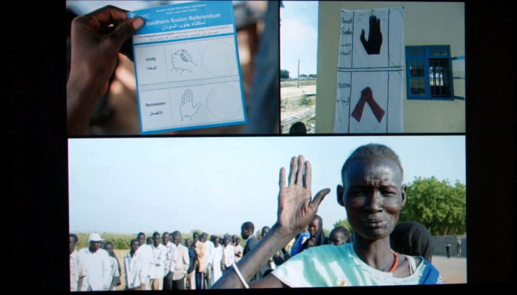
But there’s another reason. The design for the South Sudanese context is to consider that only one in three people can read. Its literacy level is pegged at 27%, the world’s lowest according to UNESCO. The problem is so prevalent that during that referendum, hand symbols had to be introduced in the design of their ballot. A raised palm indicated a vote for secession from Sudan, and two clasped hands indicated a vote for unity. In this context, simplicity clarity, even literalism is key.
The experience of going to South Sudan has left me with an indelible and humbling lesson about my own critical myopia. As critics, could we at times suffer from a short-sightedness where we’ve boxed ourselves into a limited field of vision and in so doing cast ourselves as privileged commentators dancing around font and form, out of context?
Every design question I asked in Juba was answered with a political response. There, I realized that design was important, but was part of a larger picture. I want to leave you now with an image of Michael Saki, Deputy Chief of Protocol, shown here busy preparing for the Independence Day celebration. In this scene he’s rummaging through a warehouse and comes face to face with his identity.
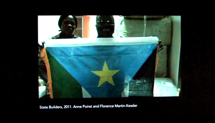
Still from video excerpt ~10:10–11:05
Thank you.
Further Reference
Presentation listing at the Lingua Franca conference site, and Annes’s bio with link to an extract from her thesis.
“SVA Alumnus Anne Quito on ‘Branding’ Switzerland and South Sudan” at SVA Close Up.
A post by Anne at Works That Work about this research.
NPR interviewed Anne about this project. [with transcript]
