Alice Twemlow: It’s such an utter thrill to introduce our keynote speaker today. When I read the novels and essays of Nicholson Baker, I find myself (as I suspect many of you do, too) in a state of something like astonished glee to find product design assuming such a starring role. You see, at D-Crit, we are keenly attentive to the ways that design figures in fiction. It is actually the focus of a whole class, taught by Akiko Busch, called Reading Design. Here students read texts such as Leanne Shapton’s Important Artifacts, and Daniel Defoe’s Robinson Crusoe in order to understand how characters gain dimension through the rooms they inhabit and the objects they collect, and how those very rooms and objects can actually become characters in the narrative.
So sometimes reading fiction helps us to understand reality more clearly. There is always going to be this tension between what is real and imaginary within a novel, where the novelist toys with our ability to both recognize reality and to embrace fantasy. There is also a tension between the reality of a novel and the reality of real life. The larger question, though, is how does reading fiction affect how we experience the world, and of course the way we ask that question is how reading design in fiction might affect how we experience design in the world as users, critics, and designers.
And if we were going to pick one writer to read for such an exercise, it would surely be the novelist, critic, and essayist Nicholson Baker. Baker has written ten novels, including the tour de force of product design criticism otherwise known as The Mezzanine. He’s also written non-fiction books including Human Smoke: The Beginnings of World War II, the End of Civilization, and Double Fold: Libraries and the Assault on Paper. Baker writes about technology for The New Yorker and contributes essays to a host of other publications such as Granta, Harper’s, and The New York Review of Books. These essays have been gathered into two collections, The Size of Thoughts, and The Way Things Work.
If Baker had to carry around one of those packs of things like the people Gulliver meets on his travels, we’d find a bizarre time capsule of contemporary life. Receipts and shoelaces, toothpaste tubes and bendy straws, earplugs, biros, and boxes of matches. What’s so exciting to me is that these things figure in his writing not merely as stage props, and not merely as types, but as actual individual things that loom up to the same scale as the characters who perceive them and evoke them. So here are just a few of the attributes of Baker’s writing that here are D-Crit we relish the most and learn from.
The first is that he slows down time. At a point when so much product design writing follows the pace of product launches and we’re expected to kind of sift and sort the significance of things at such dizzying speed, it’s an important reminder to see what can be done when you stop still, to stop and listen to an object for way longer than you’d think.
The second thing he does is to really zoom in and even under the surface of the materials from which things are made. He notices the dust-monads and wonders why velvet feels smoother than polished chrome. And it’s through the accumulation of the observation of details, sometimes microscopically small, that larger truths can be built, or as Baker puts it, “Consider the infinitesimal hooks on the horsehairs that draw from the cello string its lavish tone.”
The third thing he does is not just look at things, but he feels them, too. In A Box of Matches, his narrator lights a fire each morning at 4am in the dark. Gropingly, he feels for the curve of a mug, the cool facets of salt and pepper shakers, and the negative thump of cardboard fibers tearing when he pulled of a match from its book. And if you’re an avid Baker reader, you’ll know his characters do a lot of feeling with their feet, as well. They’re always stepping on things or having their toes poke through their tube socks.
The last feature of Baker’s writing that I think we can all learn from as design writers is his desire and ability to actually report from the production line. He goes to see how things are made. Take this passage from Baker’s 1994 essay about nail clippers for The New Yorker. He goes to visit the Bassett nail clipper factory in Connecticut, and I recommend reading the whole text for a master class in how to weave literary criticism with technology and design criticism. But I especially want to draw to your attention here, his evocation of the noise and fury, but also the grace of the manufacturing process:
Once cut (from rolls of Midwestern steel, at an impact force of roughly fifteen tons), the clipper “blanks” must be cleaned of oil, spot-welded, racked, hardened for two hours in a massive furnace, then oil-quenched, cleaned again, tempered in a second furnace to limber them up a little, and finally revolved in huge barrels with sixty thousand of their fellows for several days in a slurry of metal slugs, abrasives, and lime, to smooth away unhandy burrs
Vibrating bowls dither the components into sequential position, preparing them for a definitive riveting, which is accompanied by a Fred Astaire-like volley of air-cylinder traps and flourishes. Each clipper gets a sharpened cutting edge; a digital system checks the finished edges for truth. Eyelets, shot in at the caudral end, affix the nail files; then the entire splayed clipper, racked on hooks, proceeds through the planting sequence—ten minutes in a warm nickel bath, a minute or two of chrome. A nimble piece of pneumatics straightens the akimbo file and closes the lever.
Nicholson Baker, “Clip Art,” The New Yorker, November 7, 1994, 165 [PDF at D-Crit]
That’s design writing.
So watching how things are made, slowing down time, zooming into the fibers of things, and feeling your way around objects are just some of the ways in which design is made strange again. Here to tell us more about this, or indeed something else [al]together, please welcome to the stage criticism’s muse from Maine, the peerless Nicholson Baker.
Nicholson Baker: Thank you Alice for that extraordinarily kind introduction. I’m delighted to be here at this festive occasion. I think there are parents in the audience, and I look forward to learning things about design and research that I didn’t know. I do love doing research. I understand exactly what those people were talking a bout. I spent weeks at the Library of Congress with a camera (they let you just bring in a camera now) and you can go through the very fine carbon papers of the 40s and 50s, third or fourth carbon papers, these very filmy things, and just take pictures all day long, take thousands of pictures. And then of course you have to read this stuff at some point. But you feel the taking of the picture, and when you look at the picture, the little sight of the paper clip in the corner, the rustedness of the staple is part of the whole experience.
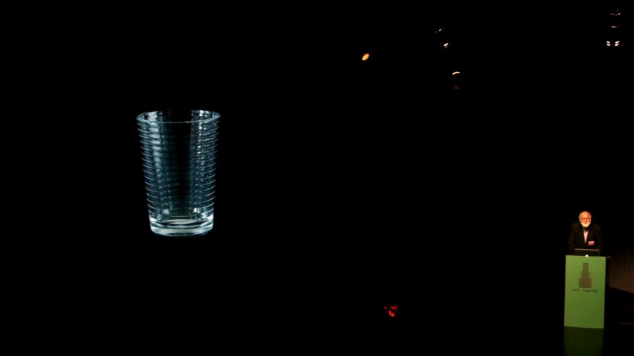
So what are we doing? I bought a glass at Crate and Barrel the other day, a drinking glass, because I admire the design and because I broke one like it at home recently. I brought it to the cashier and I watched her wrap up a purchase. She worked very fast, but she was kind enough to let me photograph her movements.
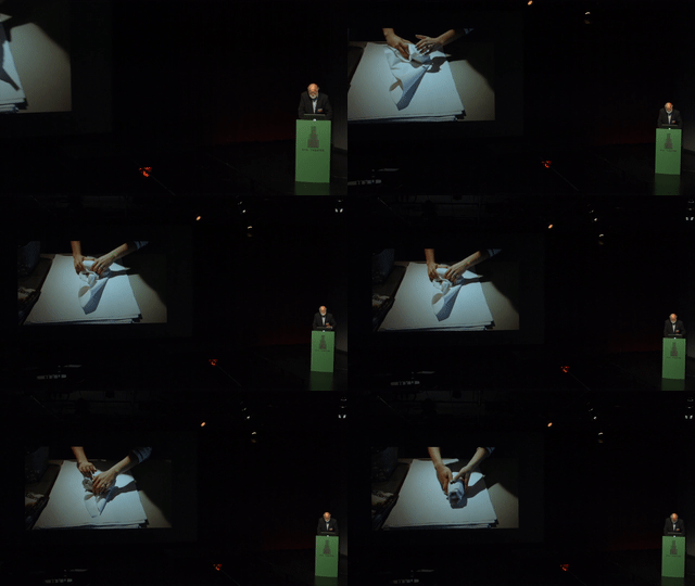
She set the glass on its side at one corner, brought it up, there it is on the pile—you know…everyone here’s been to Crate and Barrel, right? It’s a big, beautiful stack of paper that they have at the checkout counter. She started at the corner and she started to kind of roll the paper around the glass, and then she folded it in, then she folded it in again, and again, and started rolling, crumpling… This is stuff that’s sort of like newsprint but sort of like tissue paper; it’s got a crinkliness to it. Rolling forward, and then she was done.
And now my glass was set off from everything else in my shopping bag. I unwrapped it at home, and I set it on the shelf where it’s become part of a new design, the design of our kitchen in Maine.
So that’s what we’re trying to do, I think, we devotees who write about the designed and pen-outlined world. We’re just wrapper-uppers at Crate and Barrel. We’re packagers, temporary packagers. And our chosen packing medium—sentences, paragraphs—sometimes obscures as much as much as it helps us see.
Sentences are never enough. Anyone who has ever tried to describe anything inarticulate, anything curved, transparent, felt, elegant, bulbous, knows what I mean. We’re talking about an object that lives in the realm of the eye and yet here we are presumptuously substituting little bits of lettered code for what we know to be flowing and ardent and fundamentally speechless. Something that sings its shape without any need of words at all.
We’re cheerleaders. We want to say, “Wow, this thing is good. This thing is really beautiful. And it costs 95 cents.” But the word beautiful on the page is not necessarily our friend. It can seem tired and worn out. If we said it aloud, we could say it a hundred different ways. Beautiful. Beautiful. But on the page it’s just a row of nine letters, and it flowers in the mind in that limited way, as a mere adjective that everyone has read and written too many times in emails with several exclamation points after it.
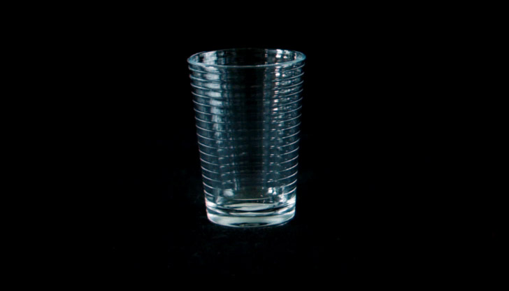
Crate and Barrel Rings Glasses
But the glass is beautiful. It has just the right inward slant. And it has ribbing, it literally costs 95 cents. How can anything so perfect cost that little? It’s a tumbler—I think that’s the technical term for it—and it tumbles happily in our minds, but on the page we really have to work to make it tumble for other people. We have to recreate the sense of delighted surprise that its designers may have had when he or she first designed it, and that’s where the peculiar resources of language can come in.
With language we can focus in and enlarge and point and push all distractions aside, and pull in metaphors if we’re in the mood, and we can talk of the object’s, its predecessors, of its means of distributions, of how its displayed in the store, of its visual allusions. In this case its allusion to something segmented, like a telescope. Glass is just melted grains of sand, but when we look at this tumbler, we might think perhaps of Ptolemy and Copernicus looking up at the moon. Or perhaps not. Maybe we think of those little camping glasses made of nesting rings. We’re trying to use words to reassemble this object’s primordial sense of strangeness.
We’re writers about objects and places, gardens, rooms, clothing, hotel lobbies, posters. We pack them in rapture in the paper or molded cardboard or styrofoam popcorn of our enthusiasm. We are the excelsior that they come bundled in when we write about them. We are fundamentally irrelevant to the utility of the objects we describe, and yet we proceed under the illusion that we’re necessary, that our encircling literally literary Harlem Shuffle of excitement is what makes the object seeable and graspable.
I’ve been thinking about design my whole life, on and off with some distractions, and the reason I started so young is because I was lucky enough to be the child of two designers and design enthusiasts. My mother, Ann Whitall Nicholson came from a Quaker family in Moorestown, New Jersey, outside of Philadelphia.
They owned a glassmaking company, the Whitall Tatum Glassworks, which had a factory in New Jersey. They made glass bottles and paperweights, and they made these nice green-tinted objects called insulators. The insulators went on top of telephone poles to shield points of juncture in power lines. There were a lot of telephone poles that needed glass, so they sold a lot of them. Sometimes there were purple insulators. I must’ve inherited some of the Whitall Tatum joy in glass, because I loved jars when I was little. My mother would take me to the A&P supermarket and she would by Medaglia D’oro olive oil, and Hellmann’s mayonnaise, and Skippy peanut butter from the shelf with all the Skippy jars. These are plastic, of course. This is the new era.
But the Medaglia D’oro is still glass and I thought that the shapes of each of these jars was perfect for what it had to do. The Hellmann’s had that kind of turn in that said use a big knife and slather it on the bread. There’s more when you reach around in it and angle your knife in. The peanut butter was just the right safe. And especially, there was this beautiful thing in the glass Skippy peanut butter jars. They had molded this handy set of 1/4, 1/2, 3/4 measuring lines so that you could reuse the glass. I loved those lines and I loved them so much I tried to put them in an novel later, unsuccessfully. If I’d been a photorealist painter, I would’ve tried to paint the numbers as they focused the light and the shadow on the inner surface of the peanut butter. But I wasn’t a photorealist painter.
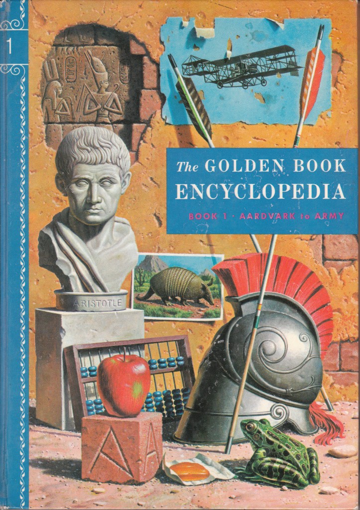
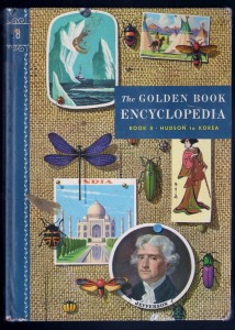
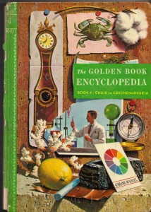
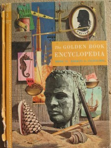
However, at the A&P supermarket, every week there was a photorealist masterwork for sale, and my mother bought it volume by volume for me. It was the Golden Book Encyclopedia. On the cover of each volume was a still life with trompe l’oeil objects arranged seemingly at random. Here’s A: aardvark, Aristotle, amphibian, apple. They were very on the nose when they started, but then they got more subtle.
Here’s another volume I really loved. I loved it because of the burlap. A painter decided that it was worth his time to paint all of that burlap. “Hudson to Korea” so he’s got insects in there, he’s got Japan, he’s got icebergs. But he’s got burlap behind the whole thing. I loved that.
Shadows of the olives on Book 11, and the paint, and they started doing things that would hang down, connected by string to things. Here’s something hanging.
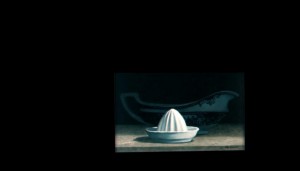
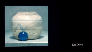
And just recently when I was thinking about the Golden Book Encyclopedia because it was so important to me, I looked and I found that there are the cover artists, credited. So often, the things that are really important to us, we don’t know who actually did them. I mean, who is the author of this stuff? Ned Seidler, Ken Davies, Don Moss, illustrators.
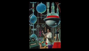
And I think this, I can safely say as a would-be art critic, is a cover painted by Donald Moss. And I know this because if you look at this guy with his scientific…see the sort of glassware there? This is one of his other illustrations for a science magazine. Same glassware.
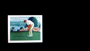
He then got a job at Sports Illustrated painting golfers, and he just died a few years ago. I never got a chance to talk to him.
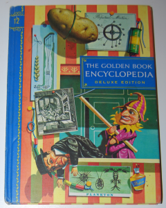
Here’s another guy, Ken Davies. Ken is still alive, and I talked to him day before yesterday, and he has painted he loves Punch and Judy. I’m not crazy about Punch and Judy myself, but he also painted this great potato, hanging. And the perpetual motion machine. I think that’s by him. Here’s some of his later trompe l’oeil work.
And here’s my favorite Golden Book Encyclopedia cover. That is a clay man right there, painted by a painter, and I think it’s painted by Ned Seidler, who later painted stamps for the US Postal Service.
This is what [inaudible] me out. This sand, this desire to catch the difficulties that the clay artist had with clay, he’s catching in paint.
My mother gave me drawing lessons with my sister, and she taught at the Memorial Art Gallery in Rochester, and she taught us to look at seed pods and the underside of mushrooms and at peoples’ eyes and mouths and at wrinkled fabric and at trees. One of her art lessons that really helped me was she said to draw a pillow. And then she said, “Now draw the inside of the pillow.” I remember trying to force my pencil to render the mystic feathered darkness of the pillow’s interior, which I failed to do but I loved it.
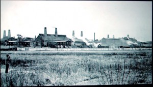
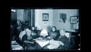
This talk I’m giving you is about my parents because without them you can’t do anything. My parents had grown up in a sort of arty family. Her grandfather was an amateur photographer. This is his self-portrait using a glass plate negative. And here’s a picture he took of the Whitall Tatum glass factory in New Jersey. Here’s a shot he took of some Quaker relatives. There’s this guy staring forward, pretending to read the public ledger, and the woman on the left has a Quaker bonnet on. That’s what Quaker bonnets looked like.
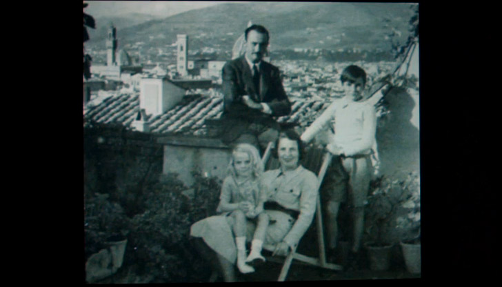
And my mother’s father was sort of in revolt against this Quaker-iness that he felt in Moorestown. He was on the same street as all these stiff Quaker relatives, and so he became an art critic and he wrote scholarly studies of [?] and Donatello when he lived in Florence being kind of an expatriate. He studied with Bernard Berenson and they hung out at I Tatti for a while, and here they were when they were sort of typical American expatriates. My grandfather, grandmother, my mother, and her brother, outside of Florence, kind of soaking it all up and rejecting America.
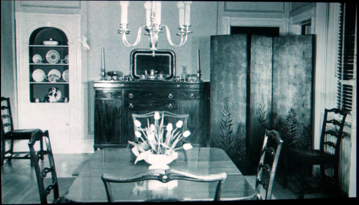
But my grandmother was not a Quaker. She was from the South and she wrote essays for Vogue magazine. She loved Chanel suits and Chippendale furniture, and she loved arranging couches and couch pillows in rooms. Once when she came to visit us, she hid the couch pillows that my mother had made because they were too modern. My mother discovered them stuffed into a cupboard when my grandmother had left. Often, the first thing she would do when she arrived was say, “Now, Ann, if you’ll just help me lift this couch we can just pull it over here,” and she would arrange the room the way she thought was better. She hired a photographer to take this official picture of her dining room in Moorestown, New Jersey when she’d gotten it the way she wanted it.
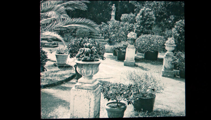
Later in Bermuda, after her husband died, she set about constructing a garden fit for an Italian villa out of a disused clay tennis court that was near the gardener’s cottage that she rented from the rich woman nearby who owned the big department store in Bermuda, Trimingham’s. Here is her foray into Italian villa garden design on a clay tennis court:
I loved it because there were these huge spiders that would hang on enormous webs between the flower pots, and there were little crabs that would creep out from holes along the side and scurry around in the garden.
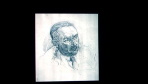
My mother’s brother, Alfred Jr. (we called him Uncle Nick) became an artist. He did some portraiture. This is his portrait of my grandfather. But mostly he painted trees. He loved the landscapes of Claude and Pouissin and Turner. And going through a museum with Uncle Nick was an odd experience. He had these sort of guttural reactions, sort of an “Ohhhhh, my God,” when he would see something he loved. Sort of a laugh, a moan, I don’t know what it was. But other paintings he would look at them and just wince and turn away immediately, he hated them so much. But mostly he just painted trees. Big, upreaching boughs lost in a myopic mist. He couldn’t get enough of them.
My mother loved trees too, and she still does. I remember her looking out the window and saying how beautiful the wet black tree trunks were in the rain. I frankly didn’t see it then, because I was a kid and I liked sunny days. But now I understand. Trees are very old and yet they’re always doing something different. They always have a new design. They always have something new to say.
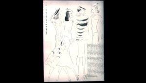
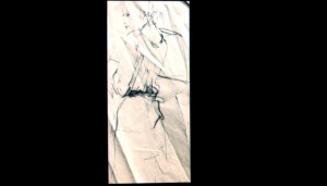
My mother spent a year at the Moore College of Art in Philadelphia, and then she studied art history at Bryn Mawr College for a year or two, and then she transferred to Parsons School of Design here in New York City, and she took a class in fashion illustration. There was a fashion illustrator who was very big then, a man named Marcel Vertès, who was a Hungarian. His loose, effortless, sketchy line was used and imitated in ads for dresses for Lord & Taylor and Bloomingdale’s that appeared every day in the New York Times and every week in The New Yorker. He was one of my mother’s heroes, and here’s one of her fashion illustrations for fashion class, trying to get that same sketchy, loose line.
Another class she took at Parsons was called Flat Design, where you learned how to design fabric and wallpaper. It was taught by a woman who was herself a fabric designer, whose designs were printed by a New York company called Greeff Fabrics. And my mother got a job for Greeff designing these things called colorways for fabrics, which meant as I understand it the various color combinations that might go with a certain black and white piece of art that she was assigned to colorize.
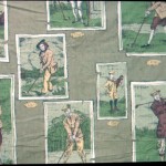
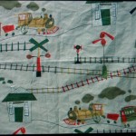
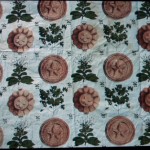
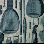
So for instance, here she was assigned this design, these golfers, and she was assigned to pick the colors. The design was called “For Men Only” and it was, I guess, meant to hang in some golf clubhouse or something. Here’s a kid’s design that she made the colorway for, and here’s another design. You gotta have lutes in life. Here’s a colorway that she designed, and you can see another colorway right at the top, another alternative thing in the swatch.
But before she got a job at Greeff, which she quit in 1956 when she was pregnant with me, she’d met my father, Douglas Baker. He was one of three sons, and here let me play for you one of the most influential experiences of my early youth.
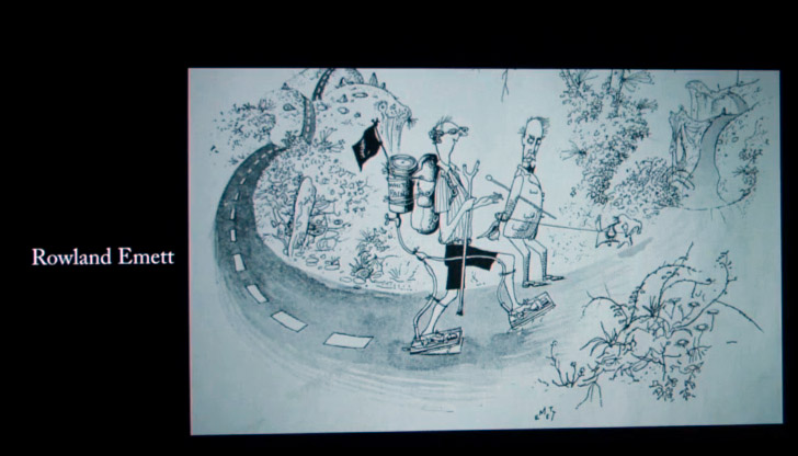
That was just such a great show. Actually, the only good thing about it was the title design. But these [diquesting?] designs connected in my head with all sorts of sketches in my favorite book of art, which was The Best Cartoons from Punch, which contained the art of a great illustrator, Rowland Emmett.
Here’s one of Rowland Emmett’s drawings, a guy on a walk in the country, and as he walks he paints the intermittent white line of the road. Love those shoes; same shoes as in My Three Sons. And then there’s this harvesting machine. He later did, I think, Chitty Chitty Bang Bang and other things for Disney, but this was the real Rowland Emmett. Harvesting the straw and making straw hats out of it, and the guys are saying, “There’s something definitely wrong with that machine.”
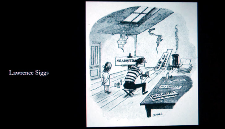
There was another drawing towards the end of Best Cartoons from Punch by Lawrence Siggs. (These are all British guys.) An artist in his garret painting “No Admittance,” “No Sweets,” “No Cigarettes,” and he says, “I paint what I see, child.” I didn’t know that it was a reference to Manet, or to EB White’s poem about Diego Rivera “I Paint What I See.” I just thought it was a very reasonable way to proceed. If you see signs, paint them.
And that’s sort of what my father’s approach was. He grew up in the South with his two brothers and the son of a doctor who taught at medical school, who wanted all three of them to become doctors and dissect dead people, and they didn’t want to do that. One became a lawyer, one became a physicist, and my father became a graphic designer. When he was 15, he got excited about the art of the Ashcan School and George Luks. His family happened to own a really nicely-dented trash can, which he painted, and it won Best In Show at the Alabama State Fair. And on the strength of his portfolio, he got into Parsons. He supported himself by working at a Pokerino parlor on 42nd Street at night called Playland, where he dispensed change to Pokerino addicts from a little thing at his waist, and he would have to say, “Poker with balls instead of cards, folks. You can’t win if you don’t play.” And the next day in art history class at Parsons, when all the students would file out after seeing slides of Italian Rennaissance masters, my father would be sitting in his chair fast asleep, catching up after a late night at the Pokerino parlor.
My father was also a handstander, and he could balance three stacked aluminum chairs on his chin. He later collected chairs. Hunzinger chairs, Thonets, Stickley furniture, chairs he found on the side of the road that he would glue together. I watched the Elmer’s glue squish out from the seams and dry to transparency, and he’d rub them with steel wool and stuff them with horsehair when they needed it. One day at Parsons he told some of his friends that he could walk on his hands all the way down the hallway, and that’s when my mother really took note of him. This young man who fell asleep in art history class and knew how to identify typefaces at a glance was walking on his hands down the hallway, with the change pouring from his pockets.
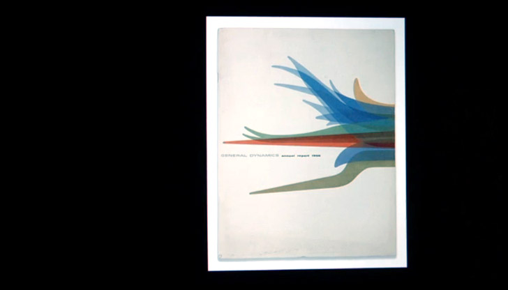
So that’s how my father and mother met. And while she was working at Greeff Design and Fabric, my father got a job at the Erik Nitsche design studio on 57th Street, working on the imagery for General Dynamics, the company that made war planes and submarines and atomic power. This is the 1956 General Dynamics annual report that Erik Nitsche designed. My father was one of two or three people who did paste-up and stuff like that.
He was a Swiss designer who created a kind of corporate modernism, and my father was there with his t-square and his triangle in the Nitsche atelier. Here’s another thing he worked on for Nitsche, the Triga method of peaceful atomic power. There’s the fuel rods and he superimposed the circles over it. He was part of that whole New York excitement in the 50s of ball-bearings in museums, as in MoMA, and cleanness and corporate logos and commercial art seen as art and Saul Bass Title designs.
Then in 1960 when I was two and a half, my father was offered a job in Rochester, and he began his career as a New York-style graphic designer transplanted upstate. One of his early designs was a Genesee Beer point of purchase display. I don’t have a picture of it. I with I did. But it had a little electric motor in the back and it would make the man’s arms move, and the man was just sort of dancing ecstatically because he was on top of a whole stack of Genesee beer.
Another display was of a man’s spiral eyeballs, and they were going behind a pair or Ray-Ban sunglasses, and he was seeing new things because he was motorized and wearing Ray-Ban sunglasses.
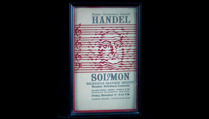
Then he started making posters. One of his earliest was the bring it for the Bryn Mawr Books sale, and he pulled some books off of our shelves, and he rearranged them slightly so that Lady Chatterley’s Lover was on top of Lionel Trilling’s Liberal Imagination, tied a string around them, took a photograph of the stack, developed the film, enlarged it on his enlarger which was a big machine like a daddy longlegs that stared down on an image, and then he retouched the enlargement, and suddenly our very humdrum books were out there. They were printed on legitimizing cardboard, and everybody could see them, and they were not just the books from our shelves but books for everybody to look at. The poster won an award, so he made more. Here’s one for Handel’s Solomon.
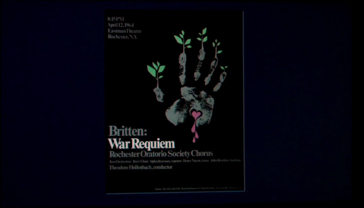
He painted the likeness of Handel out of the staves of music. He loved listening to music while he worked; still does. Here’s another musical treatment of a stave. But there’s one poster that I really remember well, because I was with him when he made it. I was 7 years old and we went into his office on a Sunday, and he set set out a big piece of white paper and inked his hand, and he squashed it down on the paper. I couldn’t understand what he was doing, but then he said, “Would you like to try?” and I said sure, so he inked my hand and I squashed it on the paper, too. The result was this poster for Britten’s War Requiem.
He made a negative of it and kind of fiddled with it and painted in this sort of stigmata/bleeding heart thing in the middle. It’s a piece of music about the horror and suffering of war. Then he painted in this regenerative plant growth from the tips, and it was a remarkable thing to see happen.
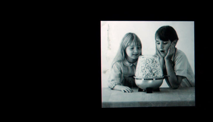
He also did some more normal consumer advertising. This is a picture of me and my sister pretending to be astounded by some popcorn from a brand new popcorn popper. It was not a successful ad, I don’t think.
And he did logos. This was the great age of the corporate logo, so he did logos. Allied Circuit Techniques, a company that doesn’t exist anymore. E. E. Fairchild, a Rochester company that made board games. A construction company that made concrete blocks, Domine Builders. He made the logo for Memorial Art Gallery in Rochester. And when we got married, my wife and I, he made the logo for our wedding.
It was interesting to watch him make these logos. He usually did it overnight. He stayed up all night and he had a big pad of tissue paper, and he would draw the logo fluidly first and then refine it and kind of get it sharper and sharper until he got it to a certain point. Then he would send that image to a stat house to make the very faithful reproduction and then out would come say, Planned Parenthood of Rochester, or the Rochester Museum & Science Center. Schumann Gallery was another one of his logos. He came home from the Schumann Gallery one day in the early 60s, and he said (he always whistled when he got home), “Annie, you won’t believe what I’ve got, and you won’t believe how much it cost.”
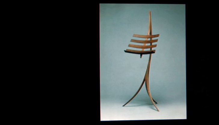
He had bought this thing, this music stand. It’s a music stand by Wendell Castle, who was a Rochester furniture maker. It was made of white oak but it had some sort of fancy wood like mahogany or zebrawood on the spines. He set it down and he said, “Doug, you to take it back.” Apparently it either cost $150 or $300; accounts differ. But it was way more money than we had, and my father didn’t take it back. It’s in my sister’s living room now. It’s worth $10,000. Amazing. But we were really thrilled to have this music stand in the end, although we couldn’t afford it.
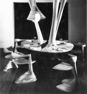
Photo: Dwell
My parents decided that they would commission something bigger. My father had seen sketches of a table that hung from the ceiling, a table without legs, at the Schumann Gallery, and he decided that we should have this table in our dining room. So Wendell Castle made this table. A sort of crazy torus that came angling down on these curved things and it would fan out like some sort of jungle plant. There it was with no legs, but there were these chairs around it. Where the chair had one leg, the table no legs. It was really an amazing thing.
He arrived with these guys with the table in four pieces and he screwed it to the ceiling beams with these eight-inch lag bolts and I was just tremendously excited. I was 9 years old and I did my homework at this table, but I had to have layers of paper underneath so I wouldn’t make little marks in the oak. But I used to walk around the table just dragging my fingers around, singing this kind of song of smoothness. When my sister had her birthday, she got to sit in the middle of the table. And we had this exciting fact that the New York Times came and took the formal photo and we thought was had really arrived, you know.
So we thought we’ll commission something else. There was this guy named Albert Paley who was an ironworker. This was his most famous work. He did the Renwick Gallery gates. He messed with metal as if it was some kind of plant. My mother commissioned him to make a planter that would hold a rabbit’s foot fern. This is sort of what it looked like. I don’t have a picture of it, but it was bolted to the ceiling again again. We liked things bolted to the ceiling, I guess. We put a rabbit’s foot fern and it thrived. It was a big, bushy rabbit’s foot fern with all sorts of tendrils and viny.
And I thought, the house is complete. Molding is done, the furniture is all glued and repaired, the Wendell Castle table is hanging, and the Paley thing is in the living room, and the rabbit’s foot fern is healthy. And it lasted for a short time, then our house was too dry. We didn’t water the rabbit fern enough, and my parents were arguing about money. The rabbit foot fern died and became this sort of shriveled mass of dead plant material. It was horrible.
And there was another casualty, which is that the Wendell Castle table started to dry up. We put tanks of water on the radiators, we installed a humidifier, but white oak is a very hygroscopic material. It soaks up water in the summer and it releases it in the winter, and the stresses were too much for it. One morning I woke up and I heard this kind of pop, pop, pop. I went downstairs, and there were these gaps, these sort of cracks in the table. And there was a quarter-inch gap in the fan-like opening parts. Wendell Castle came in and fixed that, put a shim in and glued it and sanded it and made it better. Then a year later, more popping, terrible popping.
And I realized (and I wasn’t the only one; Wendell realized) that the table was self-destructing. It couldn’t handle what he as an artist wanted from it. His team sadly arrived and took the whole thing down. We said goodbye to it. That was it. The Wendell Castle table was no more.
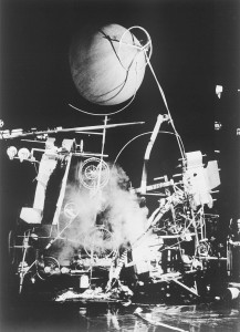
Jean Tinguely “Homage to New York” 1960 at YouTube
You know, it’s like those photographs that my father showed me in an art book of Jean Tinguely’s “Homage to New York.” He built a big crazy machine that. It self-destructed. It took half an hour, and it began sawing itself apart. And there was a piano in it. It set the piano itself on fire somehow, and it just self-destructed and that was its artistic moment. It was a moment of self-destruction, an explosion.
The Wendell Castle table’s artistic moment was to be part of our small domestic existence in Rochester for several years with Wendell Castle’s signature carved into an inside surface, and then it decide to break itself down. We said goodbye to it, it was unbolted from the ceiling, we never saw it again. My parents separated eventually, and my mother sold the Al Paley planter to a collector.
Out of the ongoing mess of our life, out of all the change that lives inevitably bring when children grow up and families separate and form new families and new children grow up, I’m left with a sort of remembered design of happiness. Of having had the good fortune to be alive in a world of arranged living rooms and mayonnaise jars and the insides of pillows and glass insulators and harvesting machines that make straw hats and dancing men on beer cases and hanging oak tables and logos for companies that no longer exist.
No design is permanent, even when it’s made of wrought iron, even when it’s printed on thick cardboard. All designs live and exist in a world of stylistic evolution and reimagining and physical decay and supplanting novelty. We do our best to wrap sheets of paper around these memories and shelter them, but the glass tumblers we buy go out on a kitchen shelf and sometimes the tumblers tumble and break. That’s life.
Thank you.
